16 december 2016 — presentations
Safari Typo Amsterdam
An evening full of short documentaries about typography in public space & book presentation
We all know the famous HOLLYWOOD lettering, but what makes these letters unique? Can the character of a city be told by the letters in public space? In which aspect is the typography in Barcelona different than in Berlin? And why do those strange, unorthodox geometric and decorative display letters perfectly fit to Amsterdam? Join us 20 January 2017 for an evening full of short documentaries about typography in public space.
Speakers:
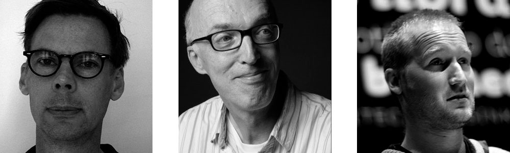
Thomas Sipp
The French filmmaker Thomas Sipp has a great liking for typography. After making 12 short animations about fonts (Sacrés Caractères), he recently portrayed 8 metropoles by their letters in public space. Thomas Sipp lives in Paris and Toulouse.
Piet Schreuders
Despite disliking the word ‘graphic designer’, many people still describe Piet Schreuders like this. But he is also author of books about design, publisher of Furore magazine and of course proud managing director of the one and only newspaper on cats, the Poezenkrant.
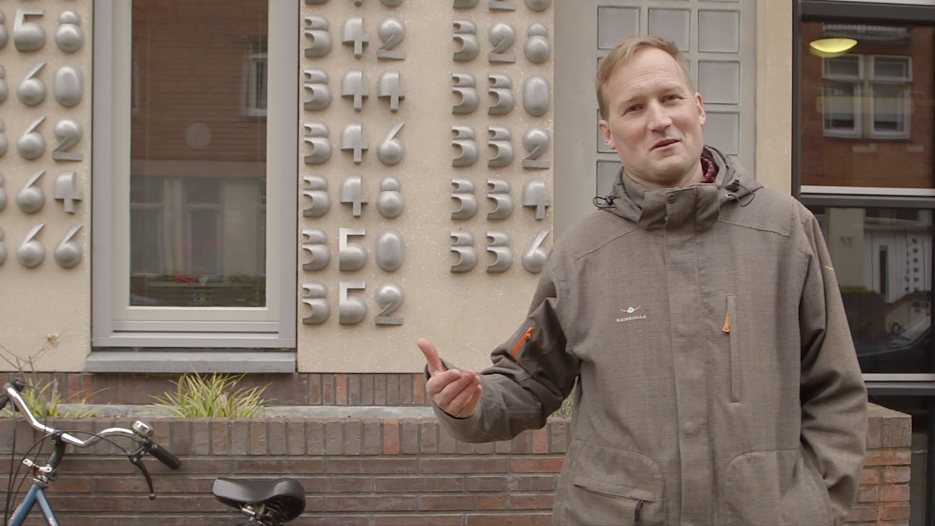
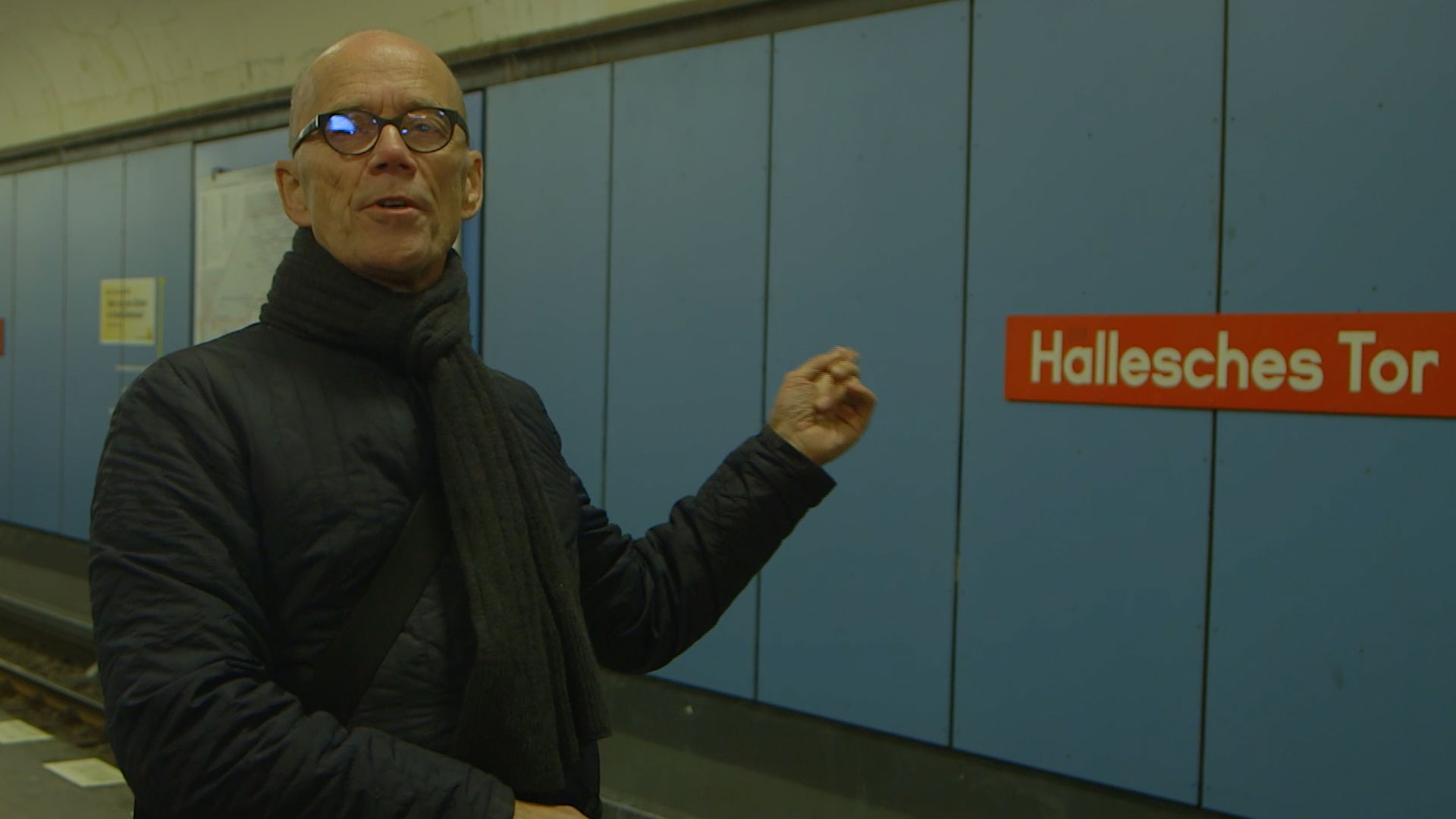
Bas Jacobs
Bas Jacobs is type designer at Underware. When not designing new fonts, he might be sometimes giving a lecture or workshop on typography or type design, just reading a book or watching a documentary. Tonight he is your guide to typographic Amsterdam.
In metrostations, shopping malls, screens, billboards, letters can be seen everywhere. These letters define the townscape as much as the architecture or the current fashion. In 8 short documentaries, titled ‘Safari Typo’, the viewer will be taken on a typographic expedition across cities. These documentaries by the French filmmaker Thomas Sipp are portraits of metropoles by their letters in public space. As Sipp describes this himself: “Typography is at the heart of our contemporary culture. These short films plunge us into the typographic cauldron of the great modern metropolis. We are taken on safaris through cities by typographers and type designers who will decipher for us the jungle of typefaces swarming all around us.” Just a couple of days after their premiere on the French TV channel ARTE TV, a selection of these documentaries will be screened in Amsterdam and the French director will personally throw his light on them.
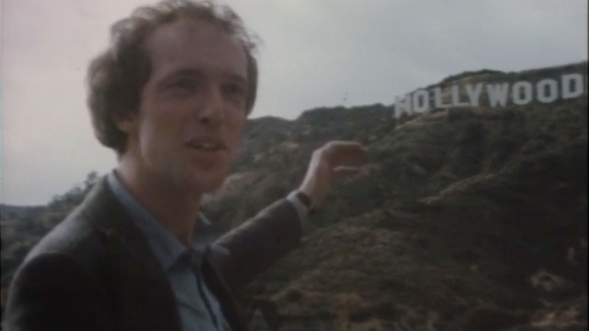
Thirty eight years ago Piet Schreuders set off on a similar expedition. In 1979 he portrayed Los Angeles by its letters in public space. Extracts from the documentary Hollywood at Last! will be personally amplified by this Amsterdam-based designer, who is also the leading figure in the film. Directly after the screening, Schreuders will show how LA has changed over the last decades.
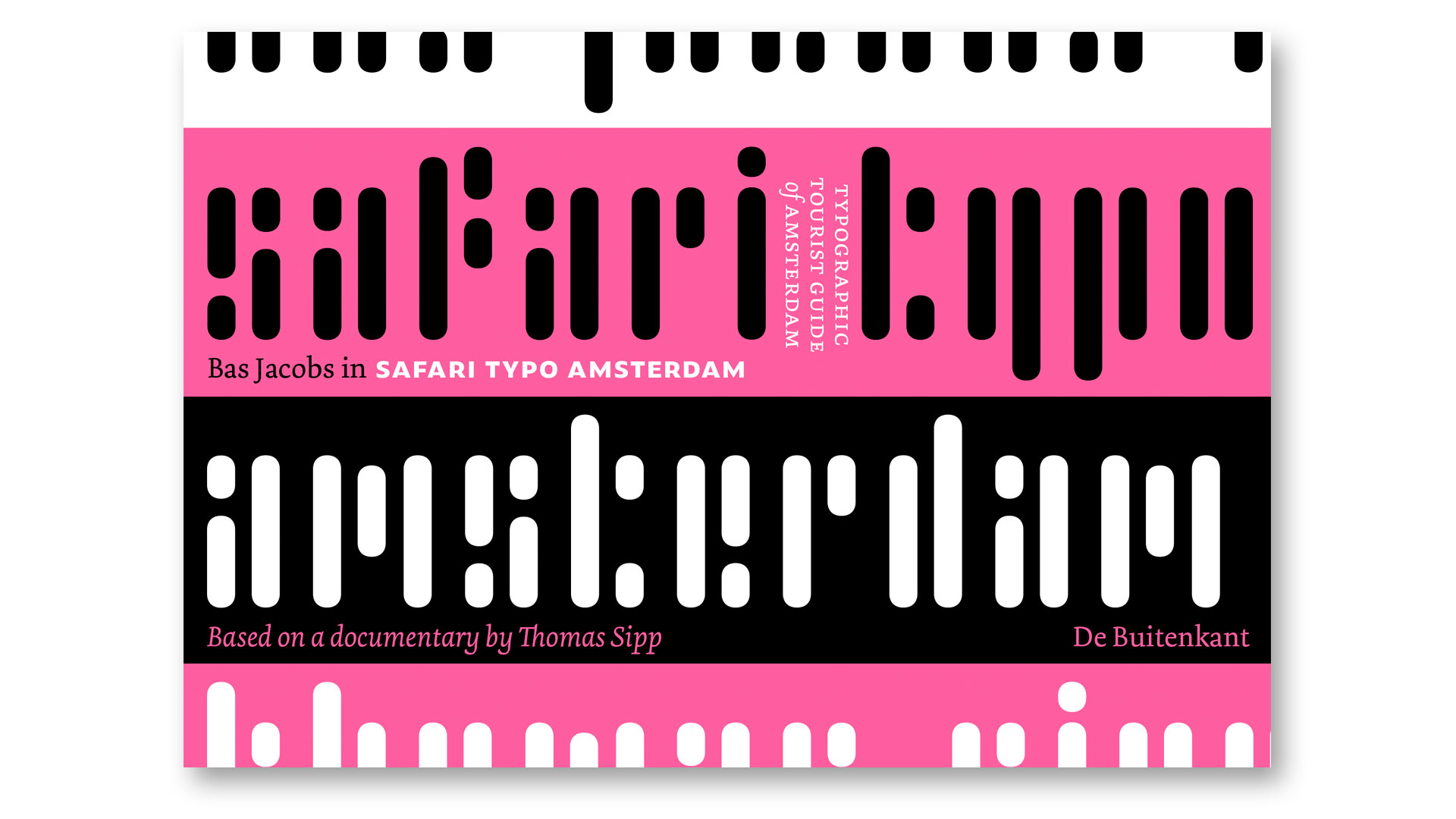
During this evening the publication Safari Typo Amsterdam will be presented. Type designer Bas Jacobs made this typographic tourist guide as a result of shooting the short documentary. The publication Safari Typo Amsterdam is a brief typographic tour of letters in public space in the Dutch capital. If you’re willing to leave the well-trodden touristic paths, let letters guide you across Amsterdam. If you have seen enough touristic traps, or don’t want to see them at all, this tour will take you to various parts of the city you would otherwise have missed. Discover how architects, artists and designers left their mark on the city by means of the letters they created on buildings, on bridges, on monuments and elsewhere. This pocket-size book is easy to carry with you as you explore the city. This book is only meant for tourists ready for a mind-expanding experience.
Location & date:
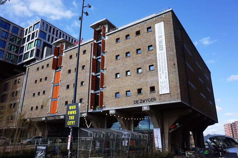
See you Friday 20 January at Pakhuis De Zwijger in Amsterdam. Doors are open at 19:50 o’clock.
Date: Friday 20 January 2017, 20:00 o’clock
Location: Pakhuis De Zwijger, Amsterdam (NL)
Language: Dutch & English
Entrance: Free (Reservation required)