28 june 2017 — publications
New publication: Zeitung newspaper
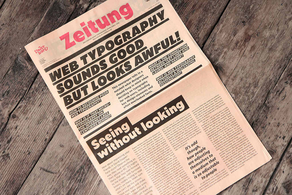
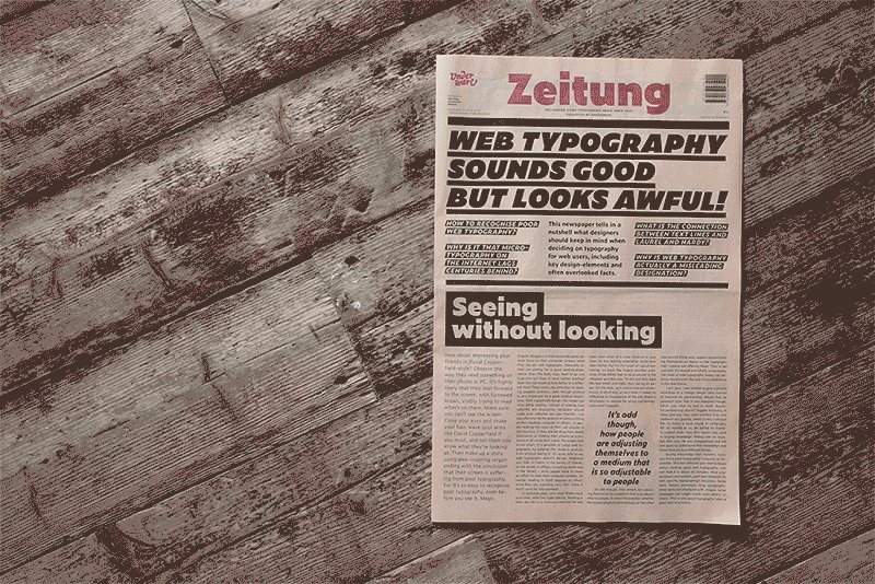
We’re happy to announce the latest news on web typography. Every wondered how to recognise poor web typography? Why is it that micro-typography on the Internet lags centuries behind? What is the connection between text lines and Laurel & Hardy? Why is web typography actually a misleading designation? This newspaper tells in a nutshell what designers should keep in mind when deciding on typography for web users, including key design-elements and often overlooked facts.
24 pages full of typographic wisdom and experiments. Everybody who designs for screens should read why web typography sounds good, but looks awful, so get your own Zeitung newspaper.