27 may 2020 — fonts in use
Fakir loves beer
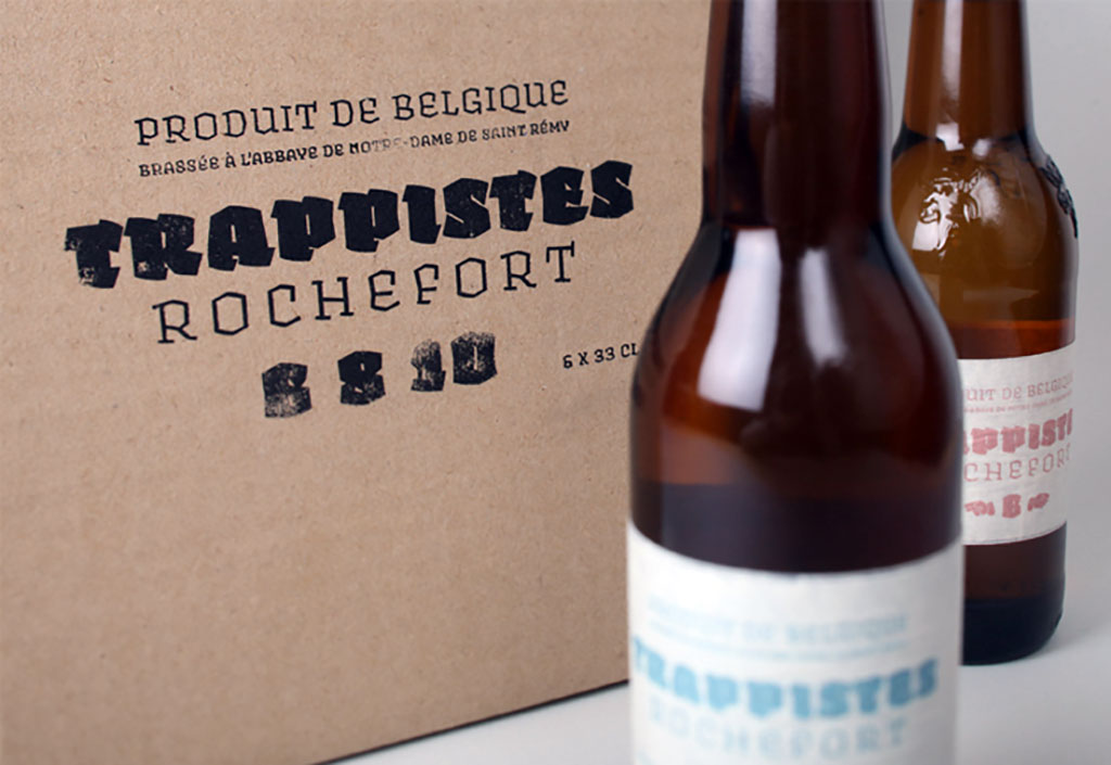
Some people love books, others love shoes, music, surfing, football, chilling, bird watching, scrabble, witchcraft or metal detecting. We love letters. Everybody is different, but in the end we all love beer. To celebrate that it’s beer which unites such a large part of the world, we collected some beer labels set in our typeface Fakir. Apparently black letters are a thing in the beer cosmos, maybe even more than in gangster rap. Beer must have black letter, or it ain’t real. In case you still have any doubts that it’s really black letter & beer which unite the world, here are a few examples of Fakir in use on beer labels from across the globe.
04 september 2016 — fonts in use
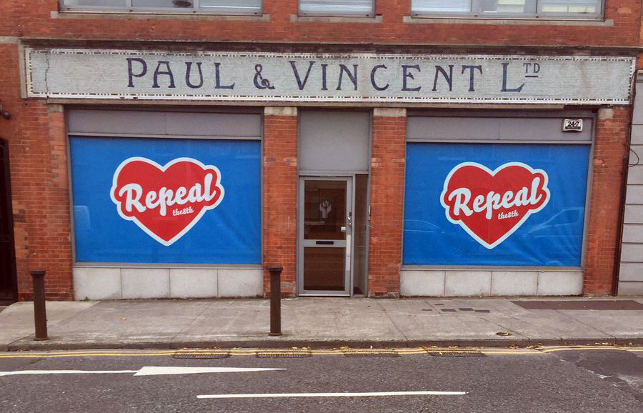
Repeal the mural
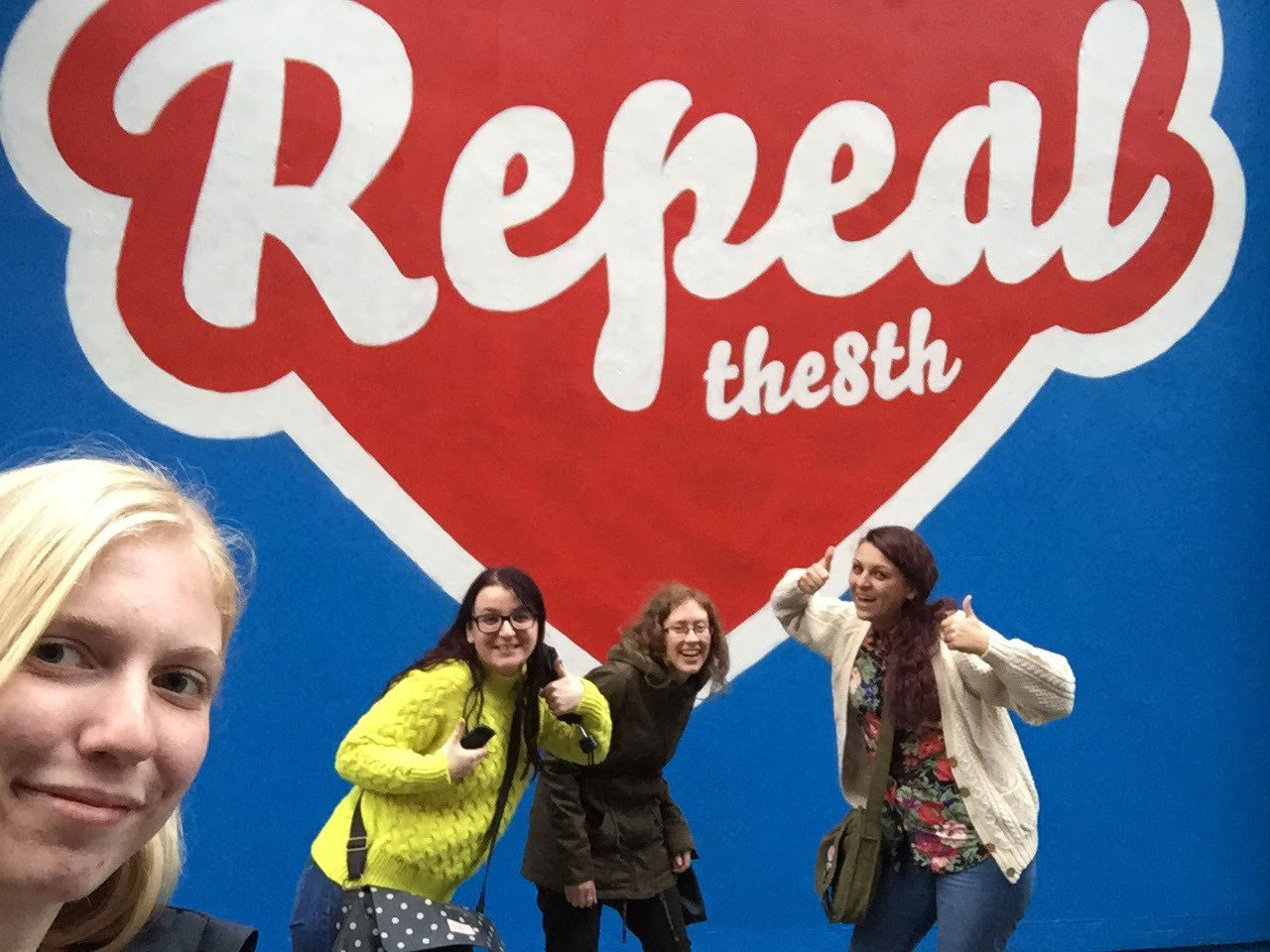
Who doesn’t know Maser, the street artist who grew up in Ireland? We wrote about Maser’s noticable murals before on this blog. One of his murals has been making the news again this summer.
During the current campaign for repeal of the Eighth Amendment (abortion ban) in Ireland, things got wild this summer after the Dublin City Council Planning Department demanded a mural from the Irish street artist Maser to be removed. His work would violate planning regulations, so they decided to paint the wall blue again.
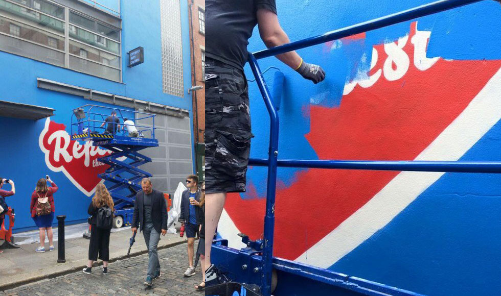
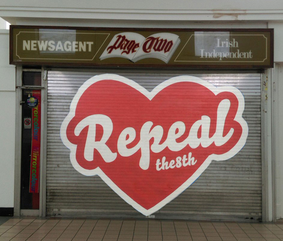
In the short time before being painted over, the mural had enough impact to stir up controversy and debate. Well, actually removing the mural and painting the wall blue again resulted in a strong and widely supported counteroffensive. Various people started to recreate the mural on other locations throughout the city, and later on throughout the country. Seriously, how many murals or grafittis have that honour?
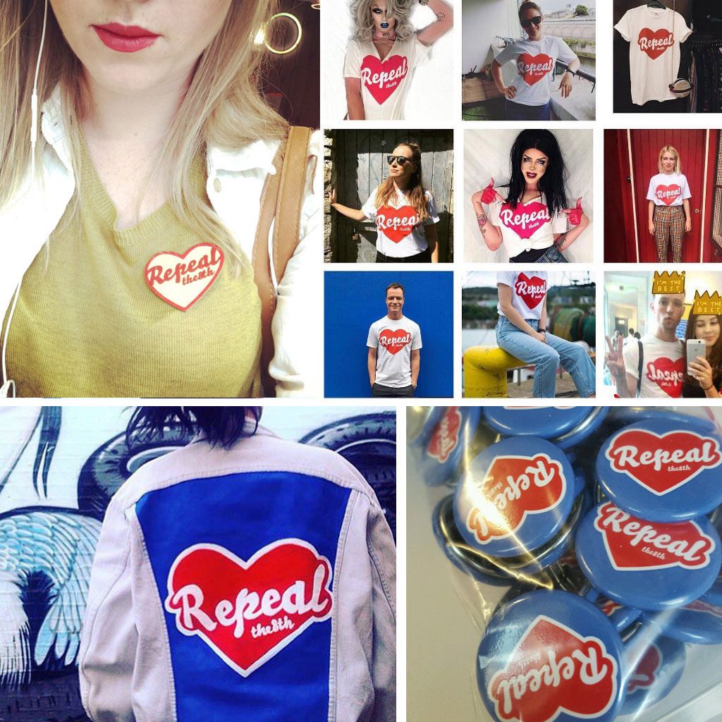
Some replicas of the removed mural:
Some other people were clever enough to bring the mural back to its original wall, but then through augmented reality. On the pretext of “You can’t paint over an issue”, a QR-code brings back the mural if you point your phone to the meanwhile completely blue wall. Even better, the mural can virtually appear everywhere, once somebody glued the QR-print to the wall. 8mural.com: Technology for the win.
The mural ban paved to way for mementos, nicknacks, t-shirts, bumper stickers, buttons, people changing their social media profiles, all showing the removed mural. Anything which helps to keep the campaign alive and raise awareness for the 8th Amendment suddenly popped up. We don’t have any political voice in Ireland, but we are more than happy that Bello is helping the campaign with its visual voice. That feels like a small contribution after all.
More images at our fonts-in-use section.
30 november 2015 — fonts in use
Maintaining style in rough times
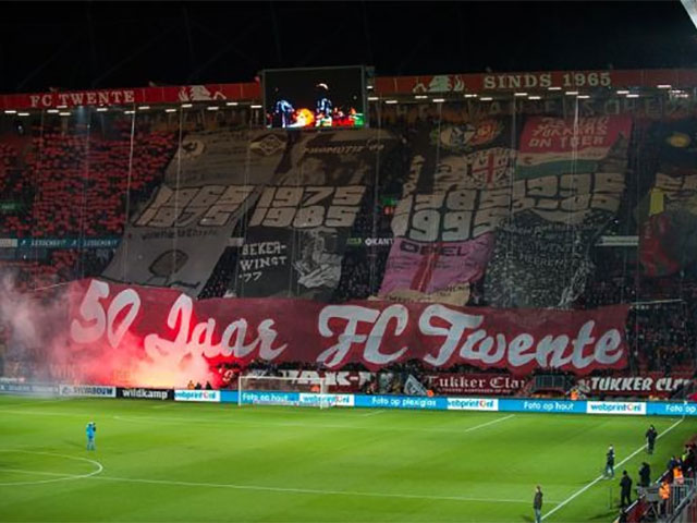
Sometimes our fonts are being used big and bigger. As type designers we create our work on computer screens, and therefore especially enjoy the large scale of some applications. This weekend Bello was used in a large banner at the Dutch football club FC Twente. It ain’t easy to be a fan of FC Twente at this moment. Although the football level radically collapsed this season at FC Twente, and the organisation is currently a disaster, the typographic taste of the fans still stands strong. (The fans of Twente are for example typographically known for their use of Roger Excoffon’s Banco typeface.) Culture in rough times. Our compliments!
We ♥ Twente!
06 december 2013 — fonts in use
Bello goes freestyle 3
Apparently something inside Bello Script makes people go ‘woooeh, yes, I will make that myself’. After episode 1 & 2, here is another Bello-goes-freestyle episode. This time a bikeshop in Toronto went DIY all the way.

Some more pictures at fonts in use.
31 october 2013 — fonts in use
Oh oh. Rivalry in the Finnish freezer.
Game is on in the Finnish supermarkets.
Pingviini vs Eldorado = Nestlé vs Tuko Logistics = Sauna vs Sauna.

Of course it’s cool to pick a typeface called Sauna for the freezing compartment…

Is this the “if you can’t beat them, join them” kind of font choice?
03 september 2012 — fonts in use
Fonts in the fictive world
Even more enjoyable than spotting fonts in a parallel word, is spotting fonts in a fictive world. Bello goes squooosh with Donald.

29 august 2012 — fonts in use
Mountjoy prison

It’s a joy to see such colourful poetry. This is a project by the Dublin based graffiti artist Maser, which he created together with the inmates of the horribly deprived and overcrowded Mountjoy prison in Dublin. Texts are set in Bello, and were painted by the inmates during a period of 2 weeks on the inner walls and at the prison yard. Considering the fact that they are on a 23-hour lock-up due to escalating conflicts between drug gangs, this was painted in their very rare spare time. There aren’t any toilets in a 4 man cell, and that small cell is occupied by 6 inmates. So 2 sleep on the floor. You urinate and shit into a bucket in the corner of the cell. Chillin’.

See more pictures of this project at fonts in use.
23 july 2012 — fonts in use
François Hollande 2012 Presidential Campaign
Vivement Mai avec François Hollande.

In May 2012, François Hollande was elected President of France. The identity of his campaign was build around the typeface Bello, a rather uncommon choice for a presidential campaign. After the electoral victory some loony French people nicknamed Bello the French Gotham, but hey… don’t believe all rumours.

See more pictures at fonts in use.
24 january 2012 — fonts in use
Fonts in the parallel world
Nice way to waste our time: spotting our fonts in the parallel world of Google’s Streetview. Where fonts live somewhere between eternal and ephemeral. Already gone in the real world, still alive in this period piece. Or sometimes the other way around.
07 november 2011 — fonts in use
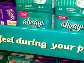
Always keep your underwear clean
Fairly regular an example of our fonts in real life situations ends up in our mailbox, which we really appreciate. Keep sending us those photos! Most likely such an example ends up at our fonts in use section. But with this one we had some internal controversy. ‘Come on guys, this is just too silly’. ‘Don’t think so, it’s a real-life example with an extra, subtle layer for connoisseurs’. ‘No, we would make a fool or ourselves by adding this as a fonts in use example. How low can we go?’ So we killed the discussion and decided not to add this nice use of Sauna as a fonts in use example.
