05 september 2019 — out now
Introducing Grammato
Until now, every text has either been written by hand, or typeset with a font. With Grammato, we’re introducing a third approach, combining the best of both worlds: beautiful, infinitely smooth written text, where text keeps its semantics. Grammato is built on standard technologies, so it just works everywhere. Wherever you’ve only been using fonts, you can now use Grammato: in apps, social media, videos, interfaces, devices, operating systems, everywhere!
We’re extremely happy and excited to announce the introduction of grammatography with Grammato ▶▶▶ www.grammato.com
26 june 2018 — out now
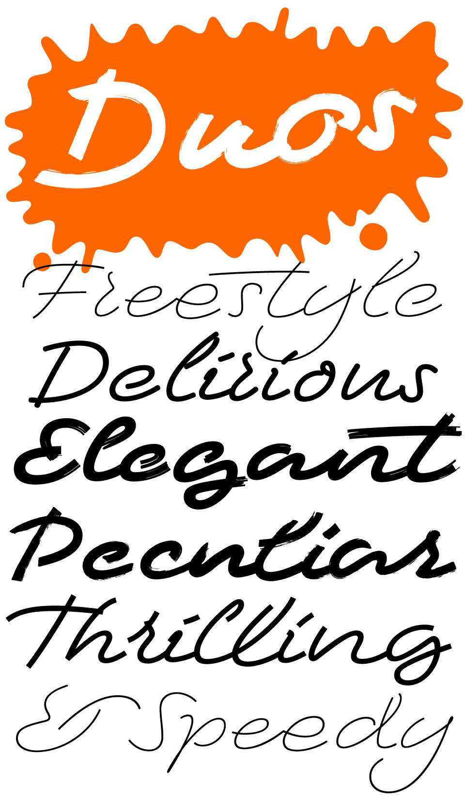
New fonts: Duos In-N-Out and Duos Write

Two new, very able, fonts!
The variable font format offers new typographic possibilities for type designers. Instead of creating separate static fonts, font families can be combined into a single font file for example. But this new font format has much more to offer. Type designers can also design typefaces specifically for this new format. New ideas for new technologies, instead of old ideas wrapped into those new technologies.
Our most recent font family Duos was already a technological tour de force, but is now expanded with 2 progressive variable versions.
(more…)
26 june 2018 — out now
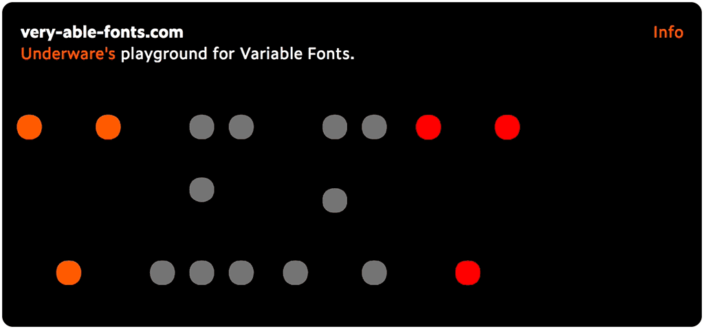
very-able-fonts.com
If you’re into type, you probably have heard the new buzzword recently: variable fonts. Everybody is talking about, some people are doing it. So are we.
But the more we get involved in making variable fonts, the more questions come to our minds. What is actually a variable font? We mean, really is? And what does it really mean? The most obvious application of the variable font technique is the weight-axis. Putting all fonts from Light to Black into 1 single variable font is something everybody can imagine, and maybe therefore also the thing everybody does. But isn’t that the same as using the marquee tag –which everybody did– in the early days of the internet? Don’t we realize by now that the internet is something else? Isn’t the Light-to-Black slider the same as the blinking marquee tag for typography in 2018?
So before we accept that this is what variable fonts are about, we should wonder what other possibilities this new font format offers. This is the moment to ask fundamental questions. Maybe this font format is actually something completely different? Maybe you can put all existing fonts into a single variable font? Maybe you don’t need all those separate glyphs, because one glyph can vary into any other glyph? Maybe you can have a legibility slider, or one from Braille to Latin? And maybe the question is not how to make variable fonts, but how to make fonts variable? And shouldn’t the interface be part of a typeface instead of depending on what an application offers or supports in its interface? Variable fonts are vari-able-fonts, so very able fonts. But what are they really capable of? Maybe the variable font format is a beginning of a new era in digital typography, where the letter is finally freed from its historical limitations? And what does it mean when information becomes dynamic at the level of the written word?
Enough questions to launch our own playground for variable fonts, which will be as much in development as the variable fonts themselves: very-able-fonts.com
22 january 2018 — out now
New font: Duos
We’re happy to introduce Duos, a script for illusionists.
This small family of handwritten display fonts contains enough variation & imperfections to create a natural and casual appearance for texts. The light weights can be deployed when class and elegance is required. The black weights are more mutually divergent: rough brush strokes will bring across a different mood than delicate rounded strokes for example. Duos brings you a new typographic palette.
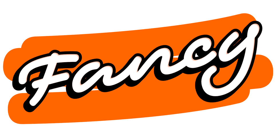
In Duos letters break apart, strokes are suddenly being cut, they crisscross, overlap, get loose. These strokes definitely enjoy their freedom. These oddities are intentional: handwriting ain’t perfect either. Nevertheless, the overall rhythm and carefully crafted connections keep this handwriting together. Every letter has many alternates, so every word can have dozens or hundreds of different appearances. Use the one you like the most, or just use the one which Duos thinks looks best. Fancy! As a final flourish, Duos let’s you play with ambiguous lettershapes, just like real handwriting.
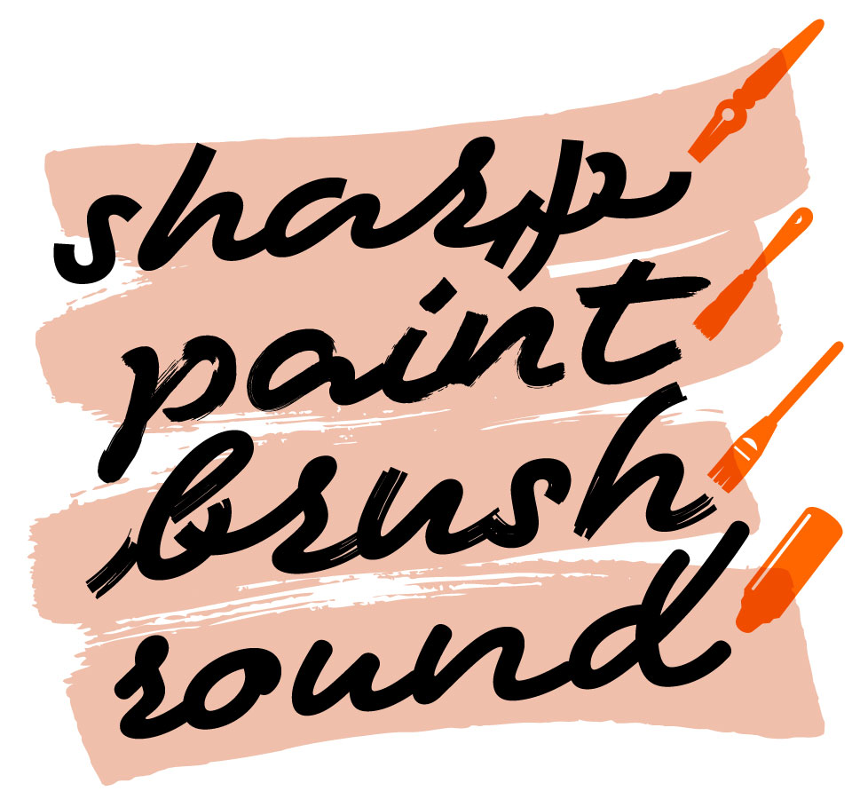
Duos is a small family of 10 eye-catching display fonts (4 styles, 3 weights) plus a bonus font which includes tools, icons, strokes and banners. The four different styles, caused by using different writing tools, offer distinct typographic voices. But whatever style of Duos you pick: apply this speedy monolinear handwriting font in large sizes, because it is made for catching the attention. Apply it short & big.
26 june 2017 — out now
New font: Zeitung Mono
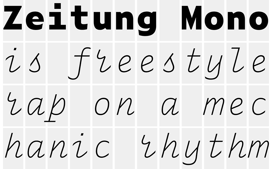
Zeitung Mono is the monospaced companion to the Zeitung family, a sans serif which works well in small sizes on screen. This monowidth font family increases the functionality of the Zeitung font family, resulting in happy programmers, smiling ASCII-kids, razor-sharp journalists and finally: worldpeace.
Zeitung Mono is everything a contemporary monospaced font needs to be. A good monospaced font has a fancy italic for unmistakable distinction & lots of weights which supply a broad typographic palette. So you may guess once what Zeitung Mono has. Right, exactly that. Say hello to Zeitung Mono.
Introduction offer: Let’s Mono Together
Order Zeitung Mono complete, and get a free license for a friend.
This introduction offer runs until 31 July 2017.
17 november 2016 — out now
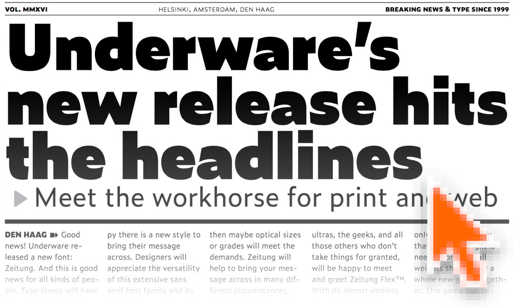
New font: Zeitung
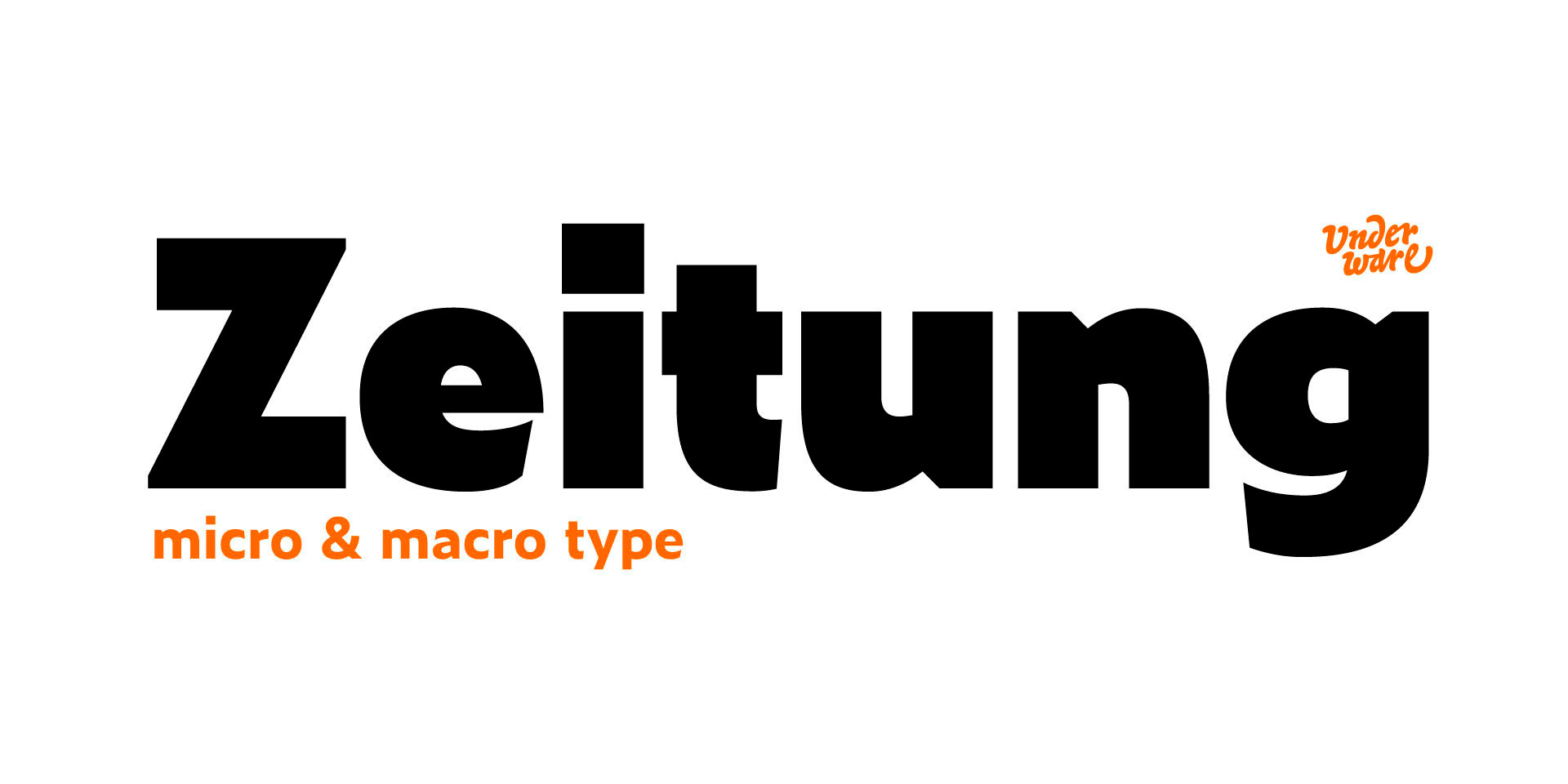
Good news! Today we released Zeitung, a new sans serif font family. And that’s good news for various people.
Type lovers will have their day made when they look at that lowercase e in the Black weight, will be happy there is a new style to bring their message across, and will enjoy playing around with the interactive newspaper on our homepage.
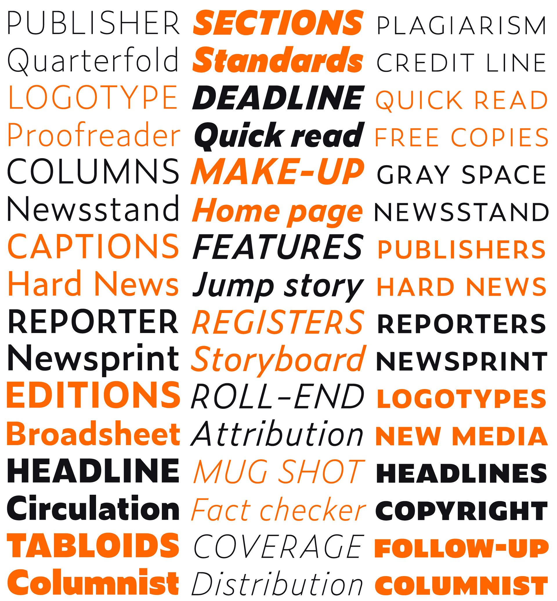
Designers will appreciate the versatility of this extensive sans serif font family, its thorough execution, and all it’s features. If 8 weights and 5 figure styles are not enough, then maybe optical sizes or grades will meet the demands. Besides of the standard Zeitung font family, Zeitung Micro is developed especially for smaller point sizes. Screen typography requires optical sizes at larger point sizes than print, so web and app developers won’t be left in the typographic cold. Grades can be very handy for selecting the optimal weight, especially on screens. The way letters are displayed on screen can vary a lot between different circumstances. Maybe the interface of your next app requires a different grade of the text than your latest website? Zeitung allows you to change the weight of your text without any reflow of your text. Zeitung will help to bring your message across in many different circumstances, from large text in print to small type on screens. Zeitung has many features.
Pioneers, the most demanding users, the ultras, the geeks, and all those others who don’t take things for granted, will be happy to meet and greet Zeitung Flex™. With its almost endless amount of weights, Zeitung Flex™ takes you anywhere between Thin and Black. Either in case only one, but exactly that specific weight is needed, or when all weights should play a whole new game together. This game can be played not just somewhere in the future, but already today, on everybody’s computer. Flex fonts are not just supported by the most recent browser, but also by all those older browsers. Zeitung Flex brings unlimited styles all over the web. In the future, and also already today. What’s even better is that Zeitung Flex™ also brings these possibilties now to desktop apps like Adobe InDesign and Adobe Illustrator. With the help of CC-Extensions you can easily apply and combine those styles. This can be handy for selecting just a single, but exactly the right grade of text for your next project. Or this extension allows you to apply some of those fancy effects using all styles from Thin to Black on a line, paragraph or complete document. Relax, you can Flex.
Please welcome Zeitung.
09 may 2016 — out now
New Font: Liza Lettering

Lately we were wondering about the fact that despite the concept of a typewriter dates back at least to 1714, not much changed in the meantime. Why is that? Why do we accept digital type to be as primitive as it is? Why don’t we just make a lettering ourselves, instead of pressing keys?
As soon as we do not accept things to be as they are, everything becomes possible. Just try it out yourself. Say hello to Liza Lettering™.
03 december 2015 — out now
Love is stronger than hate
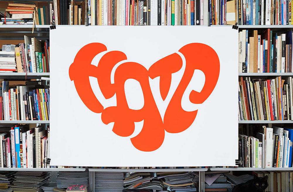
Is there something you only love, without hating it a little? Can you hate something completely, without any love? Can love exist without hate?
Exactly 100 years after Edgar Rubin created his famous Rubin’s vase – the godfather of all figure-ground illusions – this poster is published as a typographic tribute to the Danish professor of psychology. If cannot read anything, you still have a nice heart to look at. Silkscreen printed in a super bright red color, this übersized poster requires some empty wall space. Seriously, this poster is pretty big.
This poster is an example of a (typographic) figure-ground illusion. These kind of optical illusions have a long history, we didn’t invent the concept. Read more about these kind of optical illusions in Everything is black and white.
05 february 2015 — out now
New font: Tripper Pro

Please welcome Tripper. He is not that friend you want to marry and wake up next to every day. You don’t want to discuss your financials with him. No, Tripper is that friend you invite when you want a really good party, when you wanna have a good time, when you want to impress your neighbours or family. But hey, who doesn’t want to have a really good party every now and then?
Tripper, a set of rock-hard stencil fonts
Introduction offer
Buy Tripper and give a free license to your friend. Make somebody happy, for free. Double-dipper pleasure! (runs till 01 March 2015)
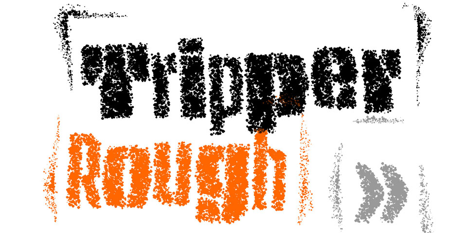
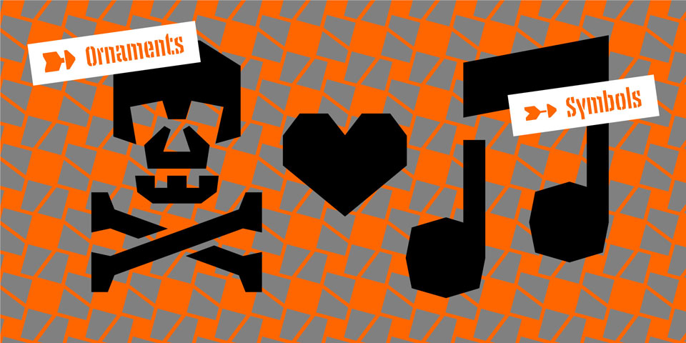
Tripper comes in several flavours. Next to the plain style, there is a rough version (with that random look), a reversed stencil style (with automatic borders), and the multi-coloured font (tricolor). If that ain’t enough, Tripper Ornaments offers enough to play around with for the rest of the year. Take the Tripper tour
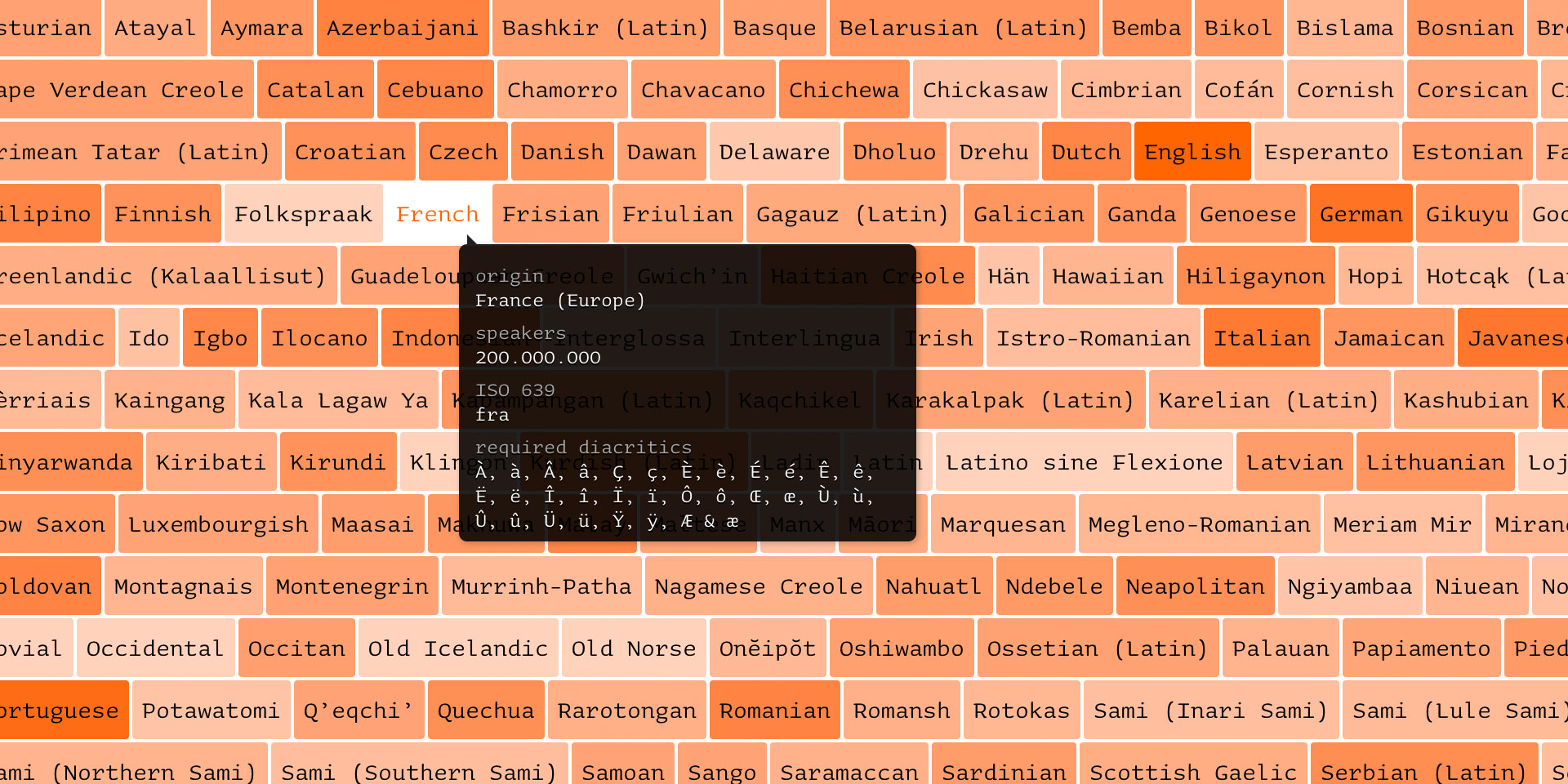
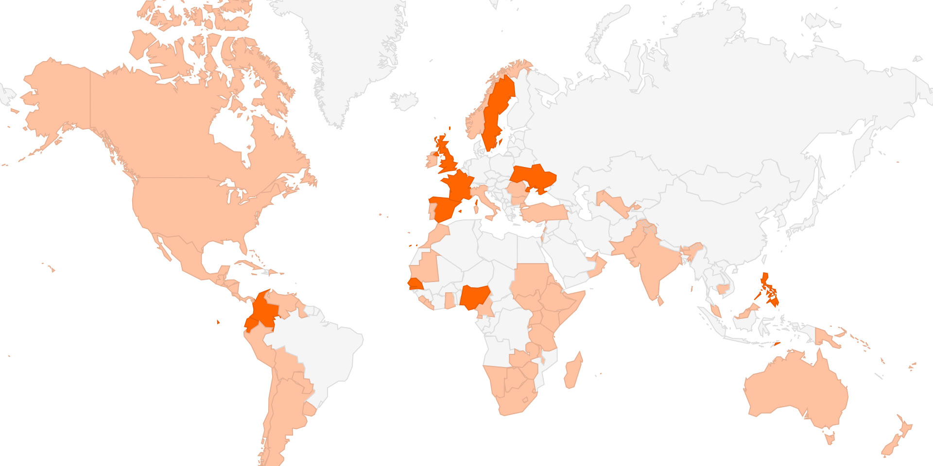
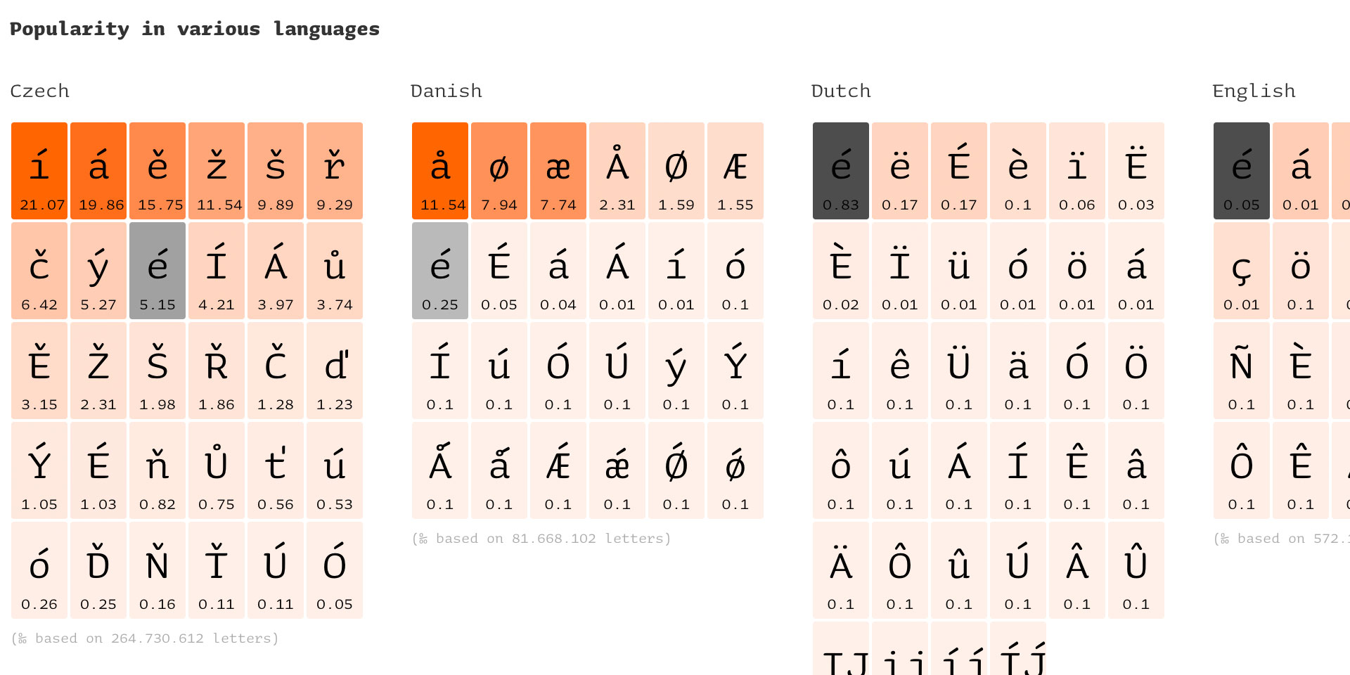
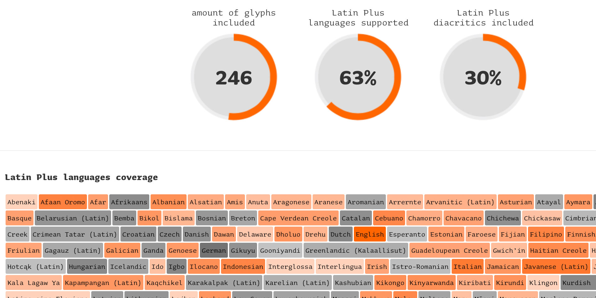
25 november 2014 — out now
Underware Latin Plus
![]()
Language support is one of the most important aspects of a font, together with the look and feel as well as the technical state & performance of course. You do not only want to know if a font supports a certain language, but also if it looks any good in that language. Those two can vary quite a lot.
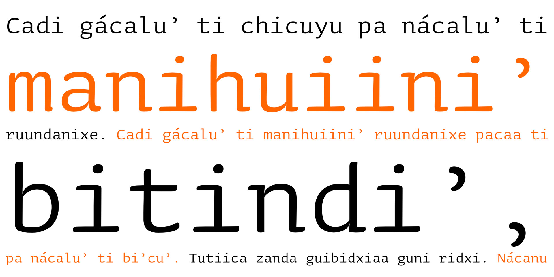
After years of researching and improving our own character set with its accompanying language support, we are happy to reveal Latin Plus today. Well documented, pairing diacritics to languages, translated sample texts and offering the possibility to explore which of the Latin Plus languages are supported by the fonts on your computer.
Welcome to Latin Plus.