


concept

three italics

weight contrasts

small caps

figures

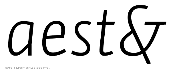
ampersands

characterism

font packages

font formats

webfonts

character set

language support

making of

PDF
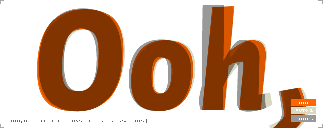
The complete Auto family comes with three different italic styles to choose from. Why?
Besides using one specific italic variant in combination with the roman fonts, the italics can also solve more complex typographic tasks when used together. Designating a quotation within a quotation is one example where two different italics can help you to avoid typographic trouble. Or try identifying a quote within spoken text in a novel, or identifying different speakers in plays and manuscripts. Synergize their forces - get these three italics rolling!
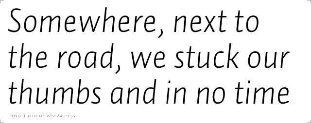
Auto 1 Italic: Trust at the speed of 240 km/h
Auto 1 italic is formal and straight forward - an italic which can be trusted at the speed of 240 km/h. Use it to converse with pin-striped passengers about market fluctuations in solemn annual reports. Discuss the austere simplicity of the Scandinavian highway scenery with turtle-necked intellectuals and serious academicians who want to feel safe - but go fast too. Hear the engine humming, waiting for you to open up the throttle.
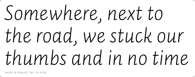
Auto 2 Italic: For long passages
Auto 2 italic is smooth... you hardly hear the engine if you drive with this italic. With serifs here and there, this italic contrasts more strongly with the roman weights than do the Auto 1 Italics. This italic will survive long passages which would ordinarily be difficult to read when set in italics. Assembled by hand with love, aged (almost) ten years next to oak barrels in a local garage.
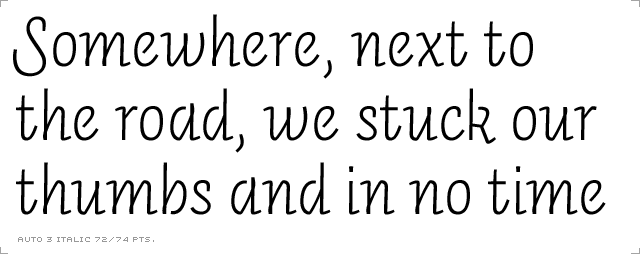
Auto 3 Italic: Demand the attention!
When you are in the mood for cruising, take this italic - and feel the heads turning. Auto 3 bears an upright italic and the contrast with the roman and other italics is created from edgy counterforms, an explicitly cursive construction, unexpected loop strokes and open endings. The capitals have swashes while the lowercase still remains straightforward. Use it for headlines or for emphasizing phrases within roman text.
What are the essential construction differences between Auto's three italic styles?
Take a look at the lowercase letter 'a'. The strongest but subtle variation is in its counterform: in Auto 1 it is rather horizontal, while the downstroke linking the bowl and the stem is much higher in Auto 2 and 3, making the counter form steeper. Further, Auto 3 features an 'a' with an open counter which lets it stand out from Auto 1 and 2.
This small counter-detail has a great influence on the whole text image: the lowercase 'a' is the most frequent letter in several languages, sometimes covering 20% of the whole text mass (according to some studies). Considering that this counterform also appears (sometimes flipped 180 degrees) in the lowercase b, d, g, p and q, it is a key repeated form which gives consistency to the font, and distinction from the others.
Although very powerful, the counterform in 'a' alone is unable to create strong typographic contrast. That's why Auto 1 italics feature many straight strokes and a 'g' with a two-storey construction, while Auto 2 italics introduce more curves, some serifs and capitals with economic swashes. Compared to the sloped italics of Auto 1 and 2, we decided to give an upright appearance to the Auto 3 italic. Currently, it stands out convincingly beside the roman fonts and its style is easy to apply to headlines, as it keeps its compact feel.