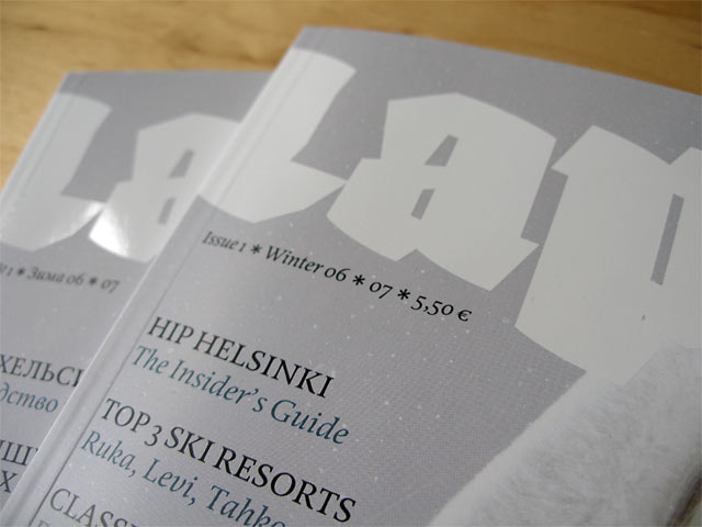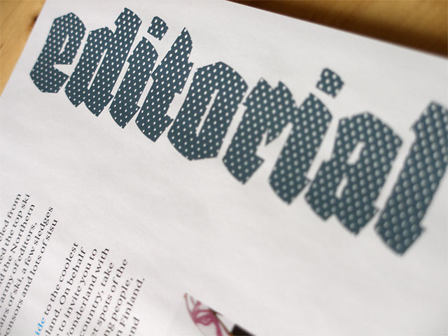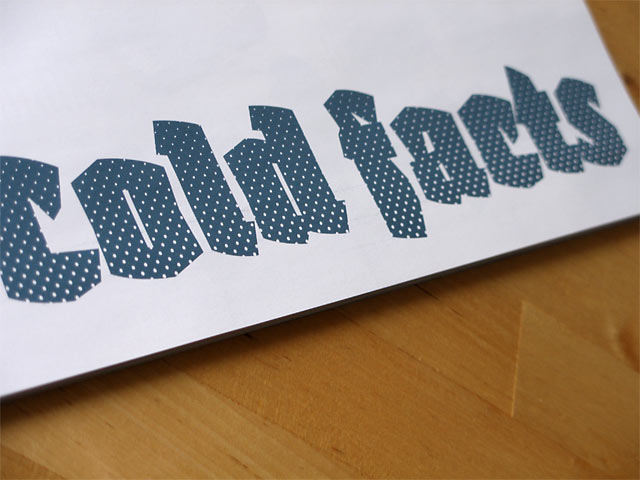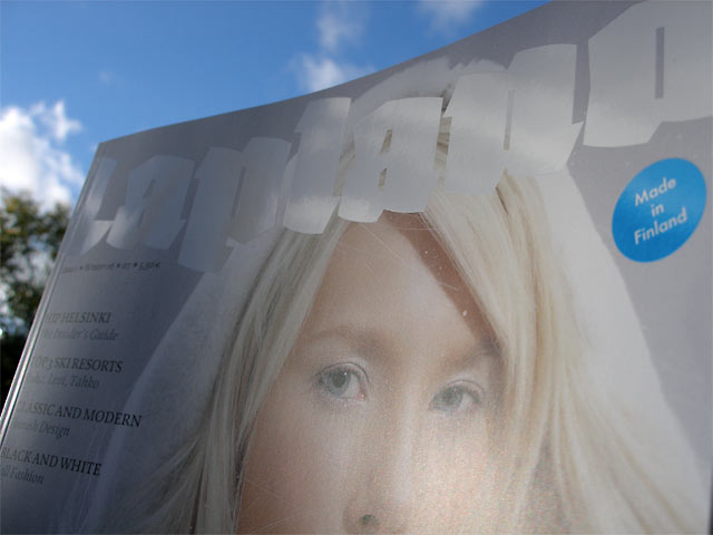
Saku Heinänen, one of the art directors of Lapland magazine, was charmed to hear a wide range of associations about Fakir typeface from the readers: 'very northern, very arctic', 'aggressive, urban tagging culture', 'national romanticism, Kalevala-spirit', 'gothic', 'pure', 'makes me thirsty for vodka', 'warm wood cut letters'. BOTH