15 july 2022 — out now
Plakato Moiré
New possibilities with COLRv1
Just as with Plakato One Two, which we published earlier this week, this version of a coloured Plakato font shows again new typographic possibilities. Plakato Moiré takes advantage of the option to include transparency within a font. Combined with variable paint tables, this allows for eye shocking letters.
Moiré effect
Moiré effects have caused printers and photographers many headaches. The effect of this interference pattern is caused by identical patterns which are slightly displaced. For example if one patterns is a tiny bit rotated. But instead of letting this cause us headaches, designers can also take this moiré effect as a starting point for their design. For example the Japanese artist Takahiro Kurashima published a couple of splendid books in recent years which take advantage of the moiré effect.
Plakato Moiré
We were curious to see what would happen if the moiré patterns would appear inside a letter. Plakato Moire introduces this method in the digital realm of variable OpenType fonts. By carefully limiting the variability of the font to the essential parameters of moiré — color, grid size, and layer rotation — Plakato Moire wants to provide maximum possibilities with a minimal set of parameters. All dynamic, all live within your browser. You can experience it yourself by influencing the parameters as you want.
▶ Please meet Plakato Moiré.
In case you don’t have a clue what this is about, or in case you don’t have a fancy modern browser for surfing the internet, here are some more demos which give a hint of the possibilities.
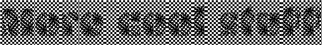
Demo 2 shows what happens if x≠y. Checkerboard becomes lines:
Demo 3 shows the effect of introducing colour:
Demo 4 shows simple black and white shape, rotated and scaled:
Demo 5 shows what happens if x≠y. Checkerboard becomes lines again: