12.2021
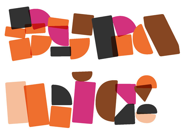
Dynamification of typography
Dynamification of typography
Dynamification of typography (12.2021)
05.2021
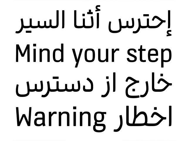
KONE custom fonts
KONE custom fonts
KONE custom fonts (05.2021)
10.2020
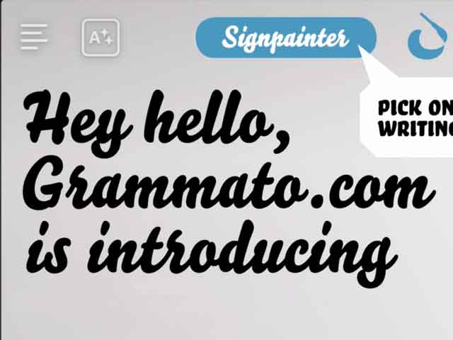
Grammatography
Grammatography
Grammatography (10.2020)
04.2018
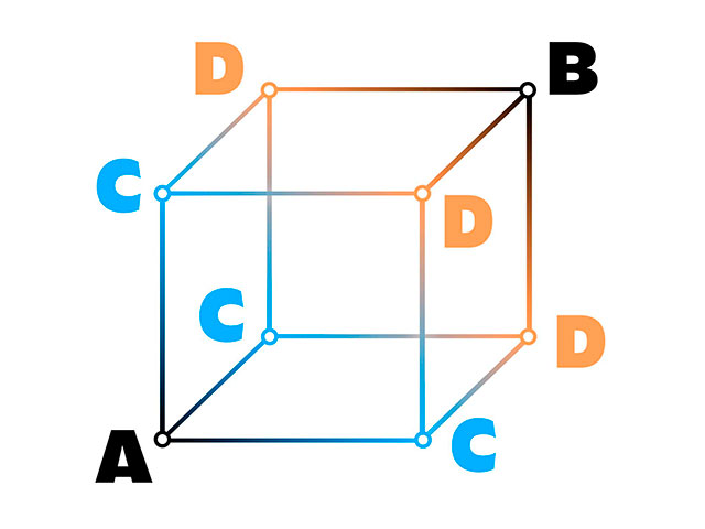
Higher Order Interpolation
Higher Order Interpolation
Higher Order Interpolation (04.2018)
06.2017
Subpixel ASCII+ Art
Subpixel ASCII+ Art
Subpixel ASCII+ Art (06.2017)
12.2015
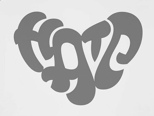
Everything is black and white
Everything is black and white
Everything is black and white (12.2015)
03.2015
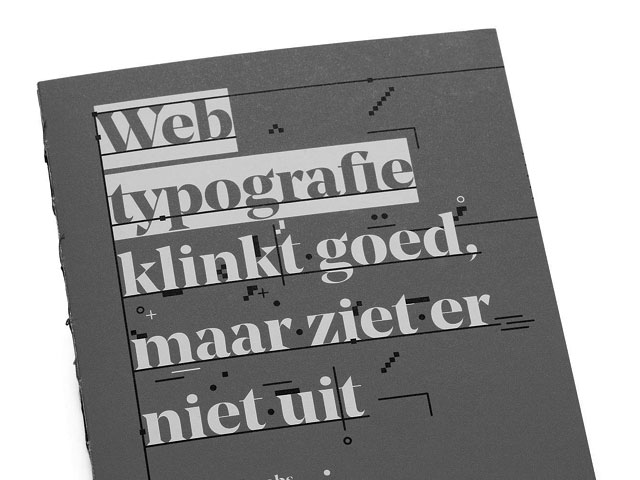
Webtypografie klinkt goed, maar ziet er niet uit
Webtypografie klinkt goed, maar ziet er niet uit
Webtypografie klinkt goed, maar ziet er niet uit (03.2015)
11.2014
Notes on Latin Plus
Notes on Latin Plus
Notes on Latin Plus (11.2014)
03.2010
Randomness versus Cleverness
Randomness versus Cleverness
Randomness versus Cleverness (03.2010)
New logotype for MyFonts (01.2009)

12.2007
New logotype for Daimler
New logotype for Daimler
New logotype for Daimler (12.2007)
05.2007
Customized fonts for European banks
Customized fonts for European banks
Customized fonts for European banks (05.2007)
Case study: New logotype for MyFonts
January 2009
Designing a logotype for the biggest online type-shop, is like playing punk-rock with a panpipe, telling your mother she is wrong, or like believing in world peace. Strange, always wrong and likely impossible. It's like searching the vegetable of all vegetables. Or like writing the book of all books. Time to write with the broom instead of the brush.
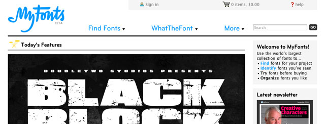
It may not come as a surprise that the old MyFonts logo — designed in 1999 — was originally only intended to be a temporary placeholder. Nine years later, MyFonts has worked closely with Underware to finally create a new official logo to accompany the new MyFonts website.
Developing an official logotype for an organization that deals with fonts is an extremely daunting assignment… no matter what the solution is, it is bound to be scrutinized as some kind of ultimate statement about superior fonts and typography.
To approach the task from the most obvious angle, one would probably try to find a solution which could represent a wide range of styles in one logo. For example: using multiple fonts, or varying the positioning and weight within the logo to convey a sense of typographic diversity.
When reinventing the MyFonts logo, we experimented with similar approaches, but ultimately decided to express something more than the idea that MyFonts is just a place with a bunch of fonts. In our minds, MyFonts — and particularly the new incarnation of MyFonts — represents not only the largest collection of fonts in existence, but also a place where the user is the center of attention, and the creative spirit thrives.
Underware’s long time fascination with optical illusions and ambigrams fit perfectly with the goal of creating a more conceptual logo — one decisive wordmark that could also express supplementary ideas about creativity, individuality, and DIY productivity.
The new MyFonts logotype is made with a broom instead of a brush. It has a secret bonus for those who get it, but still functions as a contemporary hand-painted logo for those who don’t. As any detailed explanation would ruin the magic, we’ll leave it at that.
— MyFonts & Underware
