
Dynamification of typography (12.2021)
05.2021
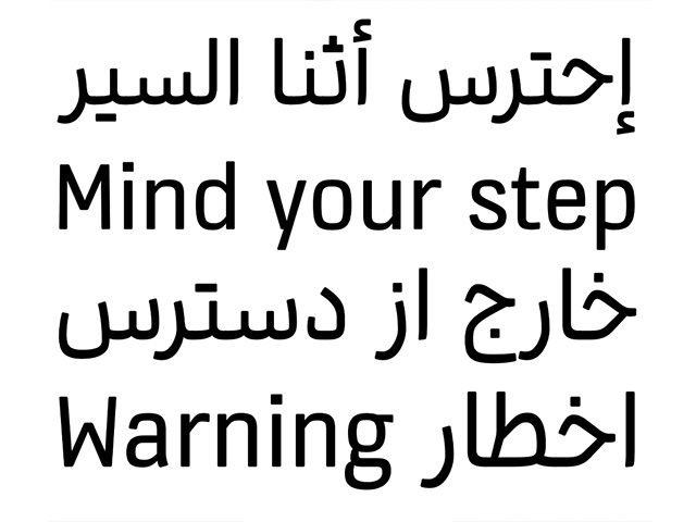
KONE custom fonts
KONE custom fonts
KONE custom fonts (05.2021)
10.2020
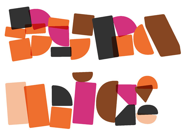
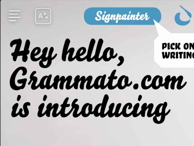
Grammatography
Grammatography
Grammatography (10.2020)
04.2018
Higher Order Interpolation
Higher Order Interpolation
Higher Order Interpolation (04.2018)
06.2017
Subpixel ASCII+ Art
Subpixel ASCII+ Art
Subpixel ASCII+ Art (06.2017)
12.2015
Everything is black and white
Everything is black and white
Everything is black and white (12.2015)
03.2015
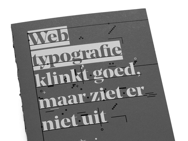
Webtypografie klinkt goed, maar ziet er niet uit
Webtypografie klinkt goed, maar ziet er niet uit
Webtypografie klinkt goed, maar ziet er niet uit (03.2015)
11.2014
Notes on Latin Plus
Notes on Latin Plus
Notes on Latin Plus (11.2014)
03.2010
Randomness versus Cleverness
Randomness versus Cleverness
Randomness versus Cleverness (03.2010)
01.2009
New logotype for MyFonts
New logotype for MyFonts
New logotype for MyFonts (01.2009)
12.2007
New logotype for Daimler
New logotype for Daimler
New logotype for Daimler (12.2007)
05.2007
Customized fonts for European banks
Customized fonts for European banks
Customized fonts for European banks (05.2007)
Case study: The dynamification of typography
03 December 2021
The introduction of our typeface Plakato is a suitable moment to reflect on changes in the practice of a type designer. Accompanied with videos of dynamic versions of Plakato, this text touches the question if the dynamics of a design should be defined by the user or by its creator.
When graphic designers create a corporate identity today, the dynamics – the way how objects move, eg. how the elements within a logo change – are taken into account from the very first beginning. (graphic designers being the collective noun for brand designers, advertising agencies, multimedia designers, etc.) The online presence of an organisation is at least as important and widespread as printed materials like brochures, letterheads and poster campaigns. A social media add might have more visibility than a highway billboard. A big difference between printed and digital media, is that the latter allows everything to be dynamic. Logically this different characteristic of the medium has consequences for graphic designers. Designing a static billboard is something different from designing poster which can have interactivity or be variable. Instead of designing a logo and a letterhead, and only wonder afterwards how a website can be made with this, it’s meanwhile common practice to think how a responsive website should feel and function at the same moment a new logo of a corporate identity is being created. The possibilities of dynamics have changed an entire field. Proposing that a graphic designer should only develop a new logo, and then hand that over to a web developer to turn it into a website, sounds completely ridiculous. The interaction is as much part of a design as the shape and colour of a logo. Luckily we consider this now to be a ridiculous action, but only two decades ago this was an accepted design practice, likely born out of designer’s unfamiliarity with technical tools. The graphic design process has radically changed this century, and there is no reason to think that this change doesn’t continue.
Plakato Play, variable font that plays like a radar in the round parts.
The dynamification isn’t limited to graphic design. Actually, with the introduction of the internet, information itself became dynamic. The consequences of this change are meanwhile clearly visible. The static world we used to know, with only books in a library and printed flyers to announce the latest gig, belongs to history for good. It belongs to a previous millennium. So the introduction of the internet has made information dynamic, and text unstable. But not only text is unstable, today the most elementary part of the text, a letter, has also become dynamic. We communicate by means of dynamic texts, which are represented by dynamic letters, thus changing our society. The speed of communication, the method of interaction, mouthpieces and platforms are all undergoing the transition from static to dynamic, and all shape the information society. (The dynamification of letters has larger consequences than this. Read for example ‘The end of self-evidence’) The information society is principally a dynamic information society, with not only technological, but also economical consequences. And, returning to the topic, consequently also resulting in a different graphic design process.
Plakato Build, a variable font that allows you to build with separate elements.
Type designers, suppliers of graphic designers’ accessories, have been creating static digital fonts for many decades now. In the change of the graphic design process as mentioned above, the dynamification has been mainly the responsibility of the graphic designer, not of its supplier. Type designers create static fonts, and leave it up to its users how those can be turned into motion. But the variable font format, introduced in 2016, allows type designers to specify the dynamics of letters within the digital font file. In the same way as the design process has changed for graphic designers in the past decades, it might develop for type designers in the future. Why wouldn’t the dynamics of a letter be as essential as its visual, static shape? Why would a type designer leave an intrinsic value (motion) of its design (a letter) up to somebody else? Of course type designers can ignore the fact that dynamics can be designed and included in a font, and just leave it up to the users of a font to design its motion, but it can be questioned if this is the right decision.
Plakato Push, a variable font that offers interaction on rollover for example. Push it real good.
A positive and important aspect is that the dynamics are an added value to the font file, and don’t decrease the functionality of a font compared to a ‘traditional’, static font. These dynamic fonts behave like any other static font: they can have the same extensive language support, all OpenType-dingdong, all different styles, etc. But on top of this they have the possibility to move, animate, rotate, morph, or whatever motion fits to a certain design. Because this motion can be included in the font file, this animated text is still text and not a movie. That is an important difference. For example: a WordPress blog title can be automatically set in this typeface, either in a static or a dynamic appearance, and can still be automatically translated by a computer, or be found in search engines. Text is still text, also when the typeface includes dynamics.
Plakato Move, a variable font where two outlines move to inline and beyond.
The introduction of the variable font format permitted a future
with lots of new possibilities for text ahead. Now, five years after the introduction of the variable font format, something as “a conventional variable font” already emerged. A font family with a weight, width and optical size axis, has become the perception what a variable font should be. Basically a new technology is being used to realize existing, historical ideas. But doesn’t the introduction of a new technique also require new ideas? The entire possibilities and consequences of the dynamification of text can currently hardly be overseen, but a dynamic letter shape which can animate in a certain way is certainly one of them. A specific motion which is not a filter applied to existing letterforms, but a motion which is designed simultaneously with the outlines of the static shape.
Plakato Draw, a variable font that draws all lines individually in perfect order.
After the introduction of the WOFF font format in 2010, the usage of webfonts took off. Fonts could be used directly in a browser, a big change to previous typographic possibilities. It still took a few years until it was standard that fonts would be used in a browser, so it also took some time that fonts could be tested directly in the browser on a foundry website. But since then it’s standard that a font foundry let their visitors test the fonts directly in the browser. The option to try a font is widely used. Sometimes directly in a type specimen, sometimes with a ‘try’ button, but those are merely UX matters.
Now that fonts have become dynamic, one could wonder why not every new font family should have not only have a ‘try’ button, but also a ‘play’ button. The ‘try’ option leads to the static fonts, also known as typography. The ‘play’ button leads to the dynamic fonts, where users can play, interact, and experience the possibilities of the dynamic designs. UX-wise there are more possibilities than a separation between a ‘try’ and ‘play’ button, but I guess you get the point. The question is: why doesn’t every new font have a play button?
Plakato Shine, a variable font that shines like neon.
Of course it requires extra time for a type designer to also design and produce the dynamics of a typeface. Time which might not always be available, or maybe financial resources are not sufficient. Or for example while making a custom font for a client a static font is adequate in that specific case, not every situation requires dynamic letters. But technical limitations to design the dynamics of a typeface, and include them in the font file, have disappeared.
Plakato Tear, a variable font that morphs from straight lines to teared paper.
As a sidenote to those who wonder if those dynamics are actually ‘invisible’ to an end-user, and question that they are only accessible to software developers: digital fonts are never stand-alone files but always depend on their digital realm. A dynamic font has to be directed by its environment, just as a static font is directed by the software in which it operates. A static, digital font file is also ‘invisible’ for an end-user, but only gives a different impression because of its widespread support of the font format and accompanying conventions. But if a digital font requires collaboration with its software environment anyway, why not striving for more synergy? As self-evident as a static font currently changes to a bold weight while pressing the “B”-button, it is logical that the dynamics which are included in the font file need to be directed and controlled by the software in which it operates. The question is for example how large the distinction between the font software and its software environment should be, or in how far they should merge, as they need to interact with each other anyway. It’s only a matter of time until new conventions arise. Maybe in the future a play-button is as common as a bold-button?
Plakato Run, a variable font that allows you to control C64-subpixels.
Currently type designers usually base the design of their font family on interpolation, mostly ending up in a weight and width axis. This interpolation is actually often the starting point in the beginning of the design process. This practice, which can be considered conventional meanwhile, wasn’t standard some decades ago. Although it was technically possible to base an entire font family on interpolation in let’s say 1990, this procedure wasn’t as self-evident back then as it is today. The same goes for designing dynamic letters. Although technically it’s possible today to make dynamic versions of static designs (and hey, this is again based on interpolation), history tells that it probably requires some time for the dynamics to become the point of departure while designing a typeface.
This article is illustrated with videos of Plakato Play, a new font family by Underware. This small set of display fonts was designed with dynamic letter shapes in mind from the beginning. For more information about Plakato (static) and Plakato Play (dynamic), just contact us.