Custom typography reaching new heights
When KONE, one of the global leaders in the elevator and escalator industry, planned to streamline different models of their elevators, they realized that consistent typography was an important aspect to achieve this.
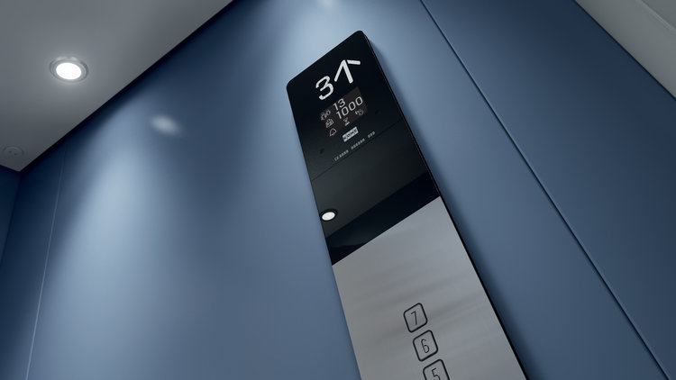
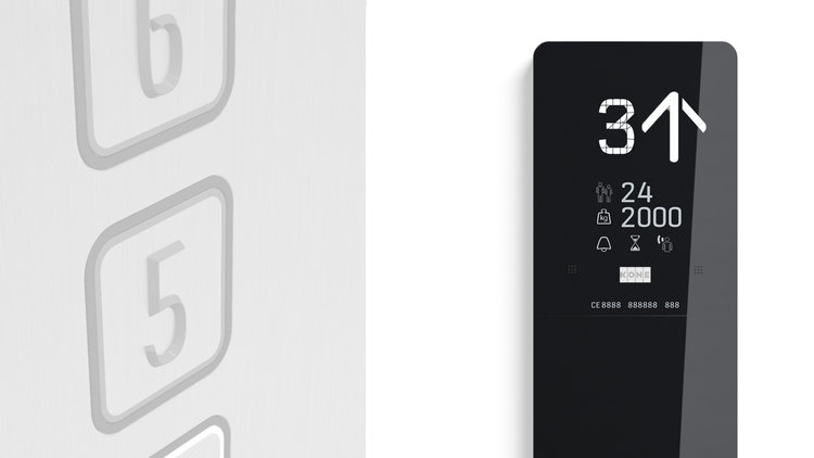
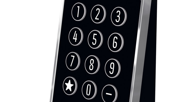
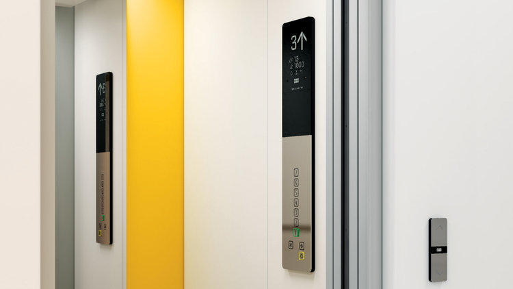
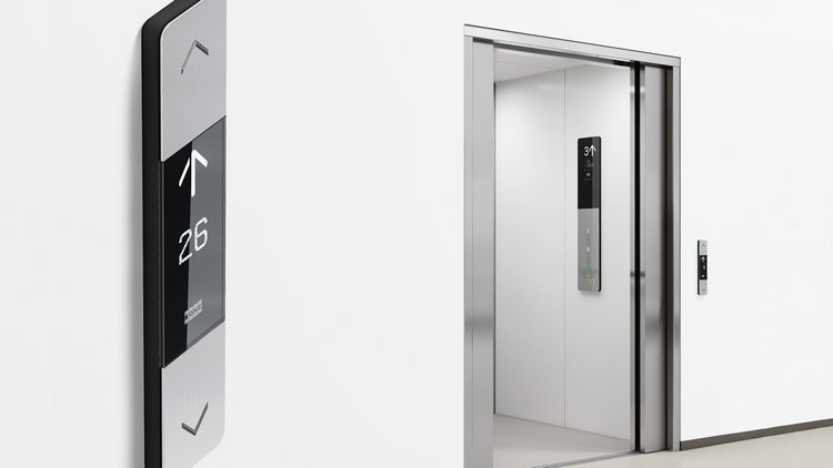
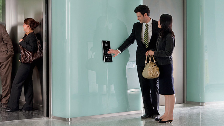
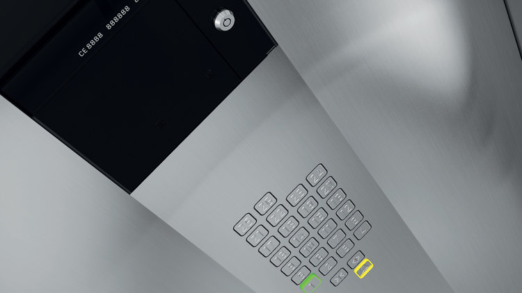
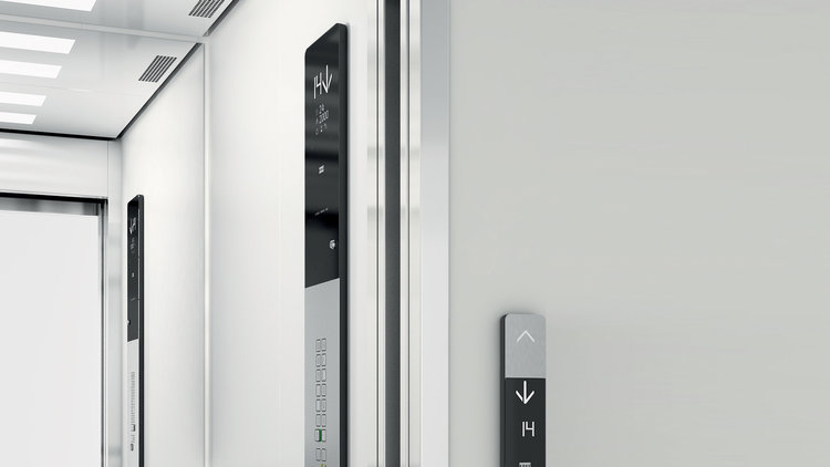
For this makeover we created a couple of custom typefaces, each focusing on its own technique and application. Fine multi-segment numbers for LCD display, condensed 3D stencil type for buttons, an accompanying sans serif typeface for longer information. Built not only to complete the panel’s minimalist and sleek design, but also to pay homage to accessibility.
When the first two new products (KONE KSS 280 and KSS 800 signalization units) were released in June 2012, they both received a Red Dot design award. The only way is up!
Read more how these custom fonts evolved from elevator signalization into a universal typographic voice in this case study.


Designed for scandinavia’s largest department store


Custom typography reaching new heights.


A humanized script typeface.


An exclusive typefaces for Scandic Hotels.


Fonts for Suunto Cobra 2 & Vyper 2 dive computers and Suunto Elementum.


The cyrillic brother of Bello Pro.


A custom display typeface for the letterheads of the Dutch designer/poet Ed Smet.


A type that echoes the corporate illustrations of the company, which are made by Petteri Tikkanen.