


concept

character set

language support

font packages

font formats

webfonts

PDF
Speedy, informal, personal
The three main features of Duos can easily be recognised in a glimpse: lots of personality; very informal; fluent & speedy. Due to its outspoken character, Duos is a perfect choice in case you have to catch all attention. This font has a very strong, own voice. What kind of voice? Laid back, easy going but also bombastic, theatrical. This is caused by the high speed and confidence in which Duos is written, still maintaining fluent connections to create smooth lines across the text. Smooth, but not always unambiguous.
Writing is designing
In a sense, all the typefaces we have designed in the past 20 years can be traced back to (hand)writing. Obviously some typefaces are much more strongly linked to handwriting than others. Many people will link script typefaces like Bello and Liza directly back to handwriting, and Dolly’s italic as well. Easy. And although it can be harder to see the link to handwriting in typefaces like the sans serif Zeitung or the sturdy stencil typeface Tripper, the underlying principles are identical in all fonts. Writing is the most simple form of design, but not necessarily the most easiest. Once you’re half way your first line of text, many design decisions have been made. Often unconsciously, but the rhythm, the darkness, the spacing, the curvature, all has been defined after just a couple of words. Every major decision any typographic design requires has already been included in those first moments of writing. Therefore it’s safe to state that writing is designing.
One of the biggest factors that influence all these decisions is the speed of writing. A low speed allows for details, uniformity & control, while a high speed automatically leeds to irregularity, inconsistency & disorder. The difference between writing and painting is sometimes obvious, sometimes they partly overlap, sometimes they are one and the same thing. Let’s consider painting to be writing for this moment. The comparison might be a little blunt, but on one side of the speed spectrum are classic Roman inscriptions, writing on the lowest speed. While the other extreme of the speed spectrum is an informal, trivial shopping list, made with the highest possible writing speed possible. Typefaces like Bello and Liza have been made with a low writing speeds, although not as slow as Roman inscriptions. Still, the slow writing allows for a high degree of control in many details in these script typefaces.
The challenge with Duos was to create a script typeface with a much higher speed, almost the speed of such a shopping list, and meanwhile try to maintain the desired style (curvature, rhythm, etc) throughout any possible text set in this typeface. Maybe it requires a higher skill level to retain a certain style with such a high speed? Not sure about that. But with Duos we made a script typeface which is freestyle, but not out of control. Wild, but not chaotic. Peculiar, but not bizarre. Stylish, but not statured.
The skeleton as design element
Depending on the writing tool, a skeleton of the strokes might be easily visible in handwritten text. The result of an everyday biro is a monolinear text, basically nothing more than just a naked skeleton. For a type designer such a skeleton can become an interesting element of the design process. The skeleton is always present anyway, so why not using this in the process? The basic framework in Duos is obvious, its skeleton is very visible throughout every style.
As a skeleton is nothing more than a line, and a line is in the end just a simple collection of coordinates, it’s tempting to quickly create an endless amount of variations. Scripting allows for various easy manipulations of the coordinates/skeleton; for example in width, in curvature, in thickness, terminal treatment, etcetera. This can be an advantage, because different versions offer different typographic voices. For example: round endings give a much warmer, softer feel, especially in the black weights. But an overload of styles doesn’t give any extra value to the end user. What should a designer do with 300 styles of a monolinear script typeface? Offering too many styles in a font family is only shifting the design decision from the type designer to the end user. Postponing the design decision, one can wonder if that’s wise. In this case we think the end user is much better off with just a tiny selection of outspoken styles. Narrowing down our playing field by creating a small set of fonts, a tiny family of just 10 styles, was the best solution to keep the end user’s life simple.
The skeleton in Duos has been carefully and differently adapted for each style. Nothing is the result of just a primitive script. For example, Duos Paint Black is furnished with extremely natural painted strokes while maintaining exactly the same width in every letter with its counter pair styles, like Duos Sharp Black.
Or take a look at the round terminals in Duos Round Black: they're not perfectly geometrical like a circle, but have tension in their curves. This treatment results to a slightly flat shaped curve, with more natural and warmer letterforms.
Strokes need contrast to look monolinear
Expanding the skeleton with an offset would lead to an undesired optical result. If the stroke has mathematically the same thickness everywhere, the human eye will perceive some parts thicker than others. Lines need contrast to look monolinear. Therefore the strokes in Duos contain a certain contrast, some parts are (up to 23%) thicker than others to achieve an optically equal monolinear end result.
Coding is designing
As much as sketching and drawing, is coding a part of the design process. Although the brush beginnings and endings of Duos Brush fonts look like they are drawn by hand or painted with a brush, they are the result of computerised calculations. With complete control over the amount, length and thickness of the jags, the amount of randomness and the curvature, the designer is the programmer, and the programmer is the designer. Programming is not a separated task from designing, it’s all part of the same process.
Controlled irregularity
In Duos letters break apart, strokes are suddenly being cut, they crisscross, overlap, get loose. These strokes definitely enjoy their freedom. These oddities are intentional: handwriting ain’t perfect either. Nevertheless, the overall rhythm and carefully crafted connections keep this handwriting together. And no need to worry: with a generous amount of alternate glyphs, you can always find a more legible, a more freestyle, or more timid version, whatever you need. Out of the many possible word shapes, you can manually select the best glyph in case you’re aiming for a different outcome.
Duos looks like freestyle, lively, rather wild, almost out of control handwriting. But a closer look shows that it never fails to take a bend, Duos always retains its style. Under the bonnet a lot of different glyphs are present, enough variations to display each letter different every time. But also a large repertoire of ligatures to guarantee fluent connections. All directed by an intelligent engine to achieve a natural result, to make Duos physically aware of its strokes. The icing on the cake of the natural look are tiny details, like the bar of the lowercase t. Depending on its context, the bar might extend to the left or right side, or both, or not at all. The stroke can extend just a little, or really a lot in case the situation allows. Two t’s next to each other get joined by a single horizontal stroke, even sometimes when there is another letter in between. It’s obvious that exploring all these possibilities is a time consuming task, and explains why the development of this font family was finished 7 years after the initial ideas were born.
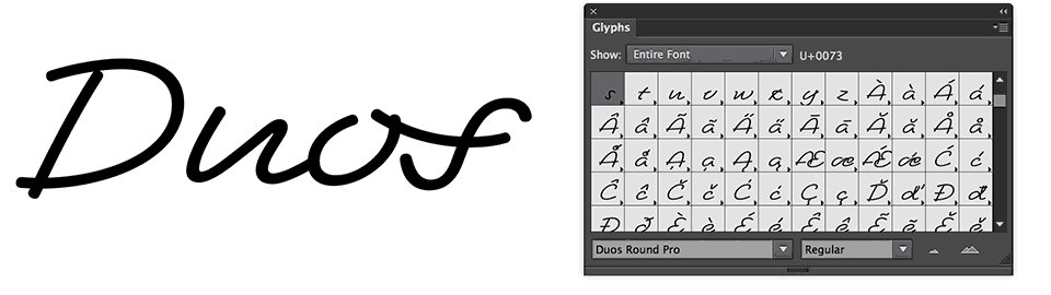
Every letter has many alternates, so every word can have dozens, or even hundreds of different appearances. In case you want you can manually select alternate characters through a Glyphs palette. Use the one you like the most, or don’t change anything and just use the one which Duos thinks looks best.
Note: Don’t worry about all this, just remember to keep Ligatures and Contextual Alternates activated and Duos will automatically take care of the rest. These two OpenType features should be activated by default in an application, so you’re safe if you apply Duos out of the box.
Bonus: Polysemic letters
Communication is never univocal. The meaning of a spoken text depends on its pronunciation, not just on the words themselves. In the same way the meaning of visual text is influenced by its appearance. The capital H of a simple, sans serif typeface will not likely be mistaken for something else. It’s unequivocal. But a handwritten note with its ambiguous shapes can often be read in various ways, resulting in miscommunication. Playing with such ambiguous shapes requires a font that has lots of perceptional freedom. Therefore script fonts, especially those which have a high speed, provide a good platform for polysemic letters. The high speed guarantees lots of letterform variation. A polysemic letter is a letter which can represent various different letters, where its meaning depends on the context the letter appears in.
For example: one of the letters shown in the image above can be an “a” in a word "massage", but also an “e” in a word "message". It is up to the context and reader's perception to pick a word, or another.
The system of polysemic letters becomes more complex if a certain glyph could represent a single letter as well as not one, but two other letters. For example if a glyph could be a “d” but also “el”. And some other polysemic letters in Duos represent a ligature, for example “hu”, but also the ligature “lm”. A combination of two letters which could also be two other letters. This brings another layer of depth in the polysemantic universe. Once all these different kinds of polysemic letters are combined, the possibilities are immense, but above all: very hard to predict.
These polysemic letters open up another universe in visual communication, which doesn’t necessarily have to be black and white. Spoken words owe their meaning not to the words themselves, so why should written language not have the same possibility? With Duos you can set words which can be read differently by different people. Say one word, and many words are perceived. Or just one. But which one? It always takes two people to communicate, the sender and the receiver, but in this case both are equally important as both of them define the meaning of the message. Duos turns visual language into magic, which makes it the perfect script for illusionists.
Note: In case you just got worried, please relax! Polysemic letters don’t pop in by default. When you set a text in Duos, all looks normal, legible and as expected. Polysemic letters need manual insertion through a glyph palette.
Short & Big
The end result of all this is a small family of 10 outspoken script fonts. Just three weights (Light, Regular and Black) and four styles (Sharp, Round, Brush and Paint). The deal is: Duos loves XXL. Think of posters, logotypes, shop windows, headlines, magazine mastheads. Duos will deliver, as long as you apply it Short & Big!
Get a taste of Duos:
▶ try Duos
▶ watch the gallery
▶ overview of all styles
▶ download Duos PDF