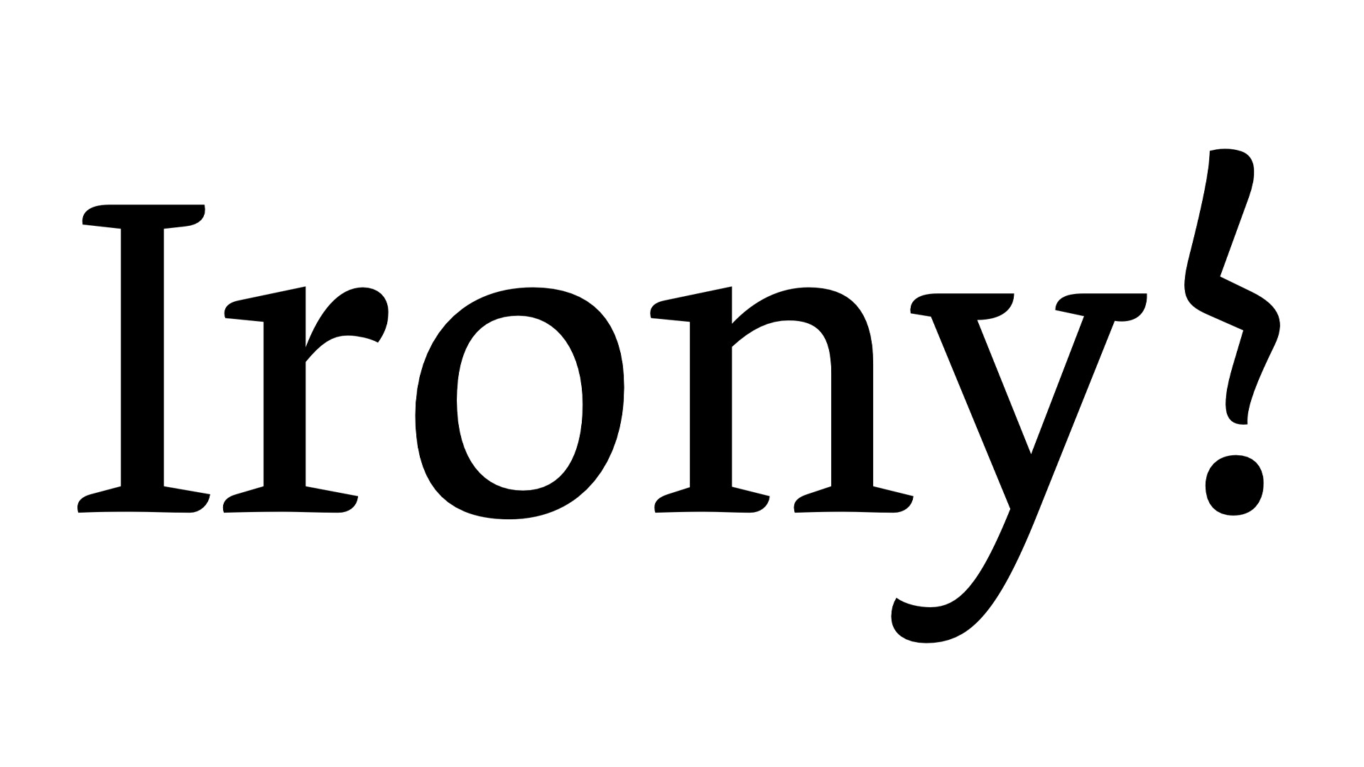
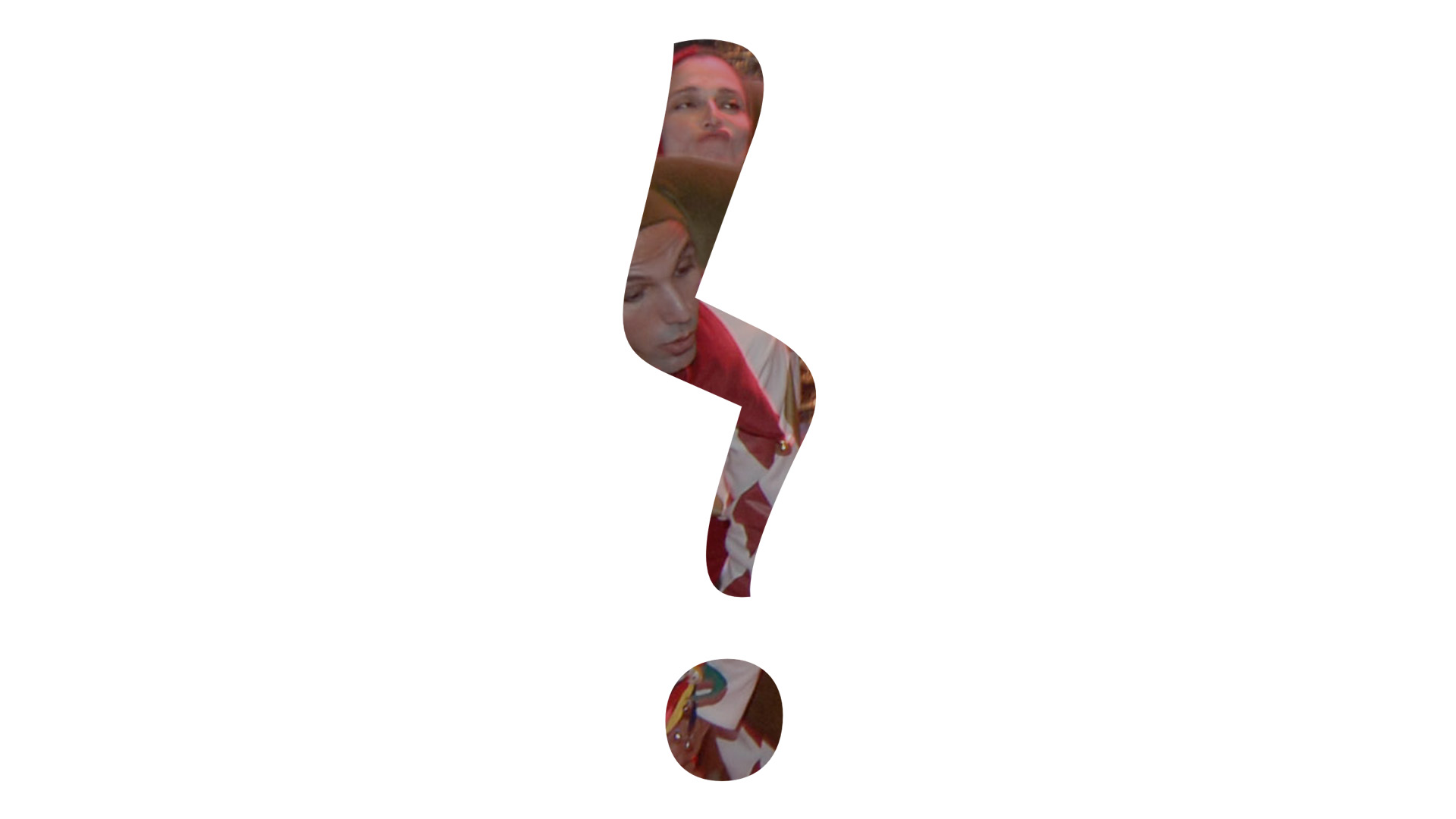
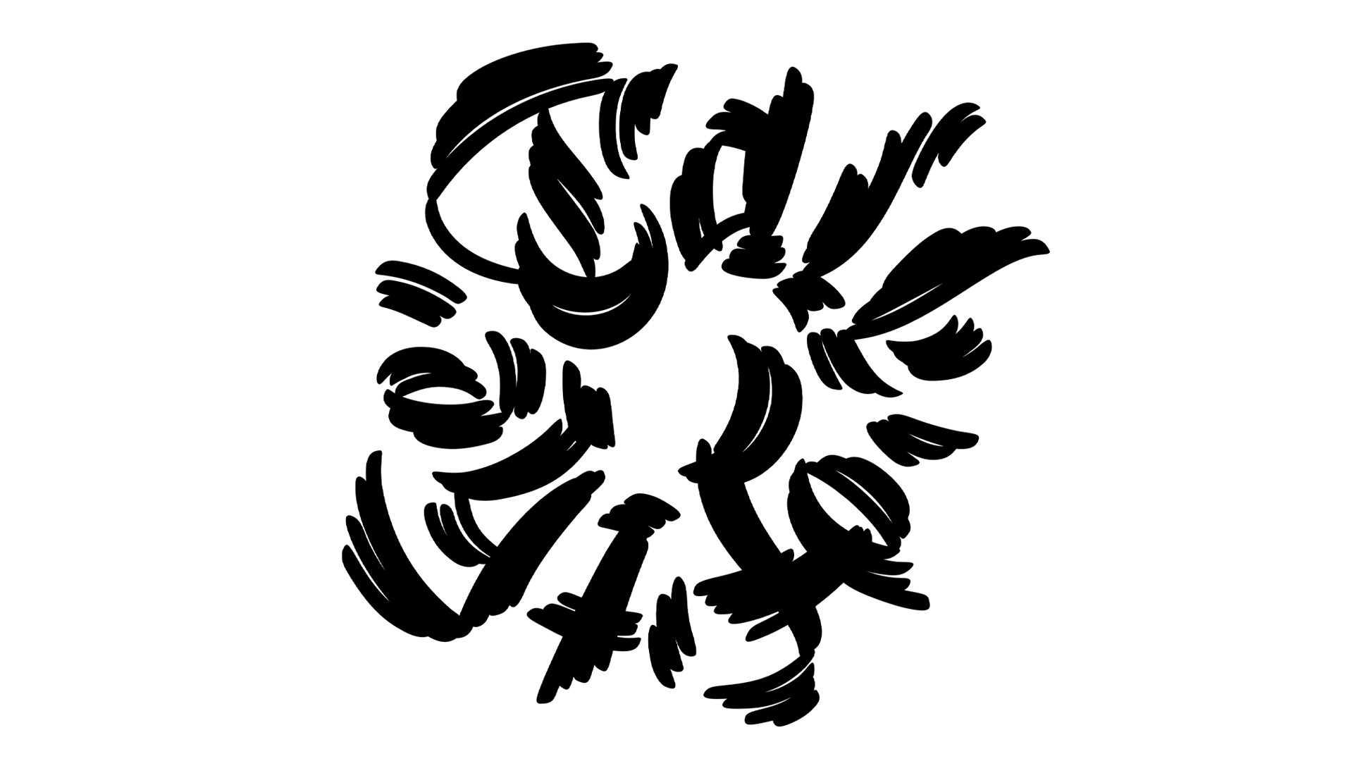
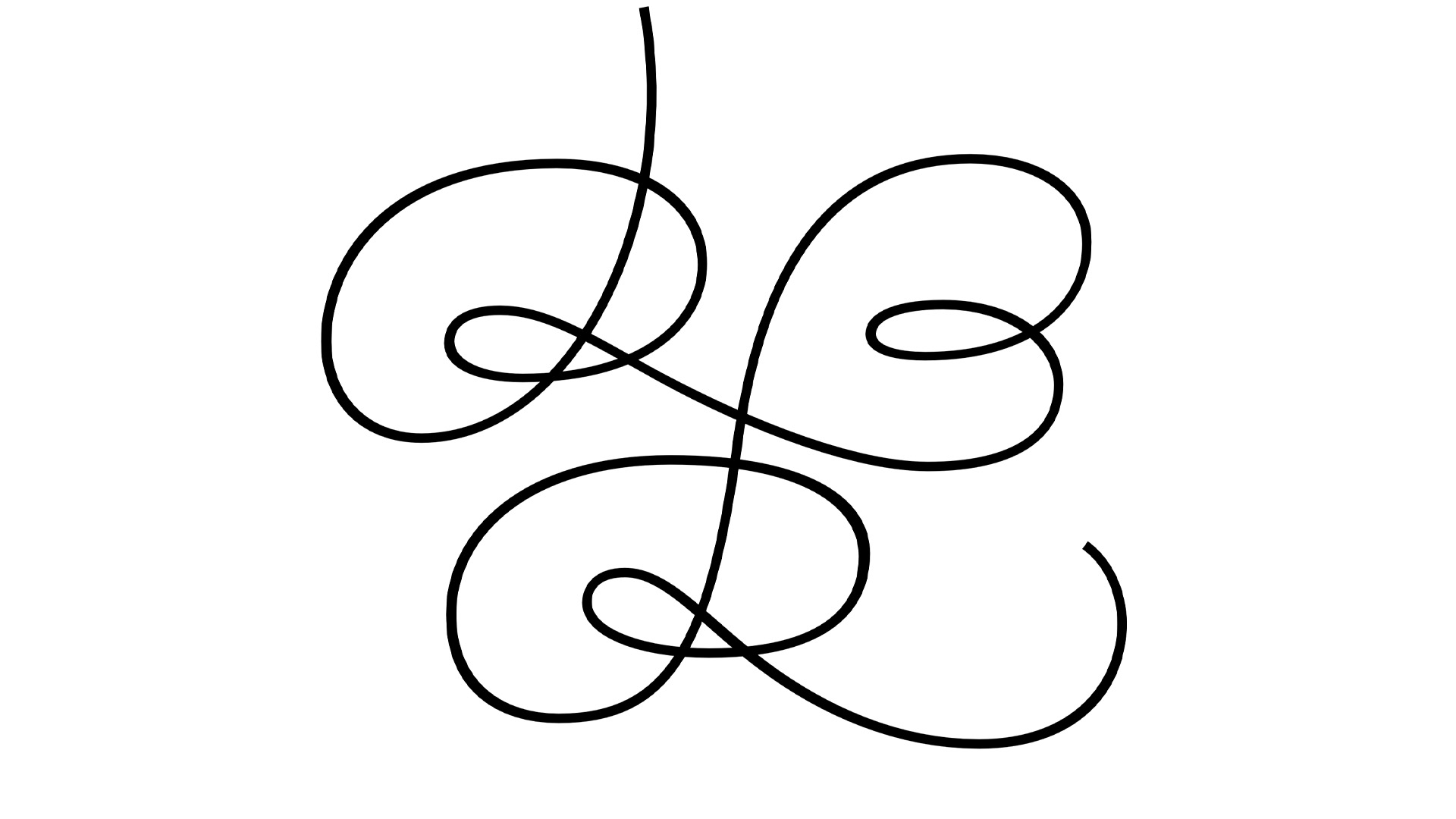
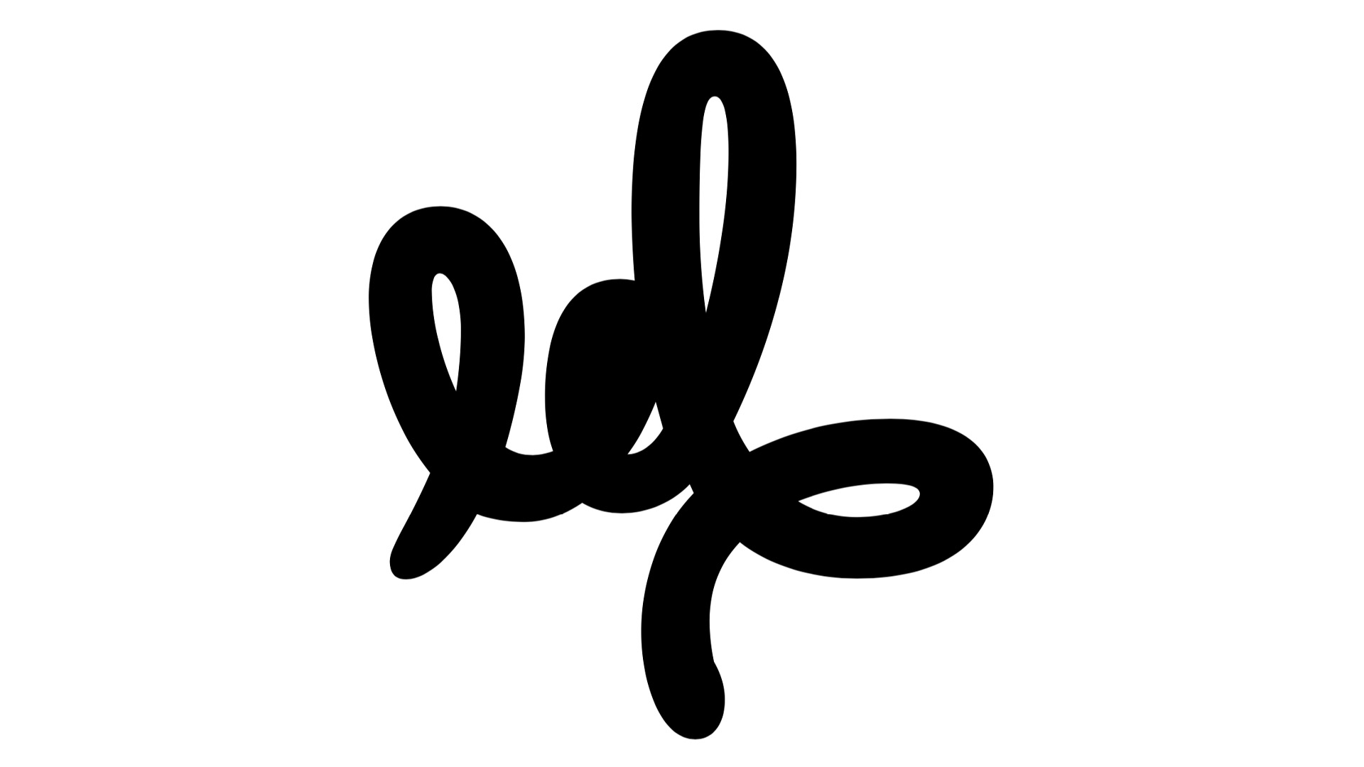
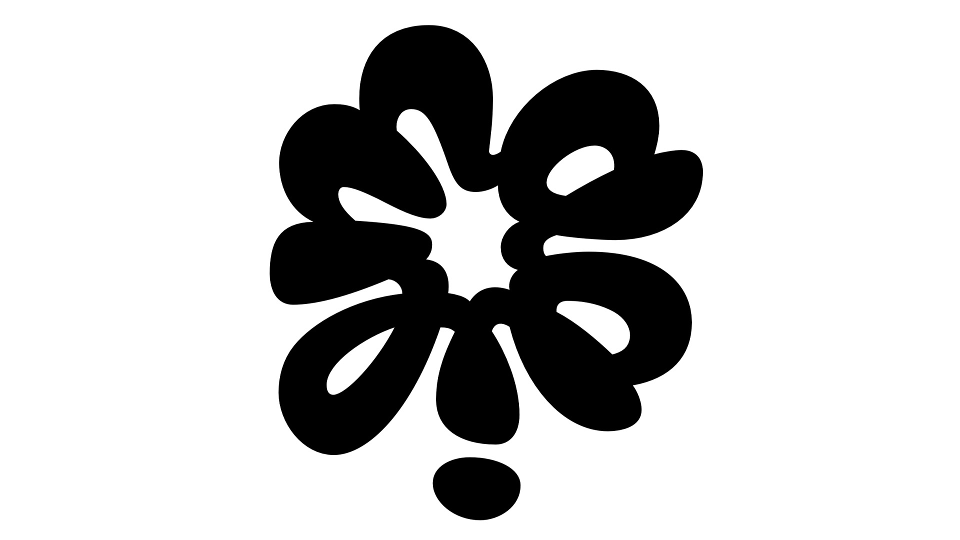
Irony mark
The introduction of a new character or even 'just' a punctuation mark is a hard, long and complex process. As every person -who can read or write- has an opinion about language and the use of language, mostly linguistic developments move with the speed of the most conservative writers/readers. Which means, every new proposal will be criticized and most likely won't survive in the end. Most of our currently used characters in the latin alphabet, letters numbers and other characters we use, have a long tradition and history. It's very hard to add a new character which lacks all that history and convention. One of the rare exceptions maybe is the notorious interrobang, invented in the sixties, and now, more than 40 years later, in 2007 natively implemented in Microsoft's ClearType font collection.
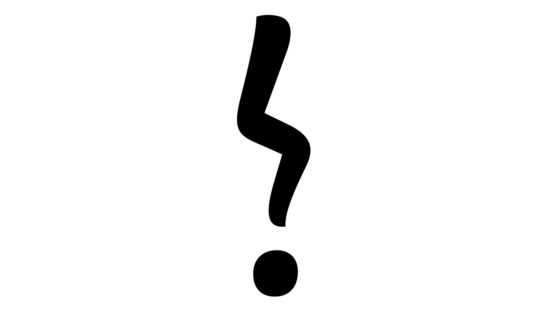
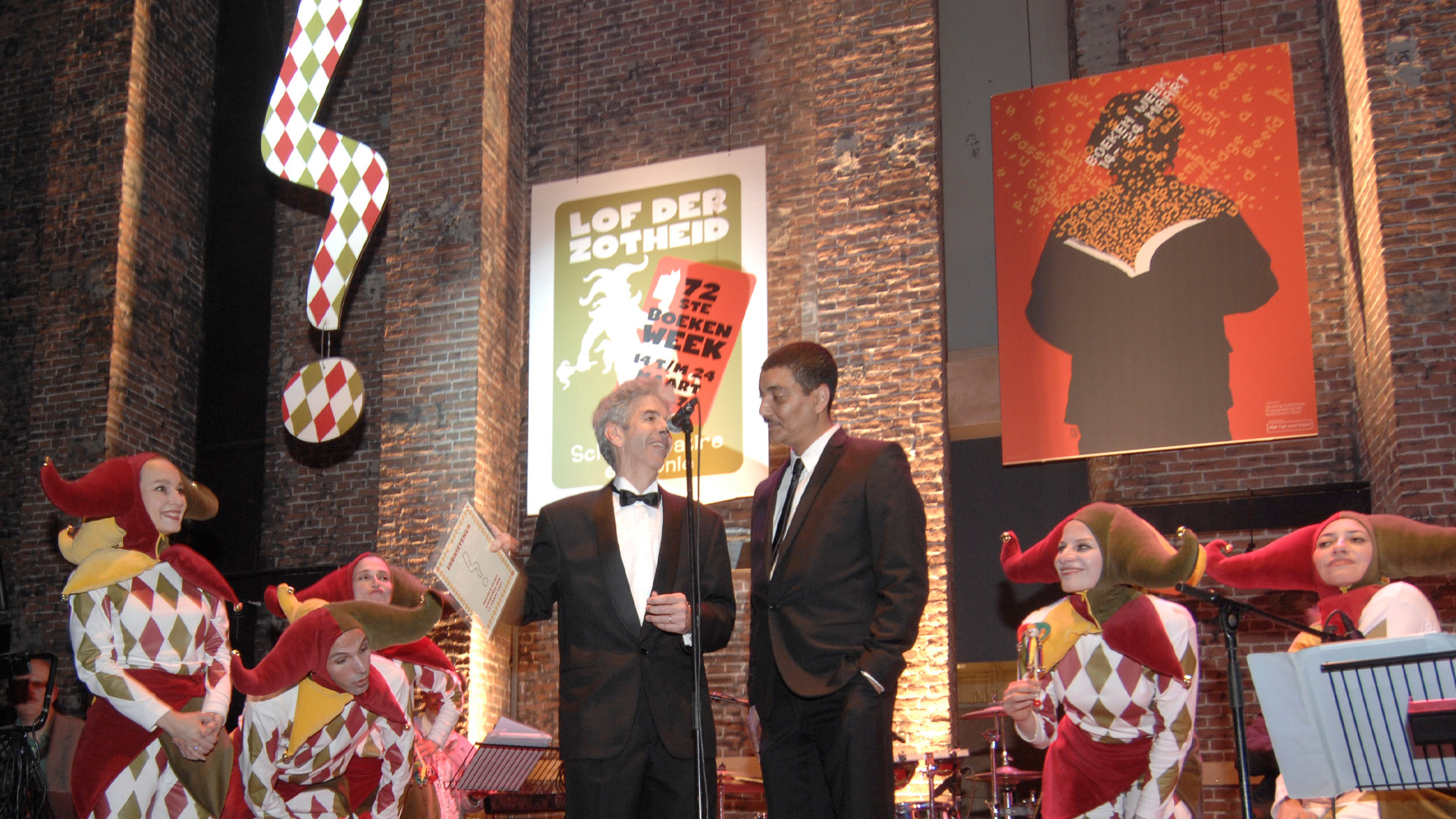
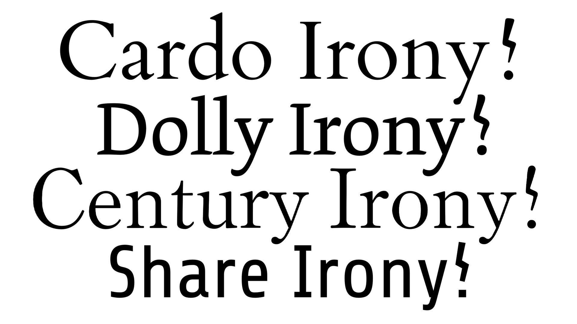
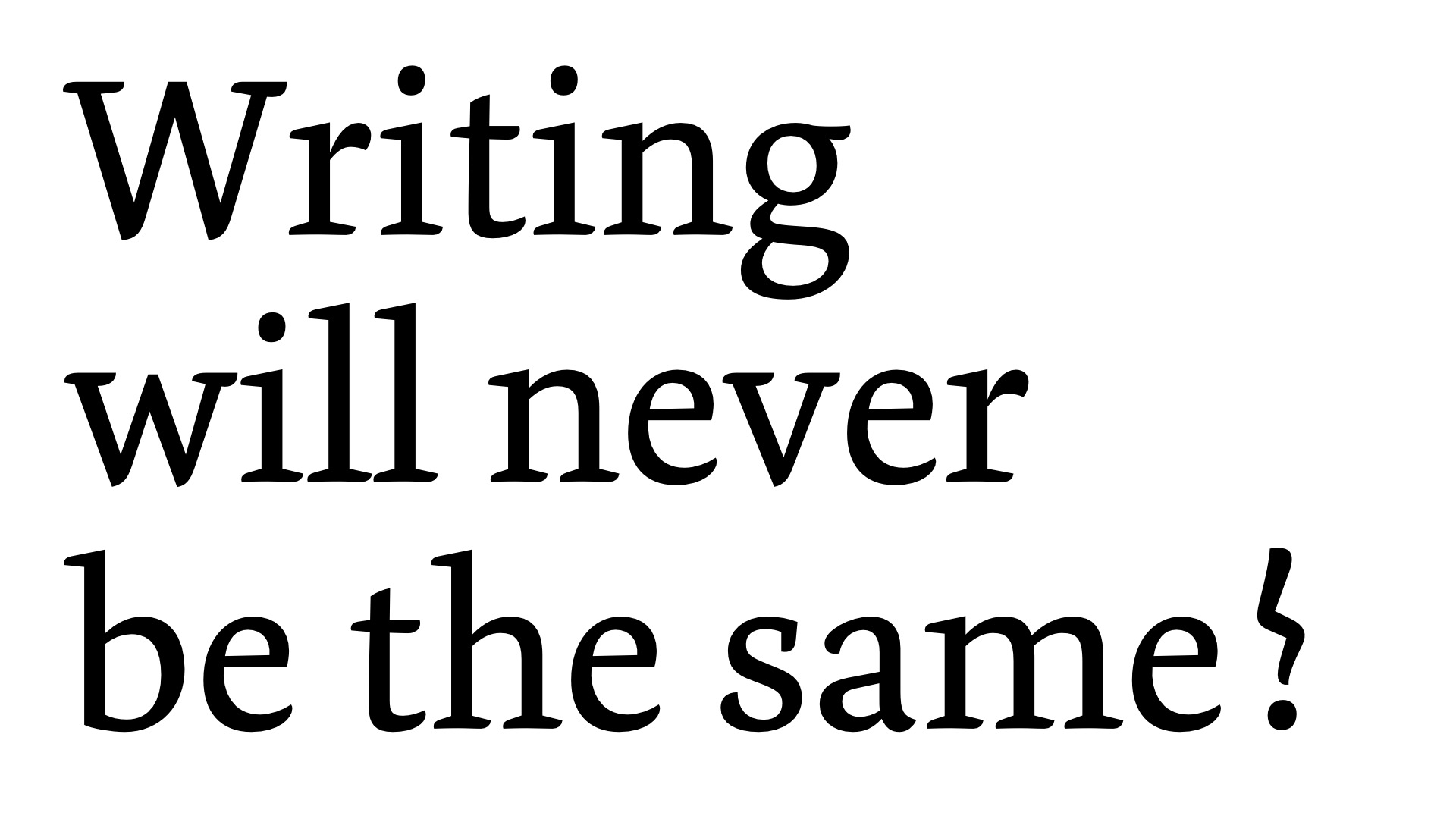
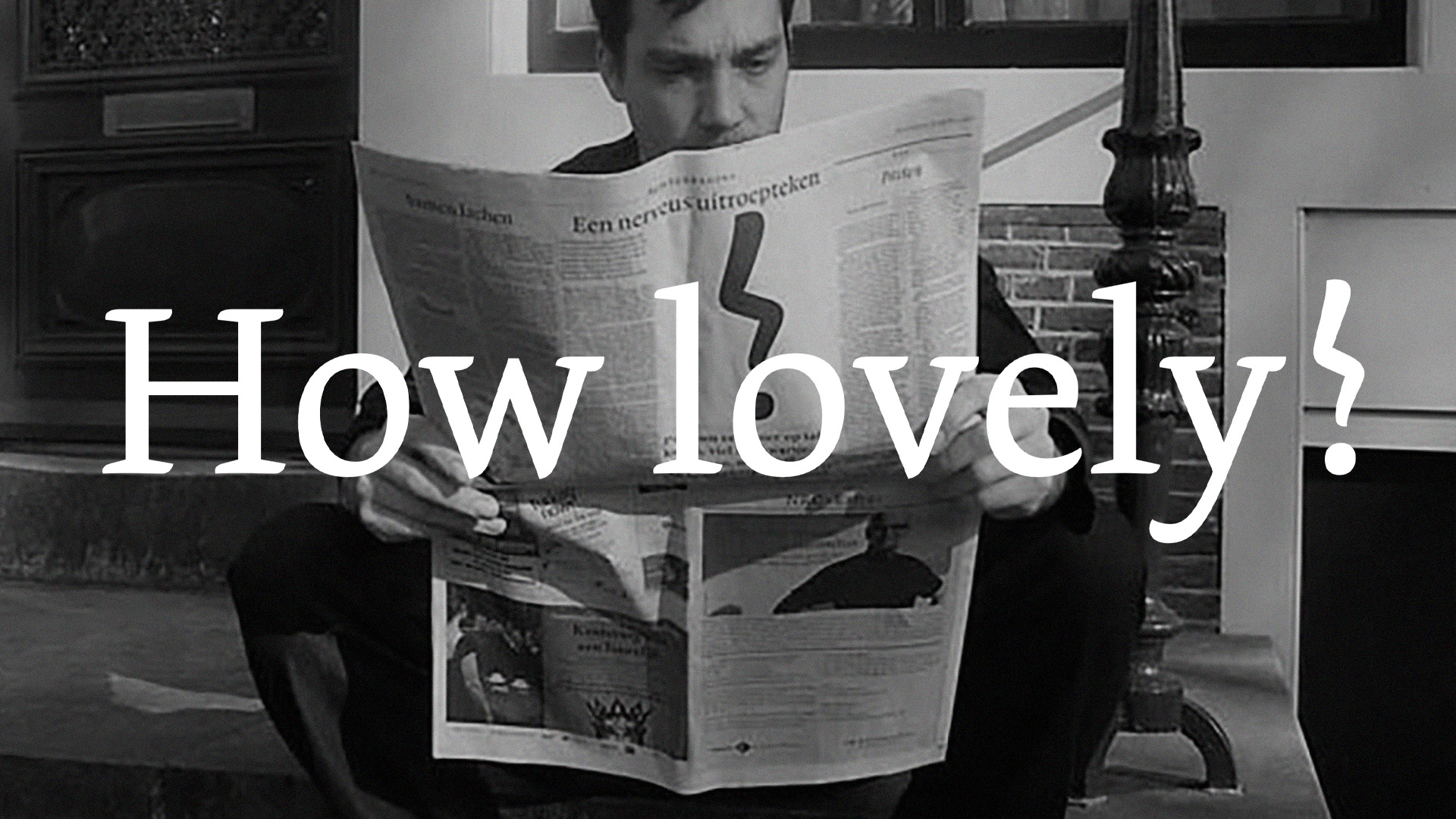
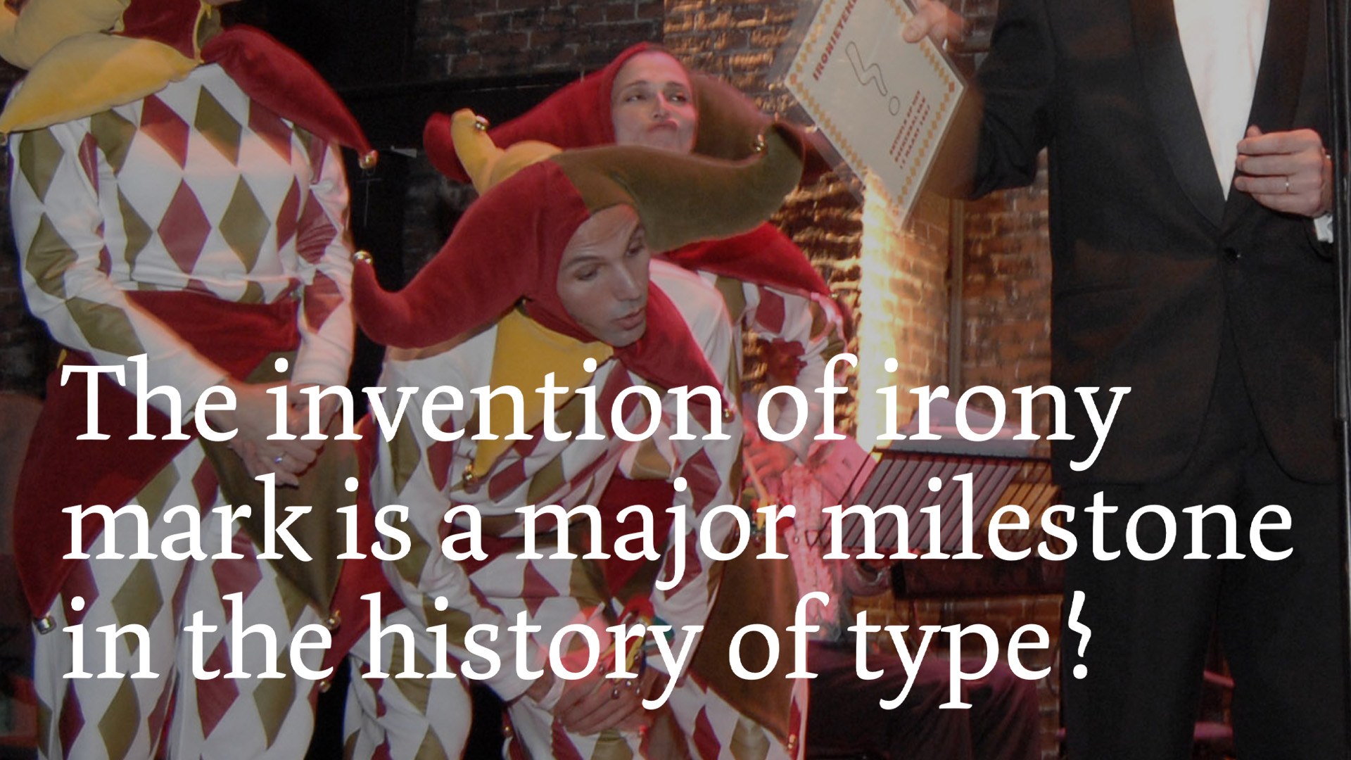
Commissioned by the CPNB (foundation for the Collective Promotion for the Dutch Book), Underware created an irony character. This didn't pass without being noticed, as it was presented at the Boekenbal 2007, where many Dutch authors celebrate the start of the national book week. To make the implementation and acceptation of this new character easy and fast in daily life, a character was created which is also easy writable by hand. A simple form is essential to give it a chance to be a success, in contradiction to the interrobang for example. And it has to look like it always existed, not too constructed or rational, but similar like existing punctuation marks.
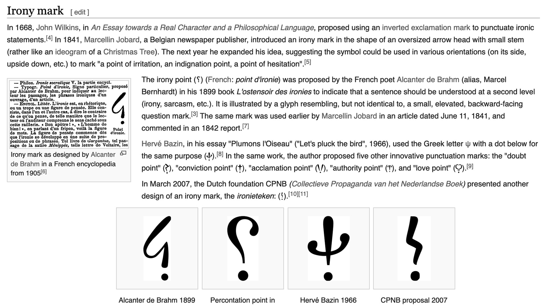
The irony mark created by Underware is not the first in its kind. Previously other attempts have been made. In the end of the 19th century Alcanter de Brahm created an inverted question mark for example. Or sometimes other solutions have been tried to express irony, by combining existing characters. The BBC uses (!) in their subtitles, others proposed to put the ¡ at the end of a sentence to express its irony.
In recent decades many remarks have been made about the need of an irony character. By prominent authors as well as many bloggers on websites. Although in informal electronic communication like emails and chats, irony is often expressed through emoticons like ;-), in literature it is still not accepted to use smileys. It's mostly considered as 'not done'.
Dutch authors have their doubts about the need of another punctuation mark ("you just have to write good enough, then you don't need an irony mark"). Admitting that this is the character you were waiting for, is also admitting that everything you wrote so far could have been better. Despite of all critics, there could be reasons anyway to include this new character to the standard character set of typefaces. For example in the interpretation and generation of humoristic texts by computers. Even with the most sophisticated artificial intelligence, it's very hard for a computer to detect ironic sentences at this moment.
And what's actually speaking against adding another character? What's the big deal? Who actually uses all characters of the standard character set in a typeface? How many people are really using the infinity character ∞ for example? But would you really make an objection if this character would be added to a typeface? Well, euhm… it's already there. Are you really using all the tricks and tools of your new car, or do you just drive safely home with it? And do you then bother if your car has DSTC, ABL, IC, BLIS and IAQS? So instead of questioning 'why', we would like to say 'why not?'.
Visit the website of the CPNB for more info.
Read more about the history of the irony mark at Shady Characters, the blog on the secret life of punctuation.
The introduction of a new character or even 'just' a punctuation mark is a hard, long and complex process. As every person -who can read or write- has an opinion about language and the use of language, mostly linguistic developments move with the speed of the most conservative writers/readers. Which means, every new proposal will be criticized and most likely won't survive in the end. Most of our currently used characters in the latin alphabet, letters numbers and other characters we use, have a long tradition and history. It's very hard to add a new character which lacks all that history and convention. One of the rare exceptions maybe is the notorious interrobang, invented in the sixties, and now, more than 40 years later, in 2007 natively implemented in Microsoft's ClearType font collection.
Commissioned by the CPNB (foundation for the Collective Promotion for the Dutch Book), Underware created an irony character. This didn't pass without being noticed, as it was presented at the Boekenbal 2007, where many Dutch authors celebrate the start of the national book week. To make the implementation and acceptation of this new character easy and fast in daily life, a character was created which is also easy writable by hand. A simple form is essential to give it a chance to be a success, in contradiction to the interrobang for example. And it has to look like it always existed, not too constructed or rational, but similar like existing punctuation marks.
The irony mark created by Underware is not the first in its kind. Previously other attempts have been made. In the end of the 19th century Alcanter de Brahm created an inverted question mark for example. Or sometimes other solutions have been tried to express irony, by combining existing characters. The BBC uses (!) in their subtitles, others proposed to put the ¡ at the end of a sentence to express its irony.
In recent decades many remarks have been made about the need of an irony character. By prominent authors as well as many bloggers on websites. Although in informal electronic communication like emails and chats, irony is often expressed through emoticons like ;-), in literature it is still not accepted to use smileys. It's mostly considered as 'not done'.
Dutch authors have their doubts about the need of another punctuation mark ("you just have to write good enough, then you don't need an irony mark"). Admitting that this is the character you were waiting for, is also admitting that everything you wrote so far could have been better. Despite of all critics, there could be reasons anyway to include this new character to the standard character set of typefaces. For example in the interpretation and generation of humoristic texts by computers. Even with the most sophisticated artificial intelligence, it's very hard for a computer to detect ironic sentences at this moment.
And what's actually speaking against adding another character? What's the big deal? Who actually uses all characters of the standard character set in a typeface? How many people are really using the infinity character ∞ for example? But would you really make an objection if this character would be added to a typeface? Well, euhm… it's already there. Are you really using all the tricks and tools of your new car, or do you just drive safely home with it? And do you then bother if your car has DSTC, ABL, IC, BLIS and IAQS? So instead of questioning 'why', we would like to say 'why not?'.
Visit the website of the CPNB for more info.
Read more about the history of the irony mark at Shady Characters, the blog on the secret life of punctuation.