


concept

write

ornaments

character set

language support

font formats

PDF
Design principles of the handwriting font Scribo
The goal in creating Scribo was not only to capture the action of writing within a digital font file, but also to create the most intelligent handwriting font we could imagine. Including the action of writing within a font means designing in time. First, let’s look at what else is involved in the design process besides the complex process of designing in time.
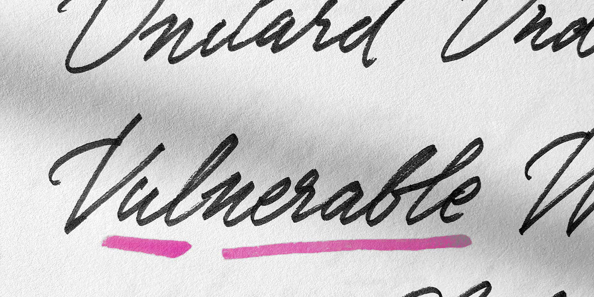
Despite the vast amount of digital communication, much is still written by hand. We too often take up a pen or other writing instrument. The basis of Scribo therefore consists of letters written by us. Since we created the custom handwriting font for Mr. Porter in 2011, we have wanted to create a more sophisticated typeface, with more irregularities and more possibilities. A typeface that was even more human. A digital typeface that is almost indistinguishable from human handwriting. But also such an advanced digital typeface starts with lots of hand sketching. Or actually not sketching, but writing. Lots and lots of sheets were written by hand to be further analysed, and function as a basis for the digital font.
With the experience of creating a few handwriting and script fonts in the past, we are building on top of our existing knowledge. We have previously created complex script fonts, for example, and have often encountered technological limits in the creation process that affect the approach to such a project. Sometimes, with the wisdom of hindsight, we wish we had chosen a different approach initially. This is why it is a challenge for us to bring together everything we know about font design, programming and handwriting into one new project, in which we not only have a clear foundation, but also try to go one step further again.
Dissecting handwriting
One of the principles of a script font, of course, is to capture human handwriting in a digital product. This requires, first of all, an analysis of the writing itself, and the result produced. Some simplification is necessary here, to arrive at a workable process and feasible end result. For instance, we have defined different forms of writing with digital fonts.

The image above shows 4 degrees of writing, from the most primitive form ascending to the most advanced form.
1) Beginner
As primitive as a typewriter, repeating letterforms, never connected.
2) Apprentice
As primitive as a typewriter, repeating letterforms, everything connected, but always connected in identical way.
3) Artisan
Advanced letterforms with ligatures, everything connected, with variation in connections. Progressive.
4) Master
Contextually aware letterforms and ligatures, only sometimes connected, with variation in connection. Controlled uncontrolled. 100% human.
As you would expect, Scribo belongs to the fourth category, the controlled uncontrolledness, full of human imperfections, but always exactly as desired. Sometimes perfectly connecting, sometimes ugly and stubborn, but always lively.
One of the most important parts of creating a handwriting font is ensuring that the shape of each letter matches the context in which it appears. This is a natural process in handwriting that every writer performs subconsciously, but requires extensive analysis to translate into a digital font. For example, the crossbar of the lowercase t may vary in length depending on the length of the word in which it appears, whether there is a lot of space above the rest of the word to the left or to the right (or whether there is any space at all!). There may also be two t’s next to or close to each other, jointly using a crossbar.

The crossbar of the t is just one of many components in achieving a satisfactory result. In handwritten text, for example, a letter will never look the same twice. To achieve this with a typeface, many alternative shapes must be created for each letter. Simply adding many different shapes for each letter is not enough to achieve a satisfactory result. This will always involve ligatures, for example, but the most important thing is how all these different glyphs are controlled: the (OpenType) code. The correct interplay between the code and the prefabricated letterforms ensures a smooth, natural result.

As you can see in the image above, each o has a different shape. This is all done automatically, with no manual intervention required. To call this intelligence is stretching it a bit. The challenge in creating a font like Scribo is to enable someone to automatically create a convincing, handwritten end result within the technical constraints of the font format. As tempting as it may sound to create 100 alternative appearances for each letter and instruct 100.000 lines of OpenType code to do it, this is not technically possible.
So the challenge for us designers is to find a balance between a relatively limited number of glyphs (alternate forms, ligatures, etc...), instruct them in the smartest way possible with various lookups and features, and design the glyphs so that they are different enough but still harmonious. The design process is therefore a constant back and forth between composition, design and code. In our case, this process takes a couple of years until the font family is finished. But if anything can be called ‘intelligent’, it is this part of finding the right balance to achieve the maximum result within the technical constraints.

Creating utensils
Another challenge is to create a type family that can be used in a variety of ways. This means not only to create the default style – the bicameral font with capitals and lowercase – but also two supporting styles. In the default style, the capitals are designed to be followed by lowercase letters. Therefore, a Caps font has been added for when words need to be set entirely in capitals. There is also an Ornament font for the necessary doodles, stripes, arrows, hints, as well as smileys and other small drawings. However, these 3 styles are written with 5 different tools (yes, 15 fonts), resulting in a more diverse palette of typographic possibilities.

Aside from the perhaps obvious marker and pencil, this particular Brush is perhaps a little less conventional. The special thing about this brush is that Scribo has optical sizes for a handwritten brush font. Although they may look similar from a distance, the difference will be obvious, especially in larger sizes. The brush of the default Brush has 5 bristles, while the Brush XL has 15 bristles.

This difference is particularly noticeable in large sizes. Think of large lettering on a shop window, for example, where the Brush XL styles will be able to show much more detail. Optical sizes for Brush fonts are not always a given, but certainly desirable in certain situations, for the more demanding user.
Dynamics first
In addition, Scribo’s guiding principle has been to incorporate the action of writing into the design and embed it in the digital file. This means that time-related elements, such as speed, should also be included in the design. And logically those are dynamic, because humans don’t write with a constant speed, that would be unnatural. But also other time-related elements, like the time it takes to write a particular letter shape, or how long it takes from the end of one stroke to the beginning of the next, must also be determined. And of course don't forget the ductus, direction and sequence of strokes of each letter. But all those dynamic components should of course still respect the static complexities, such as the contrast of the stroke.
The image above shows how the writing speed varies within a letter. In a small curve the speed is low, while in a long straight line the speed is much higher. Note that the information to create this image comes directly from the font file itself. The Variable Font format, introduced in 2016, allows this time dimension to be added to the font. For us as type designers, this has meant a completely different design process. For the end user, it just creates more possibilities. The traditional user of static fonts still gets static fonts – very smart ones in this case – and if text needs to be written dynamically, Scribo can do that too. In case you’re interested to know more about the dynamic version of Scribo, check out Scribo Write.
So Scribo opens the door to a whole new world of typographic possibilities to write text digitally instead of just displaying it digitally. We like to push our own boundaries with each new project, but in this case, by pushing both our design and technological boundaries, we have created a new genre: the self-writing script.
Get a taste of Scribo:
▶ try Scribo
▶ overview of all styles
▶ download Scribo PDF