01 october 2013 — walhalla
That little thing

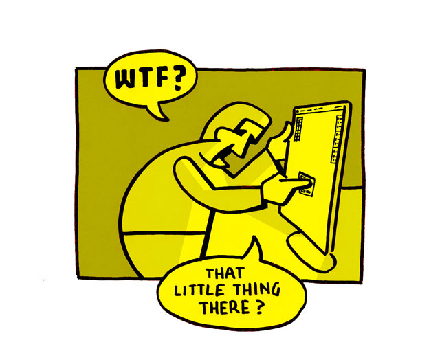
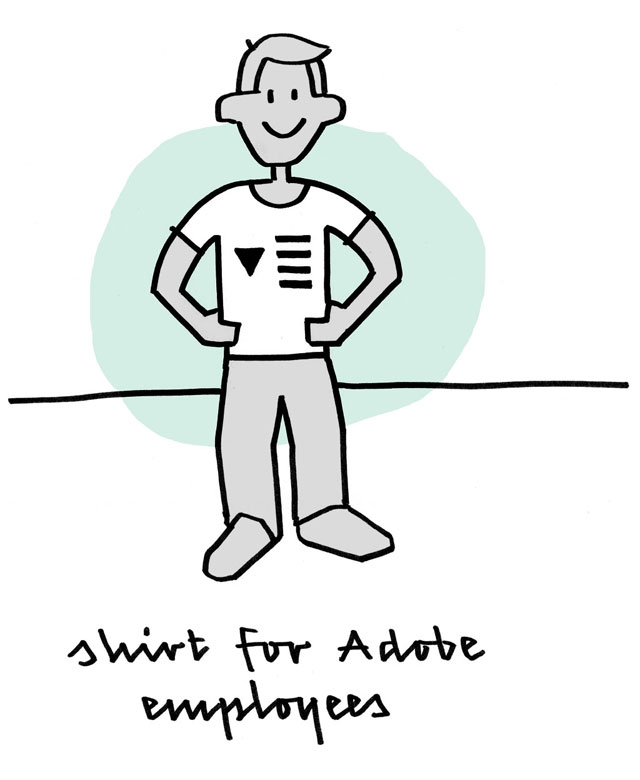
Can’t remember anymore how often we had to explain the user interface of InDesign to our customers. It’s our top 1-support question. Yes, all the magic of OpenType fonts is very well hidden in a sub-submenu of a palette. Every time we explained the menu, their reaction is the same: ‘WTF, that little thing?’. No wonder that the majority of the font users is not aware of the possibilities of OpenType fonts. Even worse, they often think the small caps are missing because they can’t find them. After more than a decade of OpenType magic, it’s about time that Adobe (but also other developers) improves the OpenType user interface within their applications. Maybe it helps if every Adobe employee is obliged to wear the “triangle plus stripes”-t-shirt until that is fixed?

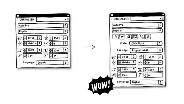
OpenType features need to be as easy to understand and apply as the Bold & Italic buttons in good old MS Word. Here is one simple suggestion for a possible UI-improvement. But we need more suggestions, so start sketching. Please make and share your OpenType interfaces, and let’s strive for a better UI.

[slides from our “It’s so technical, so let’s tell it with a comic story”-presentation at Kerning Conference earlier this year in Italy. ]