28 may 2020 — walhalla
Underware in motion
At Underware we often talk about stuff. And that stuff could be anything, it’s whatever we discuss at that moment. This is probably born out of our lack of mastery of the English language 20 years ago when we called almost everything stuff, but the word stuck in our conversations and became useful in some sense too. So let’s talk about stuff here.
In this case the stuff could be an identity, or a brand, a company, a group, an organisation or institution, or just a text. Lots of different stuff, basically anything which is graphically (re)presented. While representing this stuff, motion has become a default part of the characteristics of this stuff in digital media. Half a century ago designers had to consider the visual representation mainly only in static media. When a designer had created a poster/corporate identity/book/other media with a strong own identity, that stuff could have a successful life of its own. But in today’s world, this isn’t always the case anymore. There can be more to the stuff today. As anything can move in unstable media, it’s important to define how stuff moves. Your move is different than my move, in the same way as your dance is different than my dance, and your handwriting is different than mine.
(more…)
20 may 2020 — walhalla
Buiten Bios

We’re over 2 months into the Corona crisis, and it’s still a different world than we used to know. But instead of noticing what’s currently not possible, why not focusing on what actually is possible at the moment? Yesterday it was announced that the Dutch regulations are going to being eased from the 1st of June on. So if you’re around Amsterdam: every Friday in June there is the Buiten Bios, an open-air cinema on the rooftop of our Amsterdam studio building. Starts at sunset, max 30 visitors. Be welcome at Tugela85. Tickets are on sale now: https://tugela85.nl/activiteiten/1084/t85-buitenbios
25 september 2019 — walhalla
Grammatography exhibition Tokyo


We write 6 September 2019. Is there a better way to introduce grammatography than with an exhibition at Print gallery in Tokyo? Don’t think so. A small exhibition with big ideas, a small lecture and big guests, a small projection which fits Hiragana and Latin into a single variable letter and a big smoke machine. A big stop at our small Right To Write Tour 2019. Sounds by the Dutch artist Rob Bothoff, Liza Y, a single letter opening speech and good beer and good talks. What else should we say?
(More photos at this Flickr album)
14 april 2018 — walhalla
Say hi to hoi
Say hi to Higher Order Interpolation. Since the introduction of variable fonts in 2016, interpolation became increasingly important. During the TYPO Labs 2018 conference in Berlin we briefly reevaluated the current interpolation technique and demonstrated another way of interpolation typefaces. Until today interpolation in type design has been linear, but this limitation should belong to the past. In case you are interested in the technical side of making (variable) fonts, read the case study: Higher Order Interpolation for Variable Fonts. The basic principles of more advanced interpolation in variable fonts, explained without the complicated math.
04 february 2018 — walhalla
Now or never typeworkshop
Our typeworkshop website may still be in coma at the moment, the workshops themselves have always continued and are alive as never before. Last year we gave 5 typeworkshops, from Baltimore and Detroit in the USA, to Wrocław in Poland, and São Paulo & Rio de Janeiro in Brazil. This week our first typeworkshop-stop of 2018 is at Sint Lucas in Ghent, also known as the Berlin of the Belgian type scene. We hope to make some new people enthusiastic about letters. It’s gonna be Now or never on the 5th and 6th of February.
30 january 2018 — walhalla
Behind Duos
Warning: this movie is longer than 15 seconds. Even longer than two minutes. And there is a good reason for this. Developing fonts is a tedious task, at least in our case. To give a certain clue of time: making Duos, our latest font release, took two more years than we originally planned. In case you are interested to see and hear what’s involved in making the font family Duos, just watch this presentation that Akiem and Bas held at ATypI Montreal. Thirty minutes of slow TV for a fast font.
Prefer reading instead of watching? Only want to spend a few minutes instead of half an hour? Those people who are interested in ambiguous shapes, monolinear design problems, writing speeds or coding, will also enjoy reading the story behind Duos.
30 june 2017 — walhalla
ASCII TV
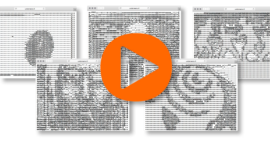
Today is the last day of our ASCII+ Week, celebrating the introduction of Zeitung Mono. Earlier this week we turned our homepage into Responsive ASCII and showed you Subpixel ASCII+ art. But we hear you saying: “yeah yeah, an ASCII website is nice, but we want ASCII movies!” So we give you ASCII movies. But then: Responsive ASCII movies of course.
Introducing ASCII TV
You can change the resolution by enlarging or reducing the window size, or by using the controllers. Also: change the color of the movie by varying between Light to Extrabold styles.
Get popcorn & drinks and enjoy your private responsive ASCII Movie Night. Please find a nice, personal selection of movies worth watching at Zeitung’s ASCII TV. More than enough for a satisfying movie evening with your friends. (If you like to see other movies in ASCII, let us know)
▶ ASCII TV
29 june 2017 — walhalla
Underware joins Type Network
We’re happy to announce that yesterday Underware joined Type Network, a group of independent type foundries and individual type designers. Let us explain why we think this is a good idea. The type world changed a lot in the past decade, and joining forces with kindred spirits is a good push in the right direction. For example, currently it ain’t always easy for some designers and other font users to find the right typeface. Not everybody takes the time to follow all font releases, make a list of personal favourite font foundries, or invest lots of time in selecting the right typeface for each project. And that ain’t always easy. It’s a jungle out there. Type Network can help to clear to that path. Visit one place, and find a limited selection of fonts, but with a range wide enough to meet the most versatile demands. We’re in great company at Type Network, the wheat is separated from the chaff, so you don’t have to worry to buy a pig in a poke. Besides, we know many of the people in and behind Type Network for many years, and they are good people. Or as the Dutch say “goed volk”. And for many more reasons we’re excited for this new adventure.
29 june 2017 — walhalla
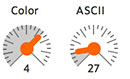
Subpixel ASCII+ Art
![]()
A new monospaced font* and Responsive ASCII* are a nice start to celebrate the ASCII+ week, so let’s get one level deeper. Notice the differences between these 2 trees? The image on the left is old school ASCII art, the one on the right is made with our subpixel technique. The resolution is nine times higher, although the point size of the text based visual art remains identical. Pretty sweet, if you ask us. How this is achieved is explained in the article From ASCII Art to Subpixel ASCII+ Art, a must-read for ASCII art & monospaced fonts lovers. No time to read all that? Get your hands dirty with the ASCII+ Art Generator, and play. This tool has been optimized for Zeitung Mono, so the results will always need to be displayed in Zeitung Mono.
Read ▶ From ASCII Art to Subpixel ASCII+ Art
Play ▶ ASCII+ Art Generator
27 june 2017 — walhalla
Responsive ASCII
Why wouldn’t ASCII art, being over 50 years old, adapt itself to modern times? We are all familiar with ASCII art and we all know responsive websites. What happens if these 2 are combined?
We released a monospaced version of Zeitung yesterday, and we all know that monospaced fonts & ASCII art are a match made in heaven. Therefore our website has a new homepage, using responsive ASCII. Resizing the window will offer the full experience: the text size which displays the ASCII art remains the same, independent of the window size. As a consequence: the resolution increases once the window enlarges.