03 june 2013 — font update
Behind the font upgrade
“Why did it take you sooooo long?” Brrr, let us explain why it took us ‘sooo long’ to upgrade our library, because if you’re not into making type you probably don’t have a clue. To many people the new upgraded fonts will look identical to their previous versions. And they are basically right, visually they didn’t change a lot. Still the same fonts. Right. Although the fonts visually improved a lot in details, upgrades like these are also focused on usability.
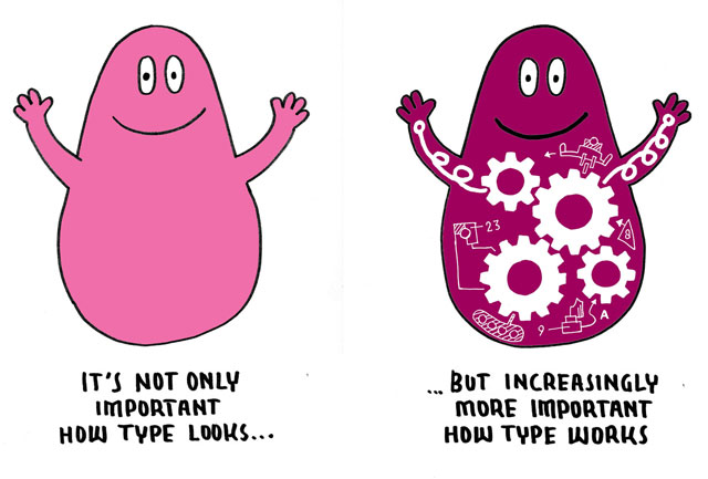
A decade ago most people still understood it was a headache to add German text on a Mac to a Polish document created on Windows. Lots of things would probably go wrong: strange accents, fucked up documents, etc. Meanwhile technology changed, we’re taking it much more for granted. We expect everything ‘just to work’, from our tablets, phones to our laptops and switching between them. So we expect the fonts to work accordingly, and not having ‘technical font issues’ within our digital lives. A correct Unicode support in all fonts is the first step in this direction, but more technical aspects need to be correct to make fonts as fluently operating as possible in a contemporary environment.

Usability is mostly hidden. Compare it to interface design: most people don’t notice an interface as it should speak for itself. However, there are some improvements in usability of these new fonts which are rather visual. For example: in Sauna Dingbats (as well as in Bello Words) we implemented an easier way to create those multicoloured glyphs. A smart OpenType feature makes it finally very easy to create those dingbats in 4 different colours. They remain text, so they nicely float along with the rest of your text. This short how-to movie shows how to build a 4-coloured dingbats with the Discretionary Ligature feature.
Technically many things changed since we first started selling fonts. Try opening a software application which is more than a decade old. Well, good luck. It’s obvious that the digital environments from today are very different than a decade ago. This doesn’t only have consequences for the fonts we create, but also how we create them.
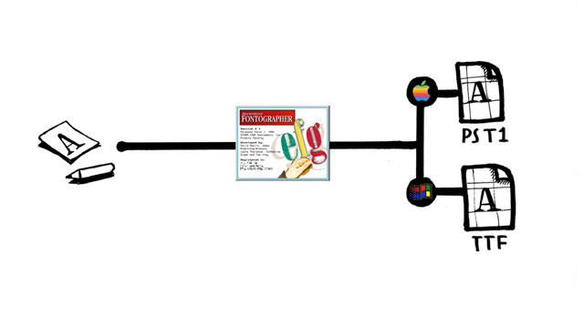
Our production process in the 90s looked a little bit like this:
While our current typeface production process looks more like this:
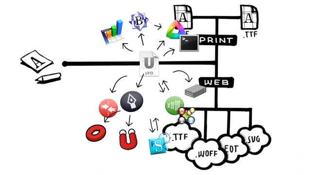
As you can see in the last image, producing type became more complex. And this image doesn’t even show the complete workflow. But this new production workflow was useful to bring all our fonts technically in the same condition. That makes updating them in the future much easier, as we plan to keep all our fonts technically in the same condition from now on.
We’ve been working out many things in the last couple of years: we did not only create a complete new workflow and type production process, but we also studied webfonts and screen performances and their accompanying technical ‘issues’ (ooh, this would require a separate blog post). We build a new web shop and a complete new account-system where clients can access their order history and upgrade their licenses. And wait, we added more figure styles, revised the design of all fonts and included a better language support to all our fonts.
Let’s focus on that last aspect here: language. Type conveys language. We took our recent library update not only as an opportunity to support much more languages, but also to improve the performance of our typefaces for the existing languages. Which means that we’ve looked again at the design of all glyphs in all fonts, and if necessary improved them. A dowdy, time-consuming task. And damn, we suffer from advancing insights. Here is an example of Dolly Italic. The ß changed a lot, but if you look more closely you’ll see that actually every letter has small differences in the outlines (and metrics and kerning).
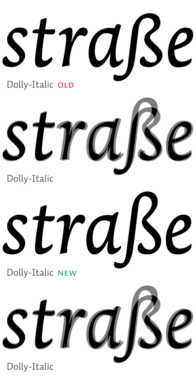
During the last decade we’ve listened to our customers. Some Germans were right that a certain ß in a specific style could be improved. They are served now. Other Finns are happy that a certain obscure kerning combination for one of those ä’s has been optimized. Seriously, we care as much about these details as some of our most demanding users. We’re doing our very best to create typefaces which are rock steady in all circumstances, in all languages. Also if your demands are very high. We enjoy conversations with our clients about directions to follow while kerning the pair Yā in a Black Italic Swash style, or talking about the conventions in designing an italic capital Schwa for a blackletter typeface.
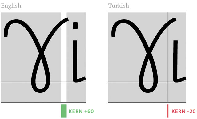
Above you see an example of Auto Light Italic 3. This specific typeface needs a positive kerning pair (+60) for the not very uncommon Yi-combination (Yiddish, Yield, etc.). But the Turkish Yıl (Year), also a common combination, would need a negative kerning pair (-20). There are tons of these language specific examples which need special attention. They can vary from typeface to typeface, as it totally depends on the specific design how every kerning pair should be treated.
This is all very simple stuff, not complicated, but labour intensive. It can’t be squeezed out a robot, it needs human eyes and brains.
In the end, these are the details which matter and which make a font valuable. A typeface might look nice in one single headline on a fancy poster, but you only know how useful a typeface really is once you’re seriously applying it in a large-scale real-life environment which is more demanding than one single poster.
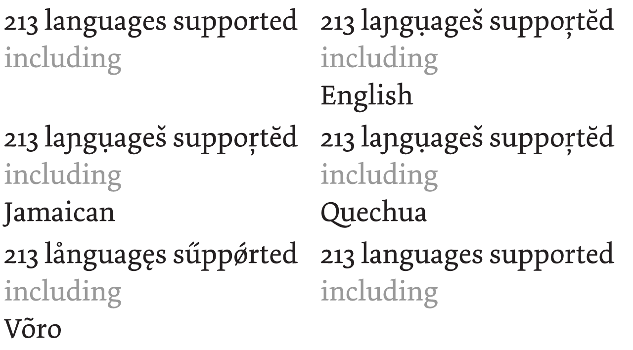
As already mentioned, we took this upgrade also as an opportunity to extend the language support. With more than 200 languages supported by these new fonts, you can now reach over 2 billion speakers all over the world. Our complete overview of all supported languages mentions a precise number: 2.134.923.711. That should be taken with a grain of salt of course. Languages are not strict math, they are as liquid as water. The list mentions how many (first-language) speakers each language has. Well, there are languages listed with just 230, 50, 20, 12 or 5 speakers. Although this sounds as if we all know them by name, this number is just an estimate. The list also mentions 3 speakers for Wiradjuri, a language spoken in Southeastern Australia. Well, to be honest: they all 3 died in the early 80s. The Wiradjuri people – who call themselves Wirraaydhuurray – still live, but native speakers don’t exist anymore. Only after the last 3 native speakers died, an official orthography was defined. A standardized spelling system was approved in 1988. It’s kind of bizarre that only after all native speakers have died, dictionaries and textbooks became available, while those native speakers didn’t have a change to write their own language. To honour those last 3 native speakers, we included 3 instead of 0 speakers of Wiradjuri in our list. (This is just one story about one of the 213 languages. This language list is actually worth a complete book.)
Eventually around 10.000 new, additional glyphs have been created to support these 213 languages, which required more than 250.000 new kerning pairs. And many existing glyphs have been revised too. Checking all glyphs, and all kerning pairs, in all styles, in all fonts, well… do the math, that’s not done in a minute. That takes a relevant amount of time.
So we sincerely apologize that it took us ‘soooo long’, but hopefully you understand why. And if you still like to see a certain language supported by our fonts, or if you still find language issues in our fonts which can be improved, also in a language we don’t speak, just let us know. We listen (as long as you talk English to us).