07 october 2013 — read more
Letter to Jan van Krimpen
Amsterdam, 07 October 2013
Dear Jan,
I should have probably saluted you with ‘Dear Mr. Van Krimpen’, but since you are dead anyway it doesn’t really matter. There is one question I would like to ask you, although I realize I’m 55 years too late.
First I’ve got some news for you. This year’s ATypI conference will take place in the Krasnapolsky hotel, at the Dam Square in Amsterdam. You would have loved to be there, enjoying heated discussions with many of our colleagues. Not sure whether you remember ATypI, because it was founded one year before your death: a Freemasonry for typophiles. It would probably (secretly?) have filled you with pride that the National Monument is in front of the conference venue. All our colleagues and friends who come to the ATypI conference this year cannot avoid this monument which carries your lettering. So despite your death, you are still guarding all of us coming week. That’s a nice feeling.
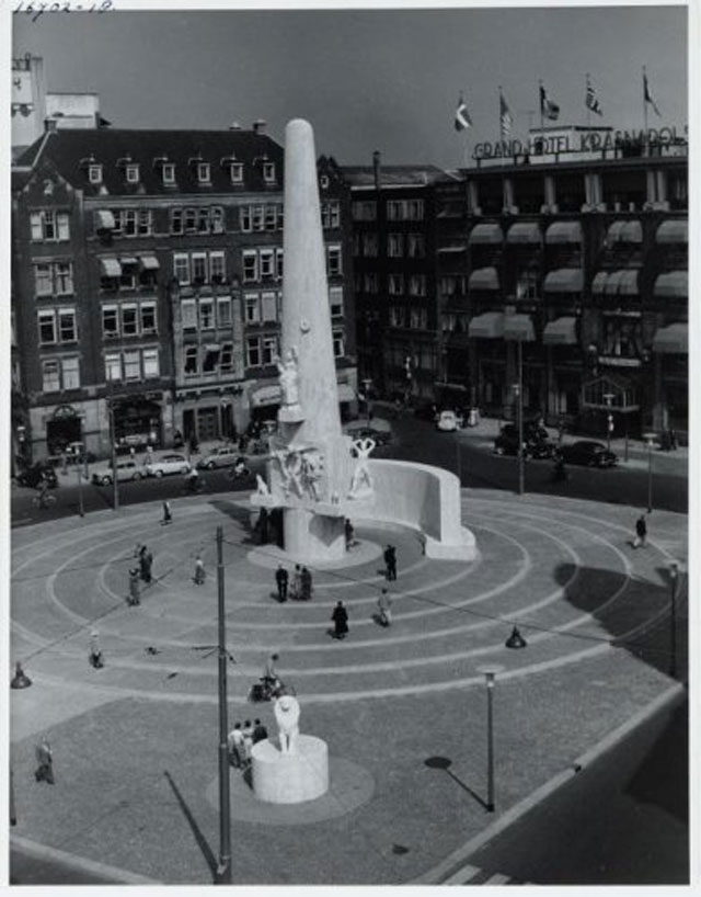
National Monument. Krasnapolsky hotel on the right side. © Stadsarchief Amsterdam
It’s very easy to notice things which are visible. It’s so much harder to see things which are absent. I don’t need to tell you that, because type designers like us always enjoy declaring that ‘it is about white shapes, not the black shapes’. But there is one white space I’ve seen in my life which I just can’t understand. Because you are responsible for that white space, you are the only person I can ask. Ever since my eye caught an odd detail in the inscription a couple of years ago, I’ve been intrigued by the National Monument. I started to figure out the reasons of this oddity, because it doesn’t fit to your perfectionism. If there is one person I can think of while hearing the word ‘pedantry’, it is you. Therefore I guess you don’t mind that I’m smartalecky. Jan, as one of the most distinguished Dutch type designers of your time, you were involved in these inscriptions. Of course. Known as a perfectionist, you always aim for the ne plus ultra in every detail in everything you create. But why oh why did you create such an odd white space?
Because it is quite a while ago, let me clear your memory a bit. The National Monument was erected in 1956 – two years before your death – to commemorate World War II. Previously there were some other memorials on that same location, including a temporary World War II memorial which gave way to the current monument. The monument is in Dutch currently known as the ‘Monument op de Dam’, but after the unveiling it was known in the vernacular as the ‘Monument by Raedecker’. John Raedecker (1885 – 1956) was a prominent sculptor at that time, a logical choice to create this important, national monument. Although his large social conscience – he was extremely left wing – probably led to ‘some discussions’. I don’t know whether you had disagreements, but I can certainly imagine you had heated discussions together. Raedecker didn’t create the monument all by himself, but in close cooperation with the architect J.J.P. Oud (1890 – 1963). You probably remember him as Bob, a good friend of yours. Because Oud had contributed substantially to the monument, he didn’t like the vernacular name of the monument. He insisted to have his name included as well. Therefore Oud asked you to design a small inscription mentioning both names of the creators, which you designed once the monument was already erected. A friends deal, right? One year after the unveiling, both their names were cut in the monument, and the monument luckily then became known as the ‘Monument by Raedecker & Oud’. Your friend received the glory and honour he deserved.
The architect Oud, one of the founders of De Stijl, was also a good friend of Raedecker. When the sculptor was asked to create the monument in 1947, he proposed to ask Oud for the urban development of the monument. At the time when Raedecker & Oud received the preliminary assignment for the National Monument in 1948, they were also cooperating on another World War II memorial: the monument of the Military War Cemetery Grebbeberg. Although this monument is much smaller in scale, the development of both monuments would take a couple of years, so these two gentlemen would cooperate on multiple projects simultaneously. You will remember that other monument, as you were involved in that too.
The National Monument in Amsterdam consists of a large conical pillar and a concave wall. The backside of that wall contains urns with soil from World War II execution grounds, but on the frontside Oud wanted to have a monumental inscription. As you already designed the inscription of the Grebbeberg monument in 1952 for Oud, the architect contacted you again for the inscription of the monument in Amsterdam. You must have appreciated that, no? Apparently Oud was satisfied with your cooperation. As the lettering on the Grebbeberg monument is rather short, you initially expected this new inscription to be short too. Well, nothing is further from the truth.
The monument contains three inscriptions. One line of Dutch text on the back of the wall. Another Latin text at the front of the cone. And the third one is the most prominent, a large Dutch text on the frontside of the wall. None of the texts are cut by yourself, you only designed them. The stonecutter Mr. J.M. Veldheer, who previously cut some other inscriptions which you designed, cut them in stone. I don’t know if you got along well together, but you were always extremely satisfied with the results of Veldheer’s work. Neither do I know what happened with that one line of Dutch text on the back of the wall of the monument, because the classic capitals are very condensed. Nothing somebody like you would design for an inscription. It’s hard to believe you have meant it like this. Or was it because you were not charmed of the text at all? You considered it doggerel, right? But then came the mayor of Amsterdam – d’Ailly – and he insisted on having the text there. You must have been roaring, no? Maybe you took revenge in a subtle way by squeezing the whole text? The mayor probably didn’t notice this anyway. J’aime bien.
The second inscription, the Latin text on the conical pillar, is rather short: just 14 words. Also because it is much smaller in size, and because you had enough time, you could design that complete inscription on its final scale and as a whole. I’ve read somewhere that therefore you considered this Latin inscription the best of the three inscriptions. You even had enough time to make your preferred variations in the shapes of the letters.
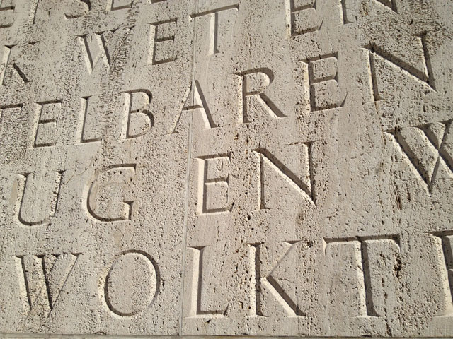
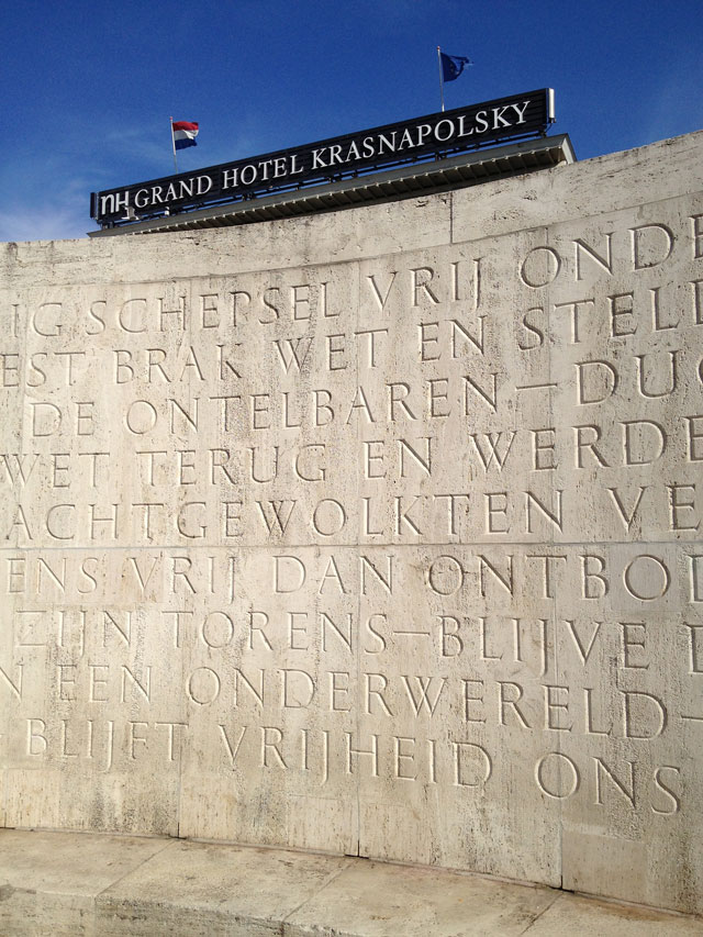
The most visual typographic aspect of the monument is however that third inscription, on the front side of the wall. It’s a Dutch poem, written by the Dutch poet Roland Holst. What you maybe couldn’t have imagined back then, is that the monument is currently mostly a popular hangout for stoned, foreign tourists. And they cannot read this text because it’s in Dutch. But don’t worry, the text is so abstract and contemplative that Dutch people also don’t have a clue what it is about. Doesn’t matter either.
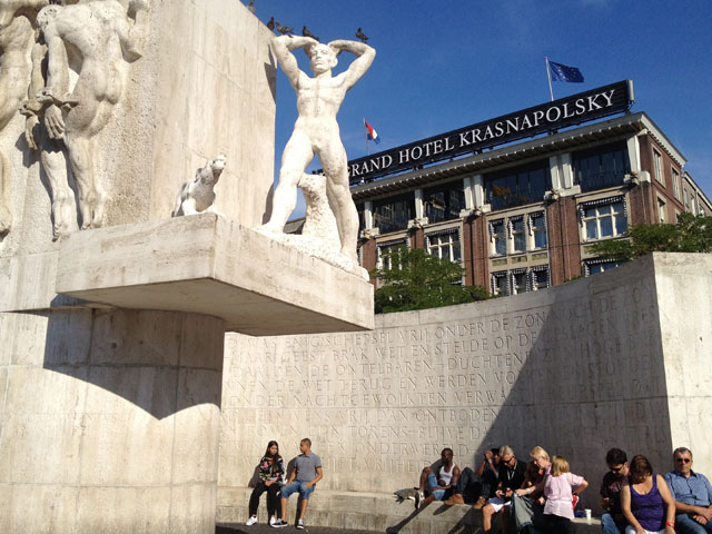
You will be appalled by the news that the monument needed a couple of thorough renovations during the past 50 years, just because the wrong stone was chosen. Italian travertin can’t stand the Dutch weather. Bitter, especially because the previous monument on that location had to be removed in 1914 because of its bad condition. Frost and rain heavily affected that monument, which caused limbs breaking off. Not much learned from history apparently. The renovations of the National Monument now turned your nice inscription into a patchwork quilt, but hey, c’est la vie.
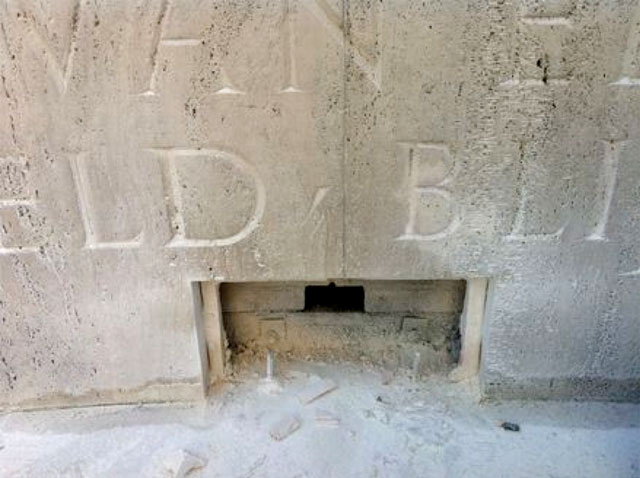
Most recent renovation of the monument, 2012.
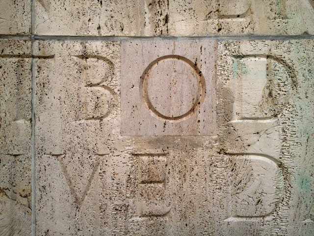
In first instance your inscription looks marvelous, perfect to every detail, beautiful letter shapes and even a nice use of the comma. By putting the comma halfway the letter height, it echoes classic Roman inter-points. Romans didn’t space words, but used inter-points instead. A word separator which was usually a triangle, just like your comma. C’est génial!
But now comes the thing which strikes me, and I’m still not sure if I figured it out yet. Although the making of this monument took several years, there was a lack of time for designing this large inscription. You preferred to design all texts as a whole, but you estimated it would take you three months (!) for just this wall. I will think of that next time I’m designing a poster on my computer under a tight deadline. Three months for drawing the complete text as a whole, the schedule did not allow this. So instead you designed all 24 letters for the inscription on a 100% scale, and you also made a much smaller scale model on card board to arrange and space the complete text. The stonecutter created stencils based on your drawings, and used those stencils to draw the letters with a pencil on the large stones.
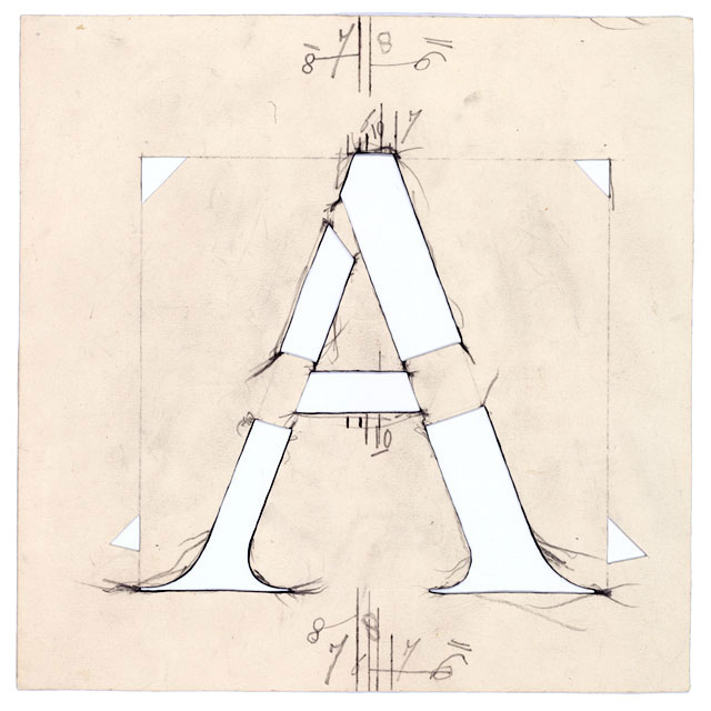
Stencil used by stonecutter Veldheer © Bijzondere Collecties, Universiteit van Amsterdam.
I think you already decided beforehand that the letters on the large wall needed to have a height of at least 15 cm to be readable from a distance. You eventually made them 18 cm on this wall. You also defined – I assume together with Oud? – that you wanted the text to completely cover the wall, without any margins on top, bottom, left or right side. The wall itself is pretty big, almost 14 x 3 meters. It must have been a big puzzle for you to figure out this design. Oh boy, if you only had a computer to assist you. The wall is horizontally divided in the middle by a prominent joint. Your calculation and sketch ended up with 5 lines of text on the top half, and 5 lines on the bottom half, full justified text. The joint ending up exactly in the middle of the monumental lettering. Nice. Based on this idea you calculated an approximate number of letters and asked the poet to write a text of that length. After all this math the text would for sure fit perfectly on the wall.
Even though it was you who suggested to ask the Dutch poet Roland Holst to write a poem for the inscription, I think you quickly started to regret that choice. The poet misunderstood your approximate number of letters, by thinking that you also counted word spaces. Which you didn’t. His text turned out to be much shorter than you estimated. Only 548 letters instead of the 650 to 660 (including word spaces) you hoped for, if I’m right. Mmm… ne pas savoir sur quel pied danser. Damn poets, they leave the problems for designers to solve them.
Suddenly you were confronted with a problem to still design a perfectly symmetric inscription, but with a much shorter text. You could have enlarged the letters for example to compensate the lack of letters, or modify the spacing to still fill the complete wall from top to bottom, or create margins, or come up with another solution. Mais… c’est l’heure de pointe… maybe you didn’t have time for that? It also wasn’t very helpful that the architect changed the size of the wall ten months before the unveiling, and still demanded a monumental, symmetric inscription with five lines above as well as below the joint. You probably remember your nightmares when he did so. But we know you are the ultimate perfectionist Jan, you must have been able to find a better solution than sticking to your original design. As a seasoned type designer you could have come up with something else, something better for this new, unexpected situation. You, the purist pur sang. ‘The man hard to satisfy’. Pedantry tattooed on your brain. Qu’est ce qui ce passe? You always refuse to accept any standard short of perfection. Was this the first time in your life you accepted a less than perfect result? Now you ended up with 5 lines of text on the top half, and only 4 on the bottom half. Gone is the monumental symmetry. Leaving a massive white space at the bottom of the monument. Why Jan, why?
vriendelijke groet,
Bas Jacobs
[Once my mind got stuck on this oddity, it was easy to figure out what happened during the creation of the monument because many original drawings, other materials and correspondence are preserved at the Special Collections of the University Library of Amsterdam. After this material was (re-)discovered some years ago, Jos Biemans wrote an excellent article in the 103th yearbook of Amstelodamum about the cooperation between Oud & Van Krimpen. There are many other well documented publications on the monument too. Also useful were various helpful public servants of the city council, willing to share their knowledge. French kiss for Amsterdam.]