27 april 2017 — read more
How Bello became the typeface of protest
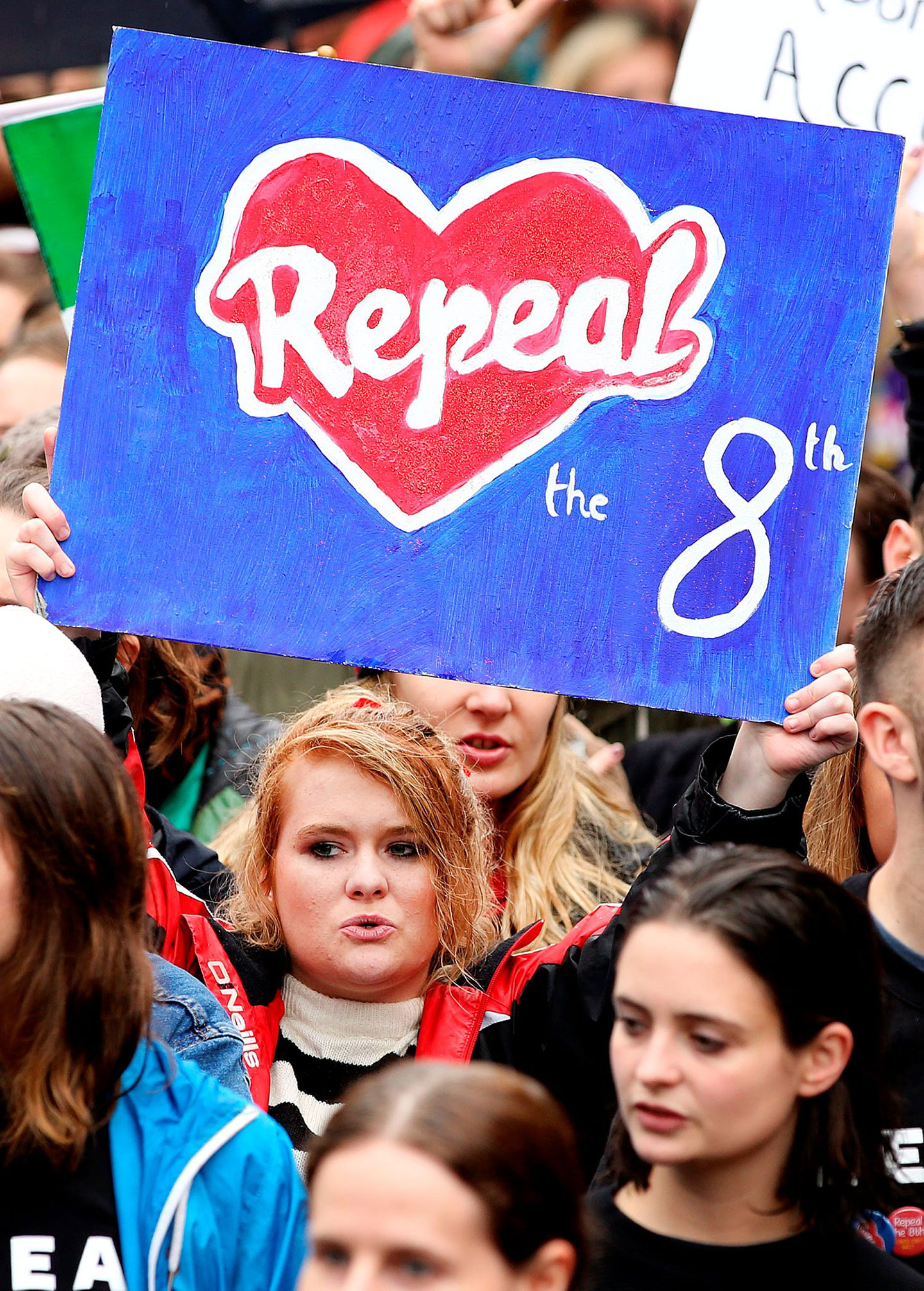
The associations a font has and the emotions it can evoke, are culturally defined. They change through time, vary around the world, and sometimes vary from one country to another. Recently our typeface Bello became associated with politically progressive movements in Ireland. The reason why this happened has been described by Robin Fuller in this article in the Dublin InQuirer: How Bello Became The Typeface Of Protest.
© photo Gerry Mooney
19 february 2015 — read more
The making of Tripper
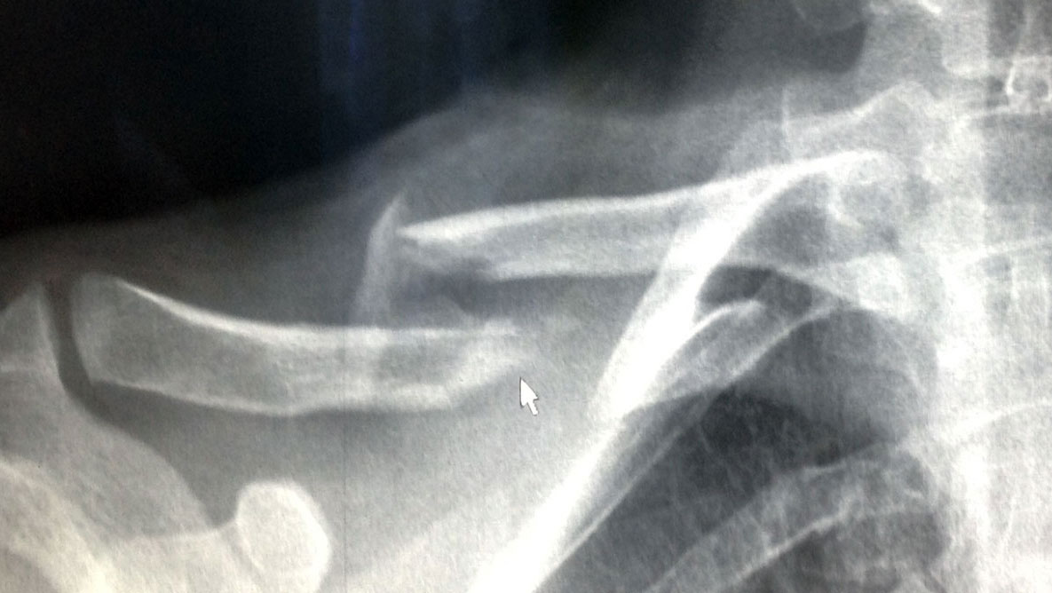
The making of Tripper: the story of an accident
This typeface came about by accident. It all started with an accident too, when Bas – unluckily – fell out of a tree. He was strapped to a stretcher and transported by ambulance to the hospital, where he heard the good news: it was ‘just’ a broken collarbone. Could have been worse. Unluckily for him, it was his right arm. Being right-handed and an avid sketch artist, well… it’s a disaster if you can’t use your favourite hand anymore.
26 november 2014 — read more
Notes on Underware Latin Plus
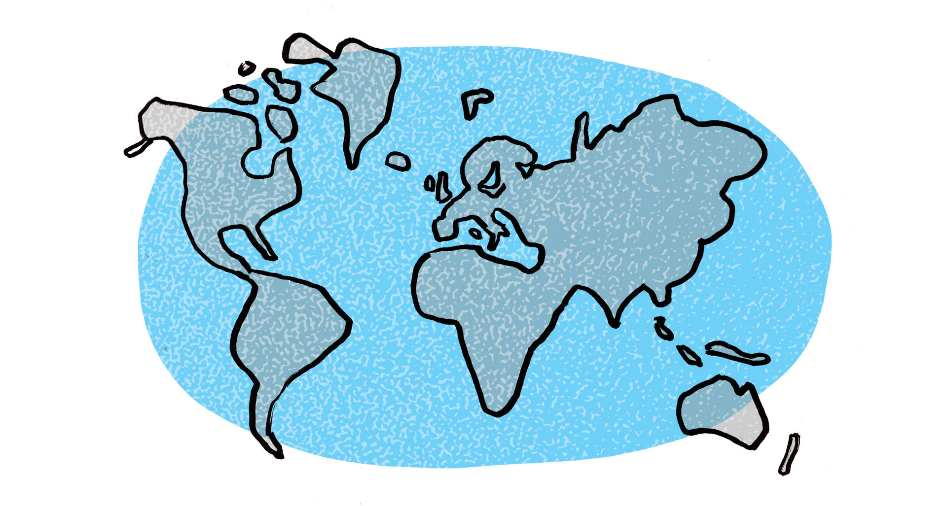
Recently we introduced Latin Plus, which is at the heart of our production line. Everything we do is based around this standard. Not only all our fonts, but also some upcoming tools are based on this touchstone. Because you’ll encounter this term more often in the future, here is the background story of Latin Plus and its languages.
Interested in how the overview was constructed, orthographic troubles, native speakers and local culture? Make a coffee, and read the story behind Latin Plus in the case-study Notes on Latin Plus.
07 october 2013 — read more
Letter to Jan van Krimpen
Amsterdam, 07 October 2013
Dear Jan,
I should have probably saluted you with ‘Dear Mr. Van Krimpen’, but since you are dead anyway it doesn’t really matter. There is one question I would like to ask you, although I realize I’m 55 years too late.
First I’ve got some news for you. This year’s ATypI conference will take place in the Krasnapolsky hotel, at the Dam Square in Amsterdam. You would have loved to be there, enjoying heated discussions with many of our colleagues. Not sure whether you remember ATypI, because it was founded one year before your death: a Freemasonry for typophiles. It would probably (secretly?) have filled you with pride that the National Monument is in front of the conference venue. All our colleagues and friends who come to the ATypI conference this year cannot avoid this monument which carries your lettering. So despite your death, you are still guarding all of us coming week. That’s a nice feeling.

National Monument. Krasnapolsky hotel on the right side. © Stadsarchief Amsterdam
06 september 2012 — read more
Just imagine…
How often has been asked: what is design? And how often was the answer solving problems? The idea that designers are problem solvers was taught in the 90s at art academies throughout Europe. But designers should not just be looking for solutions. They should at least be looking for new solutions. So they have to come up with new ideas. But how do you come up with new ideas? Not by going from A straight to B, where B is your final destination. Just look at airline logos, how many times didn’t that end up with a bird? Countless times. They all solved their problem. Original? No. Does it work? Yes, problem solved. But is this what design should be? No.
(more…)
15 july 2011 — read more
Therefore I like tattoos

11 october 2010 — read more
Let’s fuck up the Caribbean guilder
Design the new Caribbean guilder symbol.
On 1 January 2012 Curaçao and St. Maarten (since yesterday 2 islands of the former Netherlands Antilles) will introduce the new Caribbean guilder as their national currency. This new currency needs a new symbol. In recent years there have been some new monetary symbols introduced. Most notably the Euro in 1996, Hryvnia in 2004, Rupee in 2010. This has shown that the introduction of a new currency symbol is a delicate moment. Fingers crossed. Let’s wait till the first committee fucks up the introduction of the new Caribbean guilder symbol.
If the government doesn’t manage to introduce a successful monetary symbol for its new currency, people will just write the currency at length (eg. 24,50 Cmg). Honestly, how often do Europeans still write (by hand!) 24,50 Euro instead of €24,50 just to avoid confusion?
Current fashion could quickly cause that the new currency symbol would look like “something + 1 or 2 horizontal bars”. But is that really necessary? Here is a sketch of a combined ‘c’ (caribbean) with a ‘ƒ’ (florin):

But even more important: whatever it looks like, you have to able to write this new symbol with your big toe in the sand (ũ Kurt Weidemann). Rough, small, quick and dirty, the symbol should survive. Even when written by a local barkeeper on the back of a beer mat, drunk as he is:

Hopefully this issue will draw enough attention, despite of the fact there are substantially less users of this currency than the Rupee. How predictable will it be? Let’s wait till the new official committee meets for the first time (men only). Let’s wait for the public contest of the authorities. Let’s wait for the shadow-contests of typophiles, wait for @fontblog’s call for submissions, wait for type designers’ comments in international media, wait for the offical presentation followed by tons of critique. And then let’s wait for the moment we discovered we could have done better.
Kuantu e ta kosta? See you in 2012.