29 september 2016 — walhalla
There we go
Yesterday Ben Mitchell wondered if there are examples of nice manicules which are drawn in the same style as the rest of the font.
Wanted: examples of typefaces with exceptionally nice manucules drawn in keeping with the style of the letters.
— Ben Mitchell (@OhBendy) September 28, 2016
What many people don’t know, because it’s not easy to spot, is that many type designers enjoy refining many details of their fonts. For example by creating manicules which fit to the style of a font family. A special pointing hand allows extravaganza typographic subtleties in your book, website, identity or whatever you are making.
Also our fonts are equipped with matching pointing fingers. Because we enjoy drawing them, this is a nice moment to put them in the spotlights. No manicule is the same, or even close to being similar. Because no font is the same either.
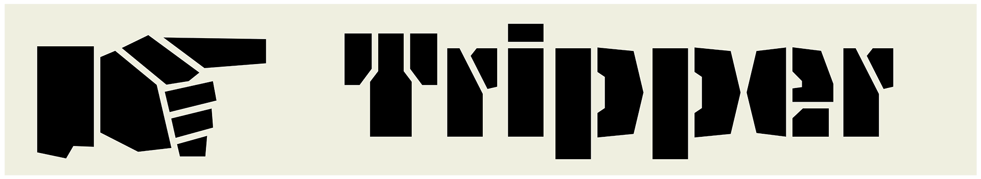
The sturdy stencil font Tripper has a sturdy stencil index:
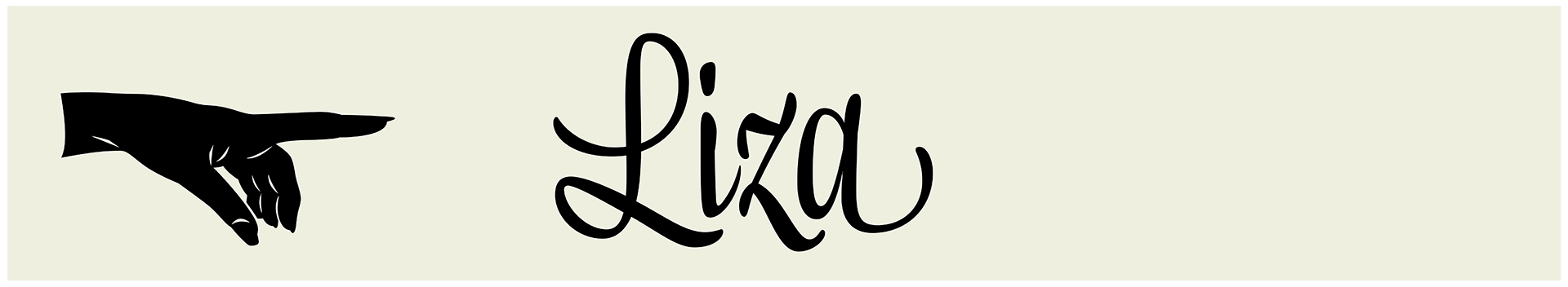
The female hand is clearly visible in Liza:
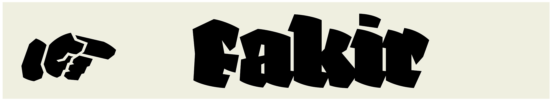
Fakir’s manicules are as edgy as the black letters themselves:
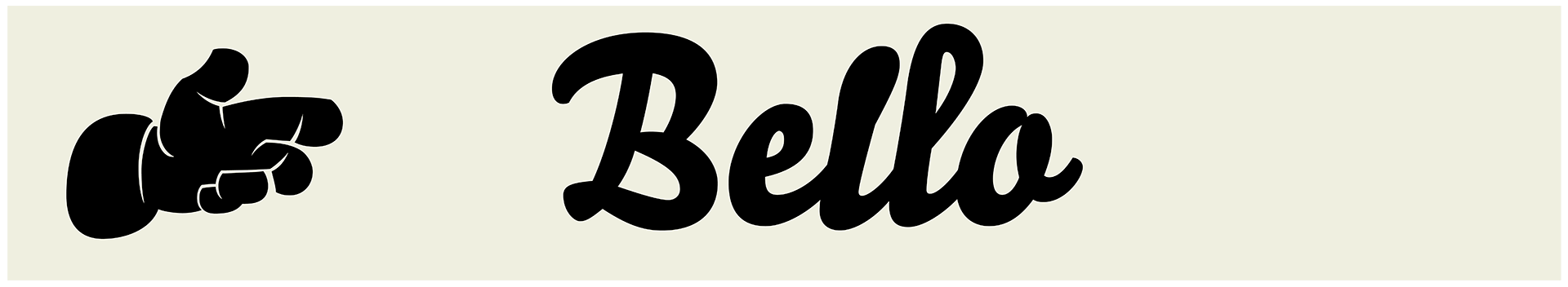
Bello & Sauna are typographic mates, and share manicules: