09 may 2025 — publications
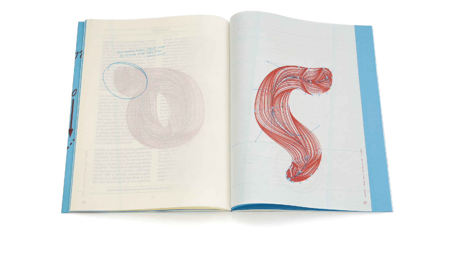
New publication: Time to play
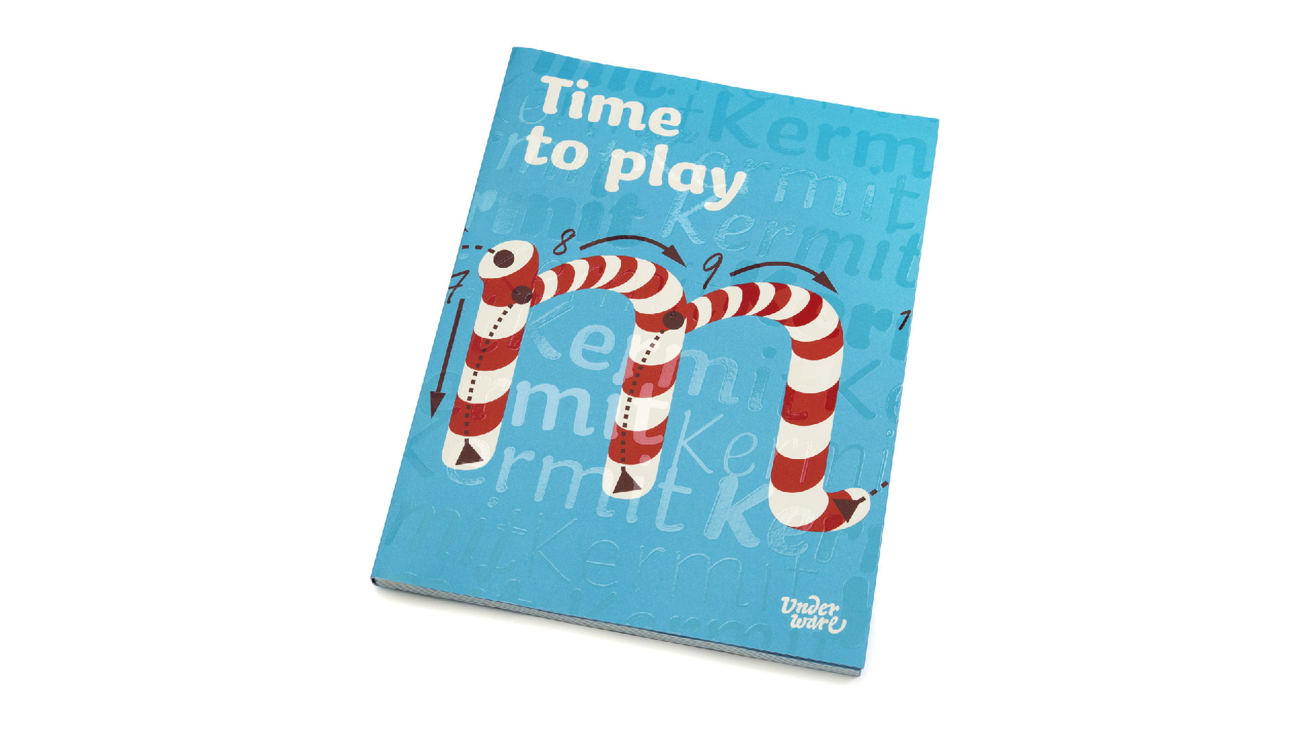
We are pleased to announce a new publication: Time to play. This publication focuses on the font Kermit, which we designed for Microsoft. This font was developed for kids, so it makes sense that this publication has a playful approach. In addition, Kermit is a writable font, with the time dimension designed and added to the font, which functions best if a play button is incorporated in the interface. In short: it’s time to play.
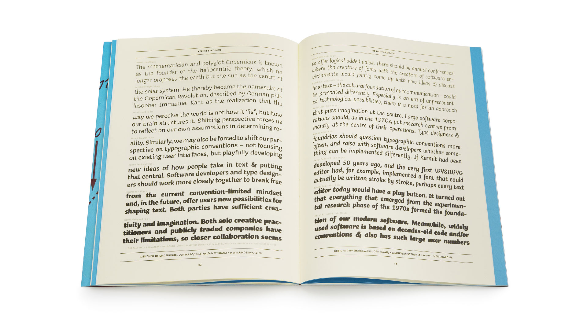
The publication consists of 3 different parts: an editorial where 3 articles place the genesis of Kermit in the context of historical and contemporary typographic developments. The articles are written by Rob McKaughan (Microsoft), Underware and Gerry Leonidas. In addition, there is a second section consisting of a traditional type specimen of the Kermit family. And there is a third part consisting of grammatographic anatomical illustrations. Each section is printed on a different type of paper, and these 120 pages are playfully mixed together by means of a clever imposition scheme. The whole edition was printed in 4 PMS colours, the cover fitted with an extra glossy silkscreen print, and all this was finished by means of a Swiss binding. You want to feel this tactile tickles in your hands. We have spared no expense to make this a playful publication.
The publication Time to play can be ordered from today via our website.
11 april 2023 — publications
New publication: Why doesn’t anyone ever tell me anything?
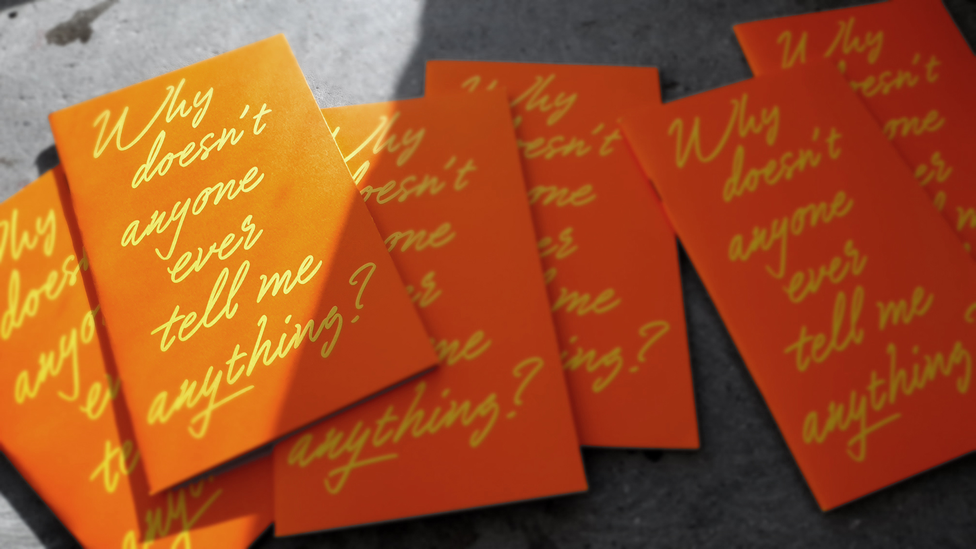
In the past 5 years we have written and published some small booklets of the same size (11,5 x 19 cm). Mostly such a booklet accompanies a certain lecture. The booklet is an extension of that lecture, or telling the story of the lecture in a different way, and is distributed after the lecture to the audience. The booklets are easier to understand by those who have attended the lecture, but are certainly not limited to just this audience.
The pandemic threw a spanner in the works for the publication of these booklets. For some years, there were hardly any in-person lectures, so no corresponding printed materials either. But last year we produced another publication in the same series again (From Typography to Grammatography, PMS 309) for our lecture Homo Scriptus at the Printemps de la Typographie conference in Paris. (We did make other printed material outside this series during that period, like the Manicule specimen or the Plakato stencil set)
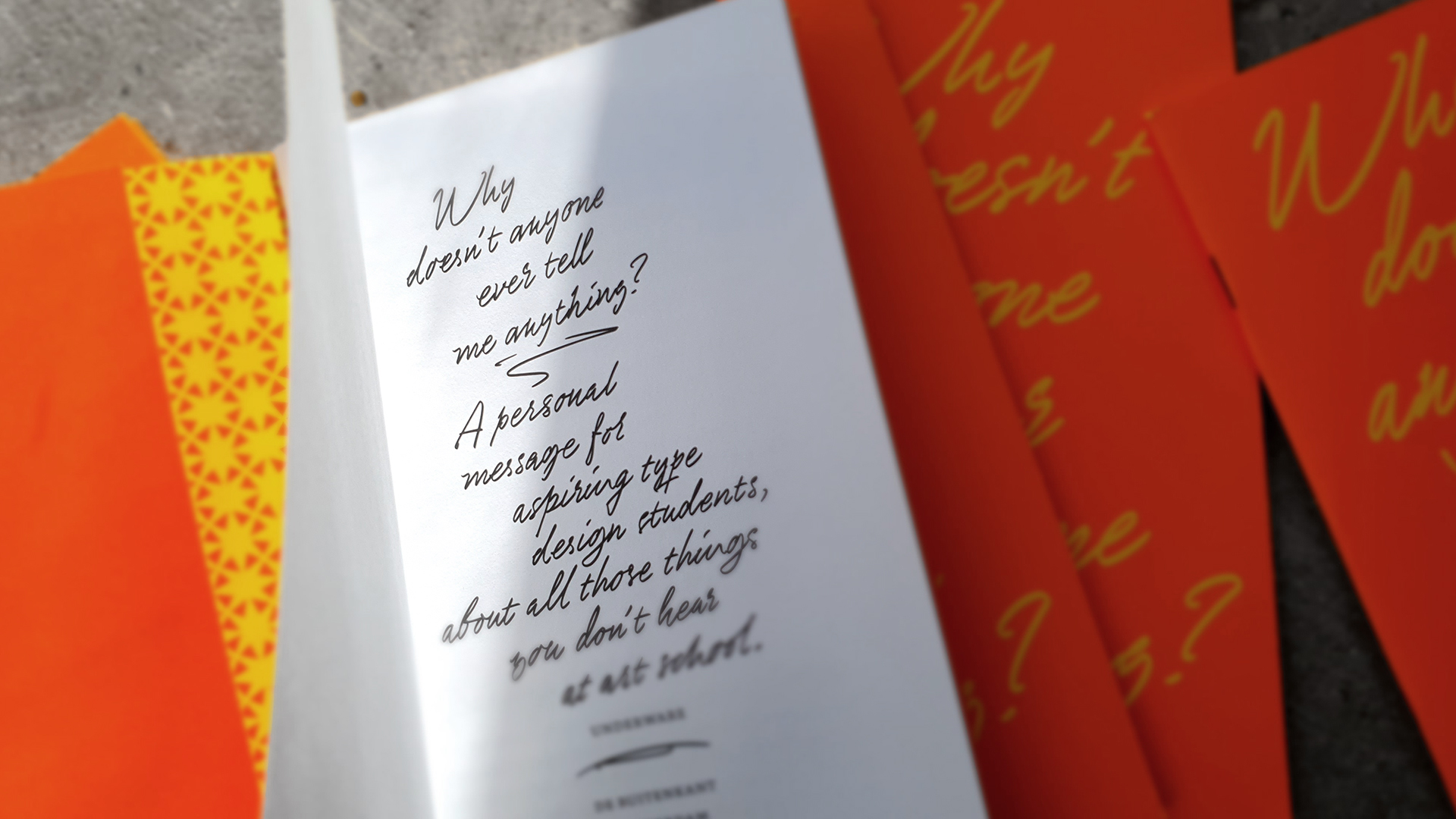
Why doesn’t anyone ever tell me anything?
This year saw the publication of the 10th volume in this series. The publication ‘Why doesn’t anybody ever tell me anything’ is aimed at type design students, and was published on the occasion of some of the educational activities we are undertaking this year. These include Sami teaching a type design workshop in Barcelona this summer (Signature moves, registration has just opened!), and Bas being an external jury at L’École supérieure d’art et de design in Amiens, or giving a type crit at Type Paris. We thought this would be a great opportunity to touch on some aspects of the practice of type design that are not always the first to be addressed, by writing a letter to aspiring type design students that contains lots of questions. This publication was published in collaboration with Uitgeverij de Buitenkant, and is therefore not limited to type design students of our workshops, but also available in regular bookshops.
▶ Why doesn’t anyone ever tell me anything?
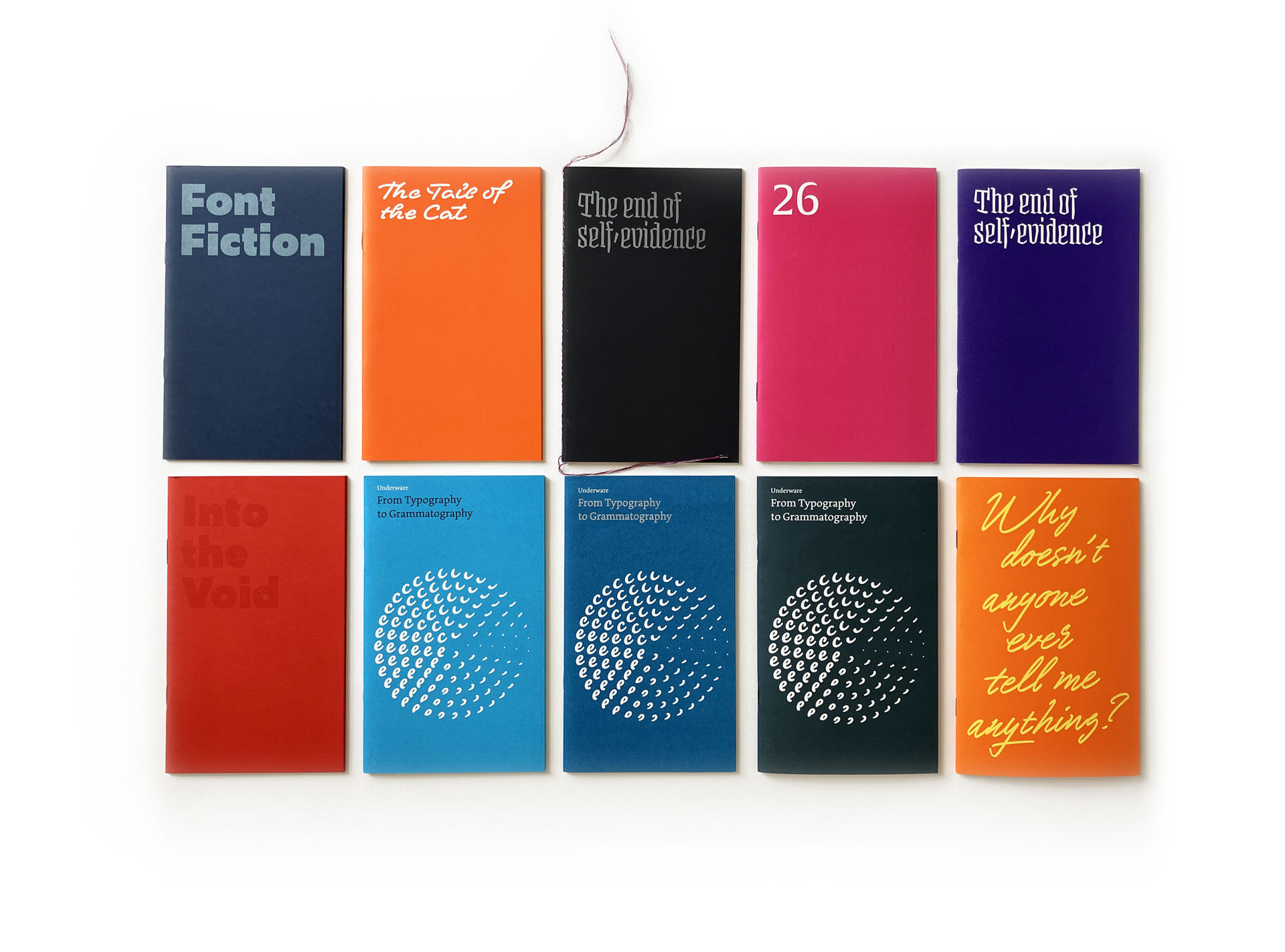
Overview of 10 booklets, from left top to right bottom:
Font Fiction (Berlin, 2018)
The Tail of the Cat (Berlin, 2018)
The end of self-evidence, black (Paris, 2019)
26 (Amsterdam, 2019)
The end of self-evidence, purple (Münich, 2018)
Into the Void (Berlin, 2019)
From Typography to Grammatography, PMS 306 (Patras, 2019)
From Typography to Grammatography, PMS 307 (Tokyo, 2019)
From Typography to Grammatography, PMS 309 (Paris, 2022)
Why doesn’t anybody ever tell me anything (Den Haag, 2023)
25 november 2022 — publications
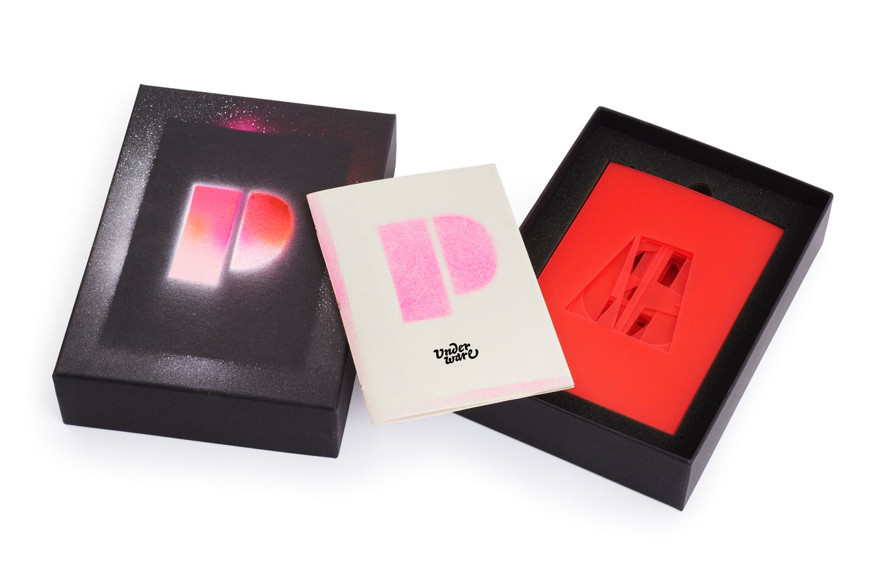
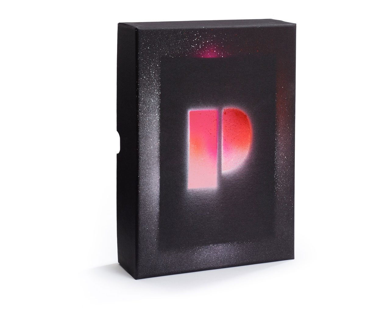
Plakato stencil set deluxe
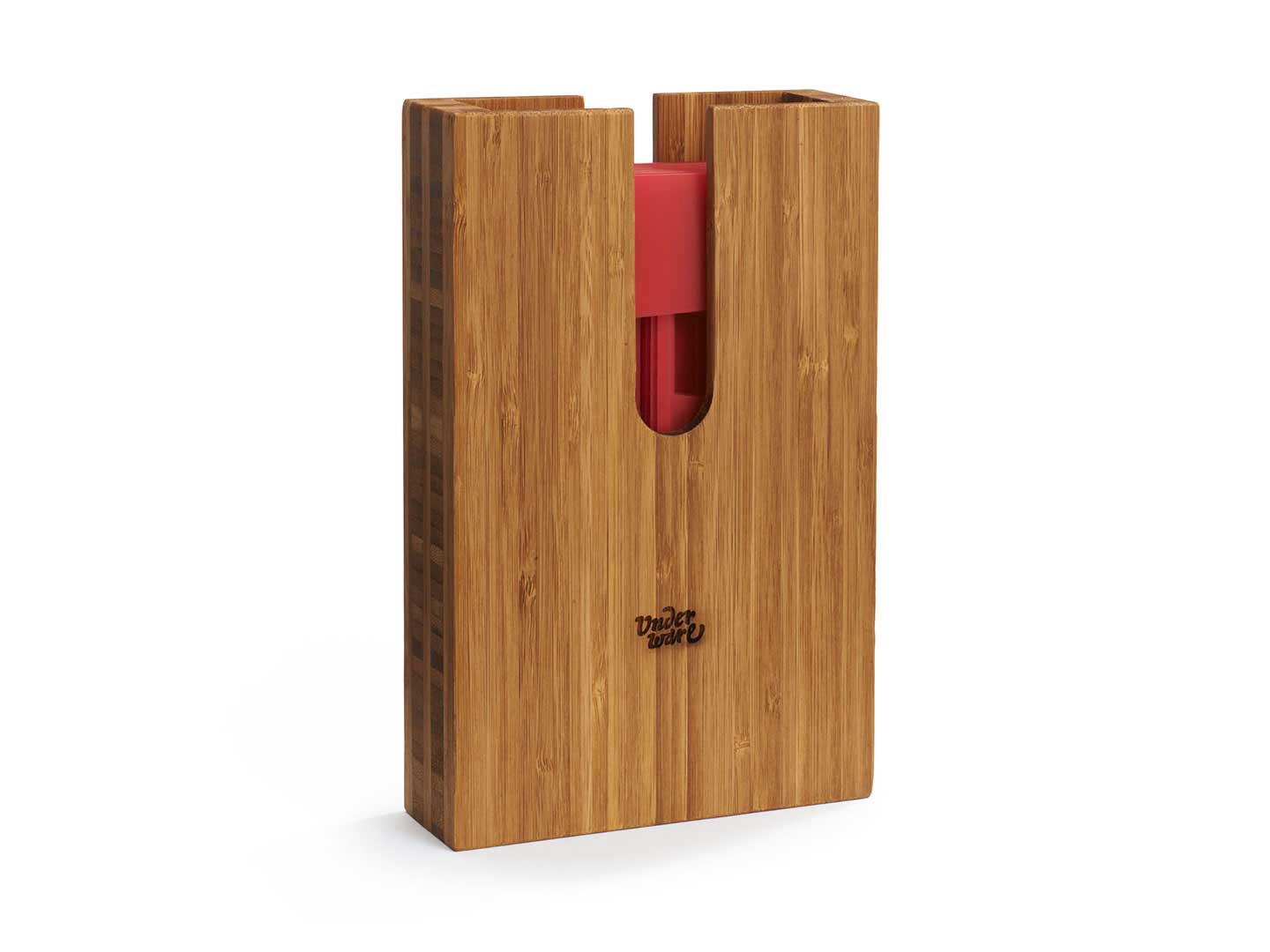
Three months after publishing the Plakato stencil set, we’re happy to publish a limited edition version of the same stencil set. The Plakato stencil set deluxe comes in a wooden box, handmade by Studio Baak in the Netherlands. These limited edition boxes have the same content as the regular stencil set: 40 separate stencils (A-Z 0-9 & ? ! ↑) and a RISO printed booklet in Plakato style.
If you want to spread your words in Plakato style with a box in 😎-style, check out the Plakato stencil set deluxe.
30 august 2022 — publications
Plakato stencil set
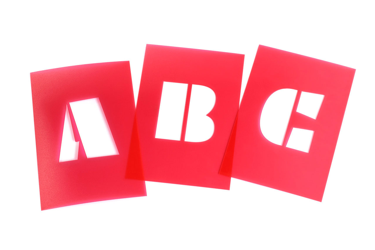
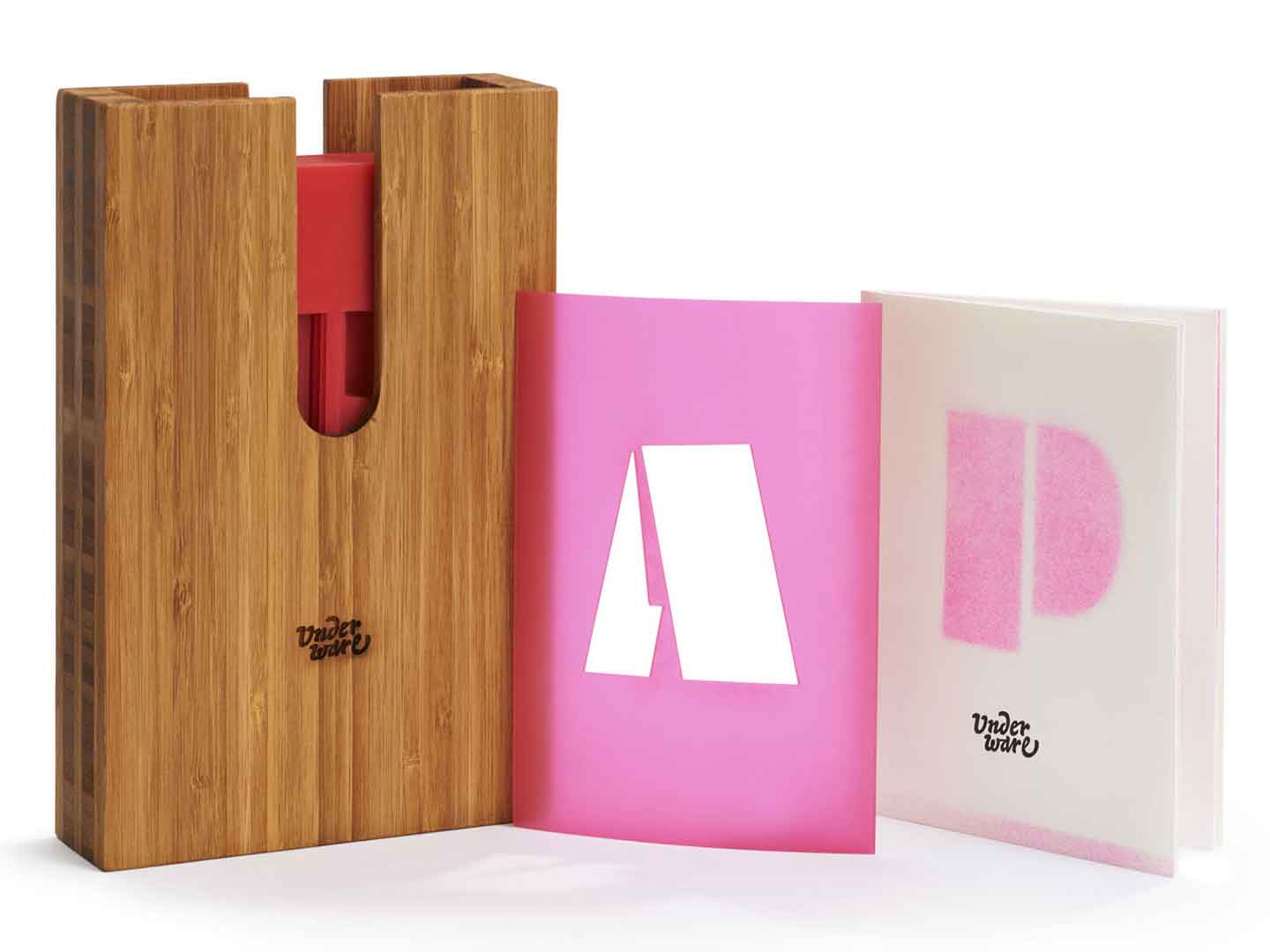
In the year 2022, printed type specimens are no longer a matter of course. But print has other specific qualities that a digital type specimen cannot have, and besides, it brings us great pleasure to make it. Earlier this year we made the Manicule Specimen, a printed publication which contains an overview of various fonts from our catalogue. A printed type specimen of the Plakato typeface family, however, requires a specific approach, one that is quite obvious. There is only one way to present a stencil typeface properly: with a stencil set.
Stencils are a fantastic way of producing visuals. With Plakato you can print out your text, and just cut it out of paper, cardboard, or any other material you prefer. Get your spray can, paint, brushes or any other tool you prefer. We always prefer spray cans because they are the fastest way to write a text with a stencil. Last week, for example, we hand-sprayed all the posters for the BuitenBios, the open-air cinema on the roof terrace of our Amsterdam studio, in Plakato style. Those posters used a custom-made stencil, but sometimes you just want to put your own message on something quickly. Prefabricated stencil letters are perfect for that.
That is why we are pleased to present the Plakato Stencil Set today. It is a physical type specimen and utensil in one. This stencil set, consisting of 40 separate stencils (A-Z 0-9 & ? ! ↑), comes in a customized box and is accompanied by a dedicated booklet in Plakato style. The booklet has a simple message: get your hands dirty and don’t let this stencil set become your typographic Japanese Senseo machine. The pamphlet stitched booklet, which is RISO printed, and the Plakato stencils are packed together in a sturdy box, and now available for a bargain. Spread your message in style with the Plakato stencil set!
19 january 2022 — publications
New publication: Manicule specimen
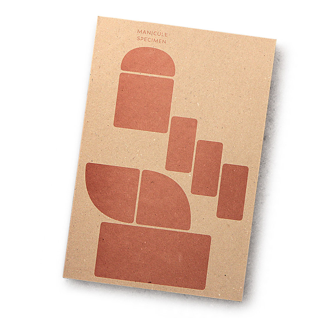
It’s been a well-kept secret, but we often design specific 👉 manicules to fit the style of a typeface and include those in our fonts. Those pointing hands are the subject of a small publication.
This month we hooked up with publishing house De Buitenkant, drukkerij Jan de Jong & zetterij Chang Chi Lan-Ying, for a Copper Monday print (a Dutch printing tradition) and made a Manicule specimen (Dutch title is ‘Handjesproef’ 😘).
This illustrated essay on the manicule, which briefly tells its transition from the margins of 12th century books up to the vaults of contemporary typefaces, brings our love for carefully designed manicules in the open. This publication is therefore not a type specimen, but rather a manicule specimen, in which each manicule is presented in combination with the typeface to which it belongs.
This publication is not for sale, but if you want to obtain a copy, join our raffle.
03 december 2021 — publications
The dynamification of typography
Because Plakato, our latest font release, consists of a set of static as well as a collection of dynamic fonts, this is a suitable moment to reflect on changes in the practice of a type designer. Accompanied with videos of dynamic versions of Plakato, this case study touches the question if the dynamics of a design should be defined by the user or by its creator, and what it means that type became dynamic.
Read the case study: The dynamification of typography.
15 november 2019 — publications
26
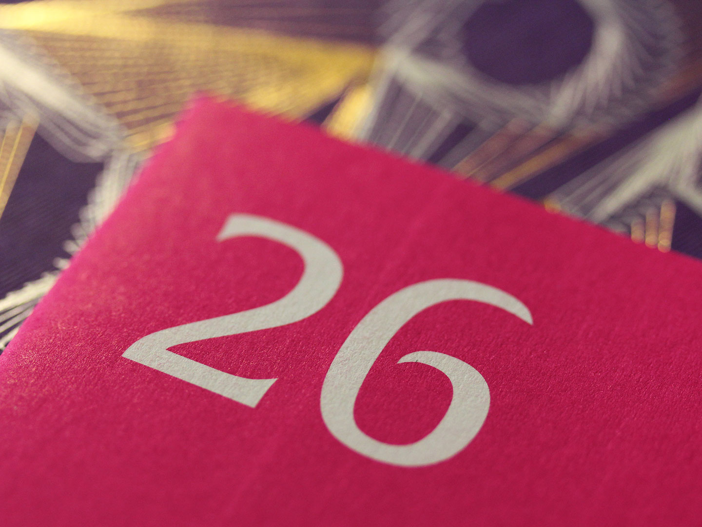
The publication 26 is a speculative 26th chapter of the book Theory of Type Design by Gerard Unger (22 Jan 1942-23 Nov 2018). Despite that the number 26 will always remain a benchmark in the Latin type world, Unger’s book about those Latin letters only consists out of 25 chapters. As Gerry Leonidas describes it in his foreword, Unger’s book “offers a reference point for the design community to respond to, and, not least, for other authors to contribute further.” So did Gerard Unger deliberately not include a 26th chapter? Is this book actually a request for other type designers to respond to? Can Unger’s choice for writing 25 chapters be regarded as an open invitation for anybody to write their own version of the missing 26th chapter themselves? We hope to read many 26th chapters by other type designers in the future, which will keep Unger’s spirit of writing on type design alive. Bring on the responses. Our 26th chapter is this publication.
The text in this publication is an elaboration of the talk Underware held during the book presentation on 6 September 2018 at the Nieuwe Instituut in Rotterdam. 26 was written and published by Underware on the occasion of TypeAmsterdam 2019.
Win a free copy!
We’re giving away 26 copies of the publication 26. For free! And we really mean “free” as in free. No hidden meanings, which is almost an exception these days. We’ll randomly pick 26 addresses from those who apply, and then we’ll ship the publication for free. This publication is not for sale. With other words: this is your only chance.
If you want to participate in this raffle and win a free copy of this publication, make sure you send your name & full postal address before 22 November 2019 to info@underware.nl and mention “I wanna win 26!”. Winners will be notified before 1 December.
22 may 2018 — publications
The Tale of the Cat
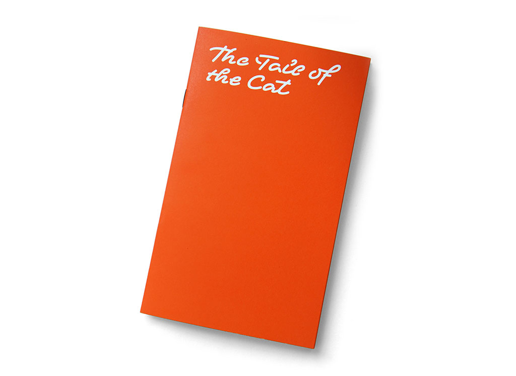
Written words always exist within the three dimensions of the maker (the type designer), the user (the designer) and the consumer (the reader). But what does it mean to be a type-maker, -user or -consumer? How is language working anyway? Together with Dutch composer Jacq Palinckx and writer Kees ’t Hart, we investigated into an expanded understanding of typography. Attendees of our lecture at the TYPO Berlin conference last Saturday, could afterwards continue to observe language with the publication The Tail of the Cat.
18 may 2018 — publications
Ten Commandments of Type
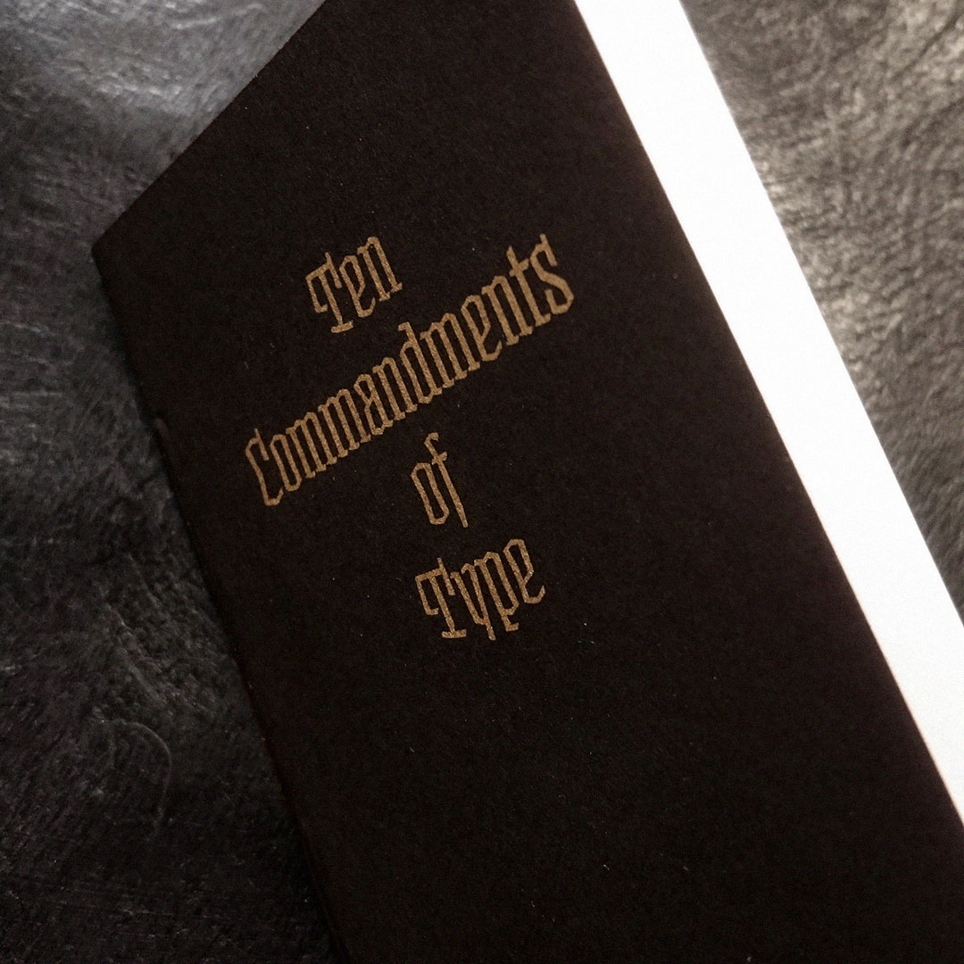
Do we still have shared beliefs? Last Sunday we gave a lecture at the All Eyes on Type Festival in Rotterdam. What to do on this very early Sunday morning, at a time when people used to go to church? We’re happy to see that it’s still possible to bring people together on Sunday morning. People who have shared beliefs and get together, luckily that still exists. So we were all in Rotterdam that day to celebrate type. Because all attendants belief in type. In a time when hand lettering became more popular than other religions, it’s important to reflect on the craft of making letters, and think about what we are actually doing. That Sunday we wanted to share some thoughts on how to communicate. Some thoughts on making letters. This service is a story in which we worked towards the ultimate celebration of type. Towards the end, everybody, every individual, received his own sacred typographic host. Because this is the only true way to celebrate something you, us, we all believe in. It became a service which was taking of with live organ music, and ended with a sacred host in the form of a tiny printed publication: Ten Commandments of Type.
14 april 2018 — publications
Font Fiction
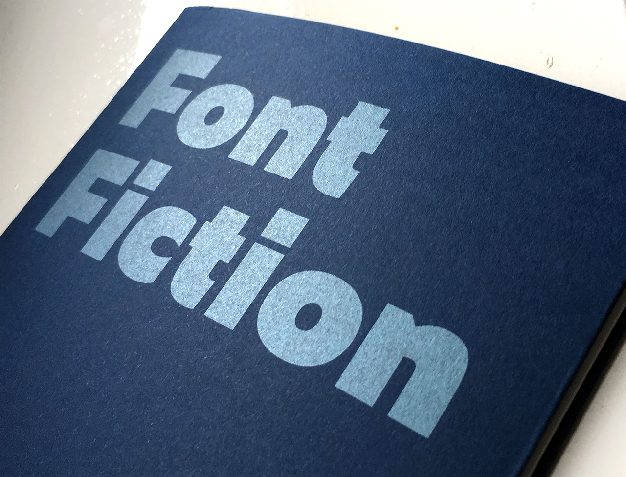
Ladies and gentlemen, may we introduce Font Fiction, tomorrow’s fonts designed today. Visitors of the TYPO Labs 2018 conference in Berlin received a – pretty future-proof – printed copy of this manifesto. The rest of the world can read it online at fontfiction.com.