30 january 2018 — walhalla
Behind Duos
Warning: this movie is longer than 15 seconds. Even longer than two minutes. And there is a good reason for this. Developing fonts is a tedious task, at least in our case. To give a certain clue of time: making Duos, our latest font release, took two more years than we originally planned. In case you are interested to see and hear what’s involved in making the font family Duos, just watch this presentation that Akiem and Bas held at ATypI Montreal. Thirty minutes of slow TV for a fast font.
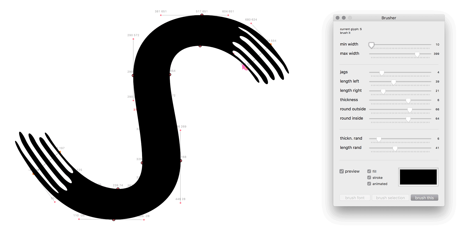
Prefer reading instead of watching? Only want to spend a few minutes instead of half an hour? Those people who are interested in ambiguous shapes, monolinear design problems, writing speeds or coding, will also enjoy reading the story behind Duos.
22 january 2018 — out now
New font: Duos
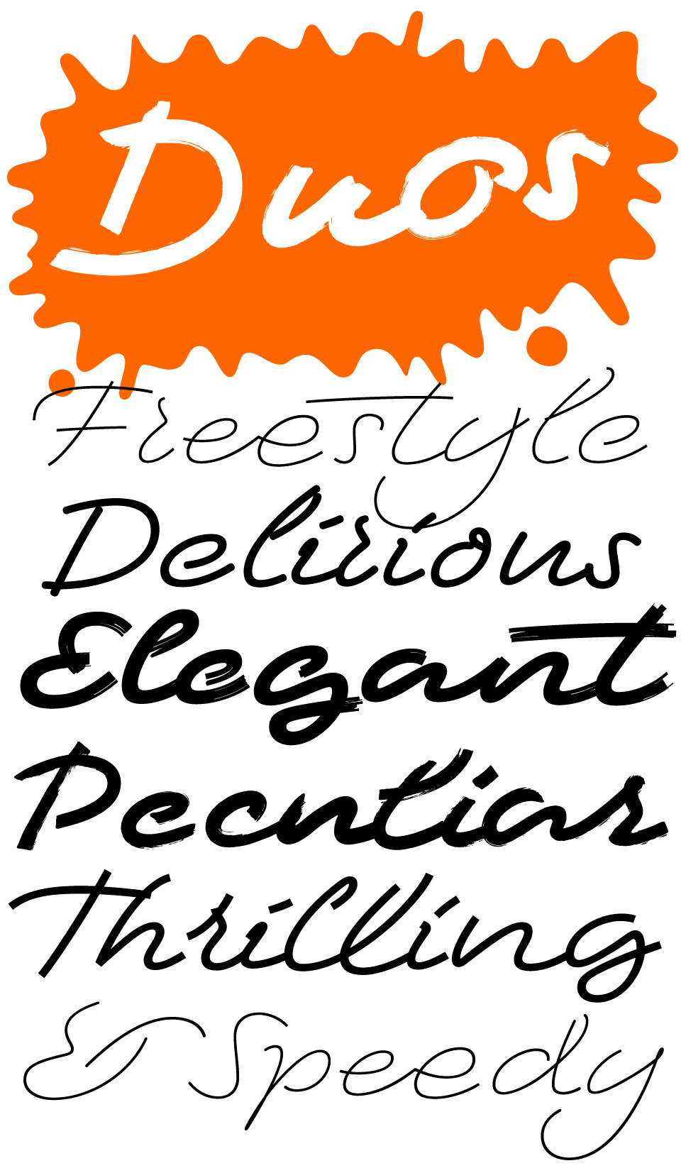
We’re happy to introduce Duos, a script for illusionists.
This small family of handwritten display fonts contains enough variation & imperfections to create a natural and casual appearance for texts. The light weights can be deployed when class and elegance is required. The black weights are more mutually divergent: rough brush strokes will bring across a different mood than delicate rounded strokes for example. Duos brings you a new typographic palette.
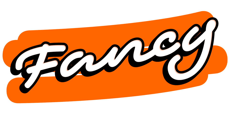
In Duos letters break apart, strokes are suddenly being cut, they crisscross, overlap, get loose. These strokes definitely enjoy their freedom. These oddities are intentional: handwriting ain’t perfect either. Nevertheless, the overall rhythm and carefully crafted connections keep this handwriting together. Every letter has many alternates, so every word can have dozens or hundreds of different appearances. Use the one you like the most, or just use the one which Duos thinks looks best. Fancy! As a final flourish, Duos let’s you play with ambiguous lettershapes, just like real handwriting.
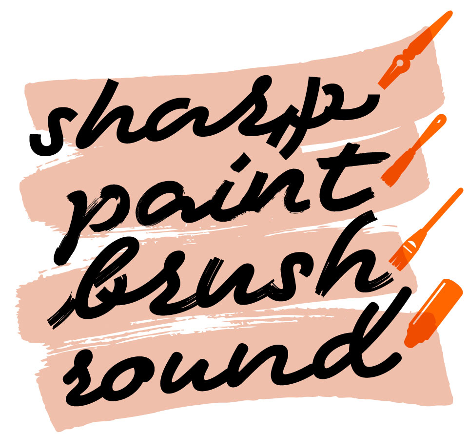
Duos is a small family of 10 eye-catching display fonts (4 styles, 3 weights) plus a bonus font which includes tools, icons, strokes and banners. The four different styles, caused by using different writing tools, offer distinct typographic voices. But whatever style of Duos you pick: apply this speedy monolinear handwriting font in large sizes, because it is made for catching the attention. Apply it short & big.
17 january 2018 — presentations
Brekend beeld
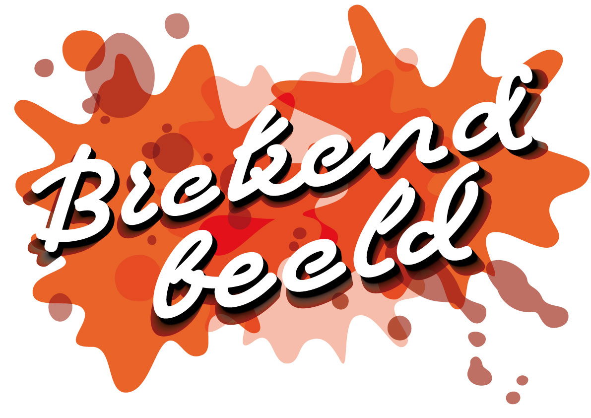
Tomorrow we’ll present and be present at Brekend beeld in Utrecht, the Netherlands. Nine inspiring thinkers and makers share their views on the current state of journalistic design. Brekend beeld promises to be an evening full of zeal, discussion and calls for action for the audience.
Participants are NRC, ACED, Grrr, Underware, PersgroepUX, de Correspondent, Cyanne van den Houten and Ted Struwer.
Date: 18 Januari 2018; 19:30 – 22:00
Location: Kapitaal, Utrecht, the Netherlands
Free entrance
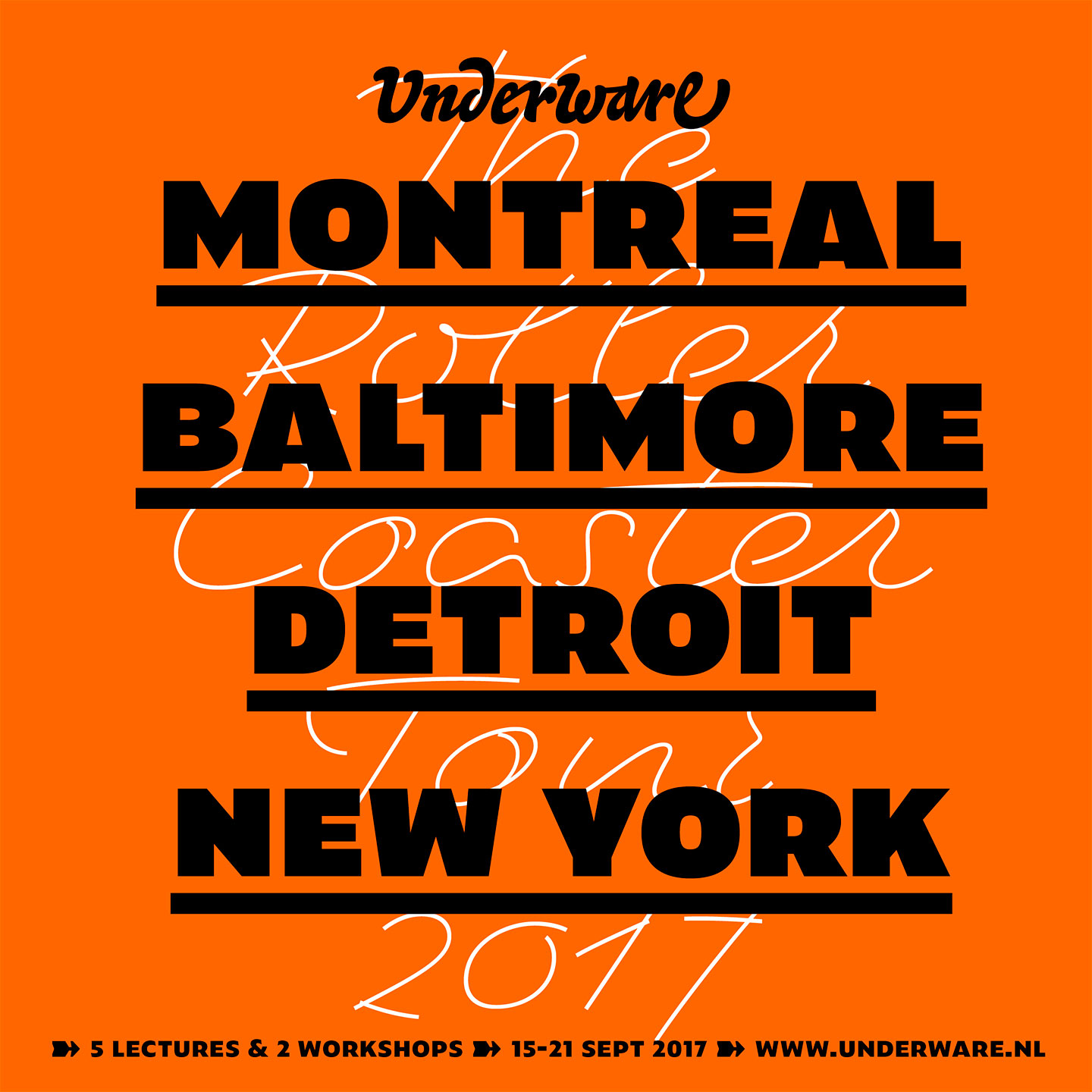
27 november 2017 — presentations
Duos Carnival Tour
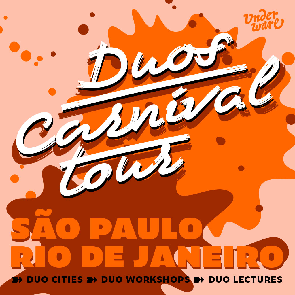
Because it takes 2 to tango, we’ll have 2 presentations in our upcoming trip to Brazil, in 2 different cities, and 2 workshops to complete the fun.
08 December
Workshop Variable Wonder No.1 at DiaTipo São Paulo, São Paulo, Brazil.
09 December
Lecture Duos Carnival at DiaTipo São Paulo, São Paulo, Brazil.
11 December
Workshop Variable Wonder No.2 at Miami Ad School, Rio de Janeiro, Brazil.
11 December
Lecture Duos Carnival at Miami Ad School, Rio de Janeiro, Brazil.
20 november 2017 — presentations
Berlin and Hildesheim
For an expanded notion of type, we’ve got two presentations in Germany this week:
23 November 2017; 14:00 o’clock
Lecture AENOT L at Exquisite Complexity, a seminar by Baruch Gottlieb at the UDK Berlin, Berlin, Germany. (Hardenbergerstr. 33, Room 110)
24 November 2017, 14:00 o’clock
Lecture AENOT S at Design-Zoom – Let’s talk about artificial intelligence!, HAWK Hildesheim, Germany. #DZ17
06 october 2017 — presentations
Bis bald. No ba.
Catch us the coming weeks in Germany and Poland. Next week we’ll be at HAW Hamburg (10 Oct), and the next day we’ll be the Hochschule in Wismar (11 Oct). At the end of the month we’ll do a workshop at Eugeniusz Geppert Academy of Art and Design in Wrocław in Poland (30 Oct). Our evening lecture will also be the end of the Wrocław Type Forum (30 Oct, 11:00 – 19:00), one day jam-packed with type. Join us if you’re around.
25 september 2017 — presentations
Underware reads from a newspaper
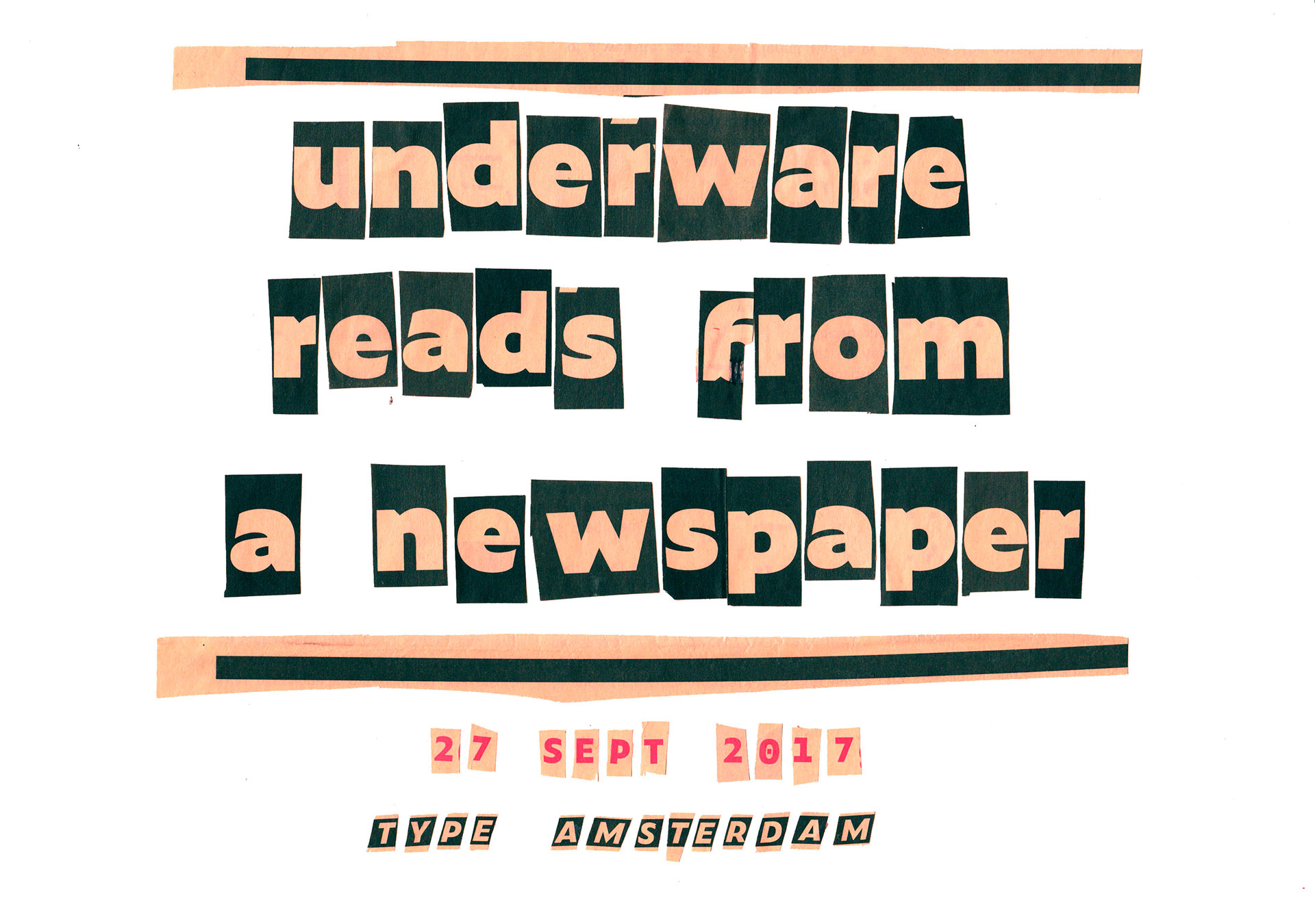
In two days, the 27th of Sept, we’ll read from a newspaper at Type Amsterdam. Other speakers include Rob Saunders (Letterform Archive), Liza Enebeis (Studio Dumbar), Janno Hahn, Pieter Boels (Antwerp Type Society) & Aleksandra Samulenkova, and hopefully Gerard Unger will also be present. Six short presentations about typography and type design in a compact afternoon. As this events always sells out quickly, tickets cannot be acquired anymore. But do sign up for their mailing list in case you don’t want to miss out on the next Type Amsterdam.
30 june 2017 — walhalla
ASCII TV
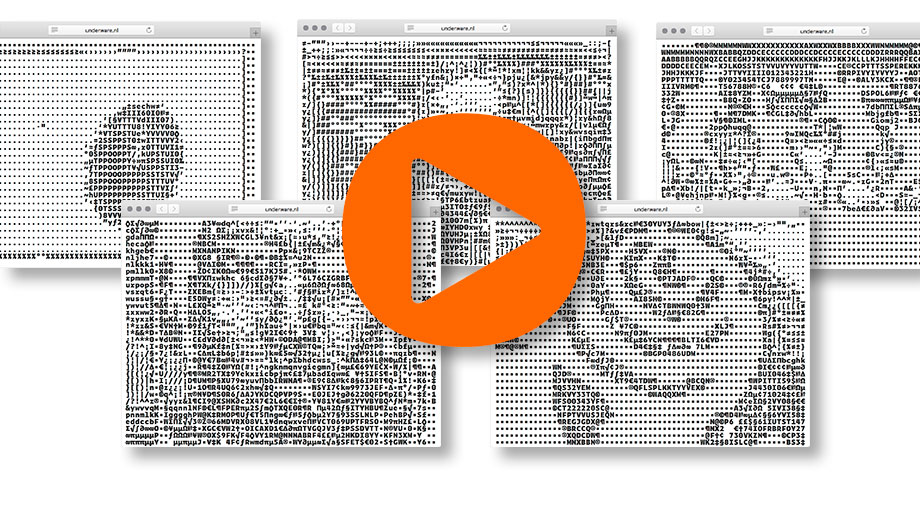
Today is the last day of our ASCII+ Week, celebrating the introduction of Zeitung Mono. Earlier this week we turned our homepage into Responsive ASCII and showed you Subpixel ASCII+ art. But we hear you saying: “yeah yeah, an ASCII website is nice, but we want ASCII movies!” So we give you ASCII movies. But then: Responsive ASCII movies of course.
Introducing ASCII TV
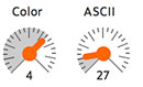
You can change the resolution by enlarging or reducing the window size, or by using the controllers. Also: change the color of the movie by varying between Light to Extrabold styles.
Get popcorn & drinks and enjoy your private responsive ASCII Movie Night. Please find a nice, personal selection of movies worth watching at Zeitung’s ASCII TV. More than enough for a satisfying movie evening with your friends. (If you like to see other movies in ASCII, let us know)
▶ ASCII TV
29 june 2017 — walhalla
Underware joins Type Network
We’re happy to announce that yesterday Underware joined Type Network, a group of independent type foundries and individual type designers. Let us explain why we think this is a good idea. The type world changed a lot in the past decade, and joining forces with kindred spirits is a good push in the right direction. For example, currently it ain’t always easy for some designers and other font users to find the right typeface. Not everybody takes the time to follow all font releases, make a list of personal favourite font foundries, or invest lots of time in selecting the right typeface for each project. And that ain’t always easy. It’s a jungle out there. Type Network can help to clear to that path. Visit one place, and find a limited selection of fonts, but with a range wide enough to meet the most versatile demands. We’re in great company at Type Network, the wheat is separated from the chaff, so you don’t have to worry to buy a pig in a poke. Besides, we know many of the people in and behind Type Network for many years, and they are good people. Or as the Dutch say “goed volk”. And for many more reasons we’re excited for this new adventure.