23 may 2023 — out now
Introducing Scribomat
")

Today Underware is happy to introduce Scribomat, making artificial writing accessible without any technological barrier.
What is Scribomat?
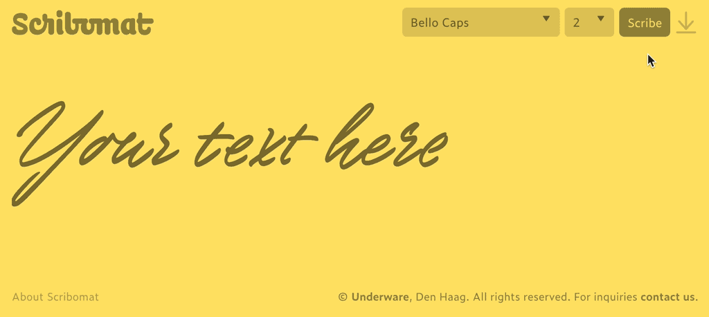
Scribomat, a platform for artificial writing, lets you scribe any text. Create your own animated text and simply download it. Type your own text, select style, press Enter (or click the Scribe button) and a written text is automatically generated for you. Voilà, as simple as that.
How does it work?
1: Type your own text
2: Select your style
3: Scribe
4: Download
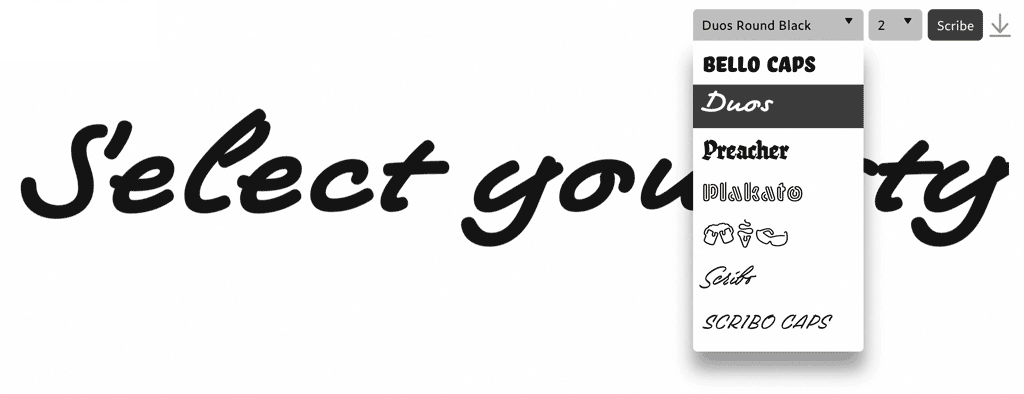
You can animate short texts, which can be downloaded in various formats. The animated SVG is available without registration, and supported by every browser. Just drag and drop, or embed the SVG like any other image. You can use these animations for evaluation purposes only, and request registration for additional download formats or commercial use. Of course the animated SVG is vector based, so it can be scaled and used in bigger sizes as well, and because it supports transparency the animated lettering can be put on top of a picture, movie or any other background.
You want more?
If you would like to animate longer pieces of texts, or use different colours, fonts, sizes, or writing speeds, just contact us: info@scribomat.com. There are much more possibilities with Scribomat, but the layout options in the public application were explicitly kept very simple to avoid any fuzz.
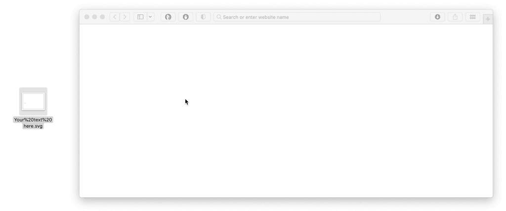
Simply drag and drop the downloaded SVG into a browser window.
Beyond the horizon
Scribomat, just like Grammato, raises awareness of contemporary typographic possibilities. Since the introduction of the variable font format, there are many more ways to work with dynamic text. These written animations, created with Underware’s patented technology and typefaces, are just one example. There will be more beyond the horizon.
Try yourself
Instead of reading about written texts, write your own text. Besides, better than watching the trembling animated GIFs (!) above, get the real, fluent experience by scribing your own texts at Scribomat.com
03 may 2023 — out now
New font: Scribo
We’re delighted to introduce Scribo. What started as a desire to really capture writing, ended up as a set of dynamic & static fonts that forced us to push our own boundaries. The dynamic fonts (Scribo Write) allow texts to be really written, as all the writing dynamics (stroke order, speed variations, etc.) are included in the digital font file! The static fonts (Scribo Pro) offer a wide range of handwriting styles, created with 5 different tools, making it the most intelligent handwriting fonts we can imagine.
Scribo Write: capturing writing in time (dynamic)
We’re in a technological age that offers far more possibilities than 20 years ago. Yet most of our software, as well as our habits of working with computers, are based on existing conventions and don’t take advantage of these new possibilities. So it’s time to rethink our existing practices, also as type designers. It is already possible to include time as a dimension in a digital font file. But what does that mean? In this case, it means that we can finally capture the action of writing in a font file.
This means that not only every facet that is part of writing, such as ductus and airtime, is built in, but much more than that. For example, ink bleed can be neatly controlled, and the visual impact of writing extended as a result. The dynamic font Scribo Write brings together the two worlds of analogue handwriting and technolgical digital typography, opening up new, previously unknown possibilities.
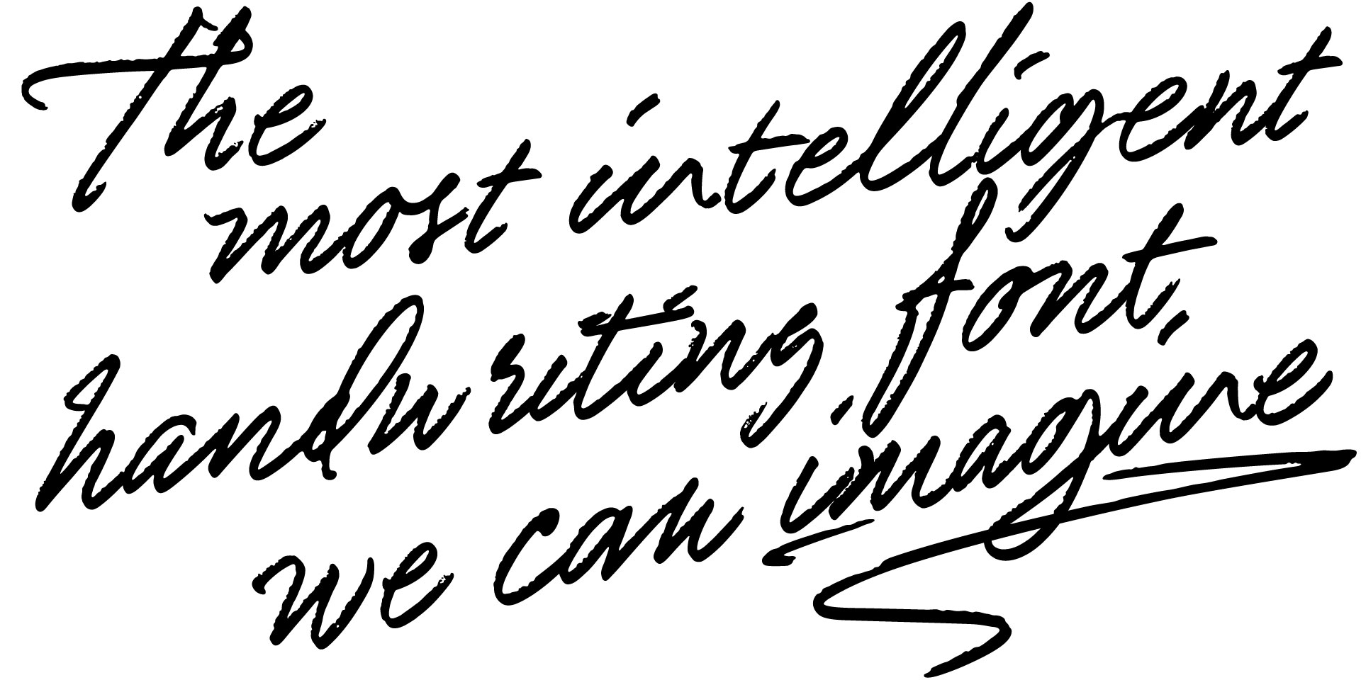
Scribo Pro: intelligent, imperfect, individual (static)
And for designers who think, “Nice, but I don’t need all this dynamic stuff, give me normal fonts”, we would like to say that Scribo is just the most intelligent handwriting font we can imagine, even the traditional, static versions. We’re happy to introduce 15 static fonts, made with 5 different writing tools (marker, pencil and 3 different brushes). As usual, the introduction of this new font is accompanied by an extensive PDF that will be a pleasure for your eye, and lots of additional images and information on our website. Of course, you don’t have to read all these texts – you can start writing your own texts right away.
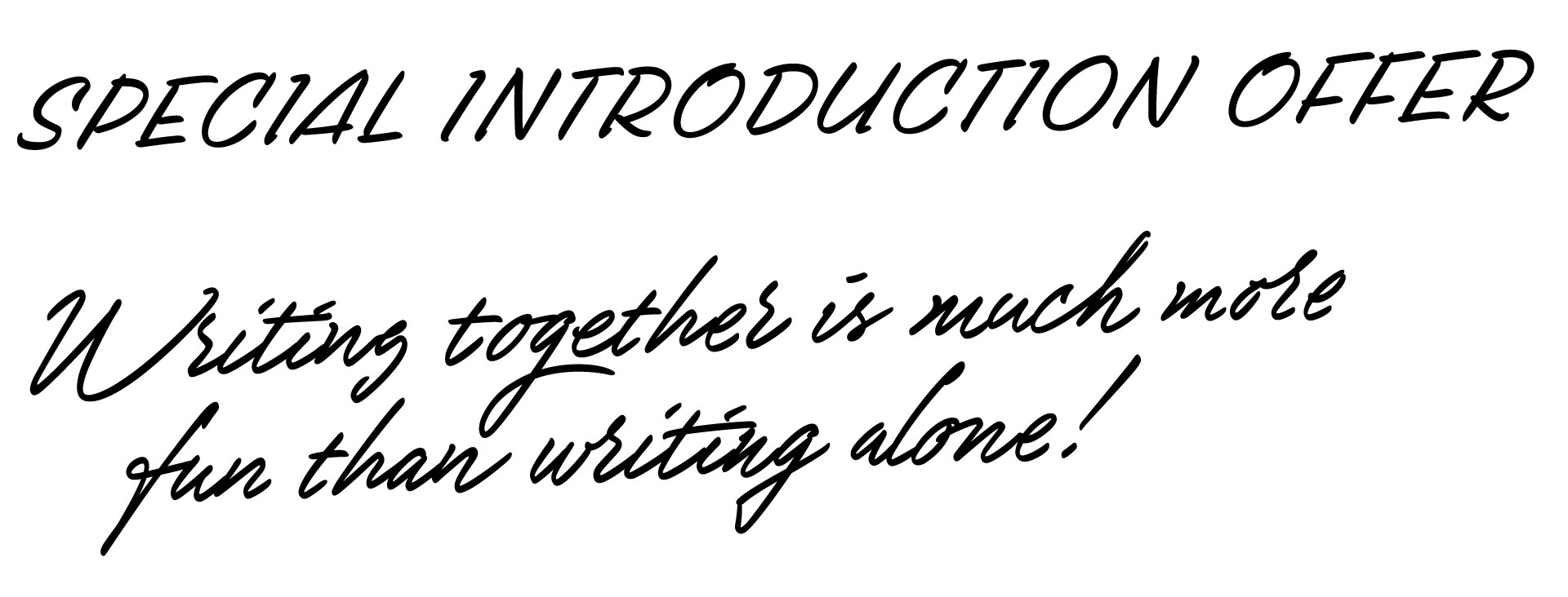
Introduction offer: Buy Scribo, get a license for a pen friend for free
Because writing together is so much more fun than writing alone, we have a special introductory offer for Scribo. Order Scribo before 01 July 2023, and receive a free license for a pen friend. Double the fun, and maybe you’ll have a new pen pal right away?
15 july 2022 — out now
Plakato Moiré
New possibilities with COLRv1
Just as with Plakato One Two, which we published earlier this week, this version of a coloured Plakato font shows again new typographic possibilities. Plakato Moiré takes advantage of the option to include transparency within a font. Combined with variable paint tables, this allows for eye shocking letters.
Moiré effect
Moiré effects have caused printers and photographers many headaches. The effect of this interference pattern is caused by identical patterns which are slightly displaced. For example if one patterns is a tiny bit rotated. But instead of letting this cause us headaches, designers can also take this moiré effect as a starting point for their design. For example the Japanese artist Takahiro Kurashima published a couple of splendid books in recent years which take advantage of the moiré effect.
Plakato Moiré
We were curious to see what would happen if the moiré patterns would appear inside a letter. Plakato Moire introduces this method in the digital realm of variable OpenType fonts. By carefully limiting the variability of the font to the essential parameters of moiré — color, grid size, and layer rotation — Plakato Moire wants to provide maximum possibilities with a minimal set of parameters. All dynamic, all live within your browser. You can experience it yourself by influencing the parameters as you want.
▶ Please meet Plakato Moiré.
06 july 2022 — out now
Plakato One Two
New possibilities with COLRv1
There are more and more possibilities with letters, also because technical possibilities have heavily improved in the past decade. You might have seen Plakato Color which was released half a year ago. That font family takes advantage of the wonderful new possibilities that the COLRv1 font format offers. However, that font family didn’t take advantage of the variable Paint table. This table allows you to change the colors, and the position of the colors, within (!) a letter.
Variable Paint table
We have now applied variable Paint tables in Plakato One Two. A close comparison with the old Plakato Color will reveal a big difference. Now you can not only change the colors, but also change the position of the color stops (the place where a certain color is located).
Plakato One Two
See it live! Instead of all this bla-bla, why not experience these new options yourself with the Plakato One Two demo? Make your own color! The demo allows you to apply your own colors to the color font and the background. But you can also play with the variable Paint table and experience it yourself. The future is bright colorful!
▶ Please meet Plakato One Two.
(visit the demo with a browser that supports COLRv1, like Chrome or Edge)
Thank you: We would like to thank you Peter Constable, Behdad Esfahbod, Laurence Penney, Dominik Röttsches, Adam Twardoch and Ben Wagner for their great support to make Plakato One Two possible.
16 march 2022 — out now
Homo Scriptus
Homo Scriptus, collection Printemps de la Typographie 2022
Homo Scriptus
Grammatographic haute couture available as NFT
On Thursday the 10th of March, our lecture ‘Homo Scriptus’ at the Printemps de la Typographie conference in Paris took place at the end of the Paris fashion week. This lecture was the final part of our Parisian Pen Triptych and ended with a fashion show of Homo Scriptus: Underware’s new label for grammatographic haute couture.
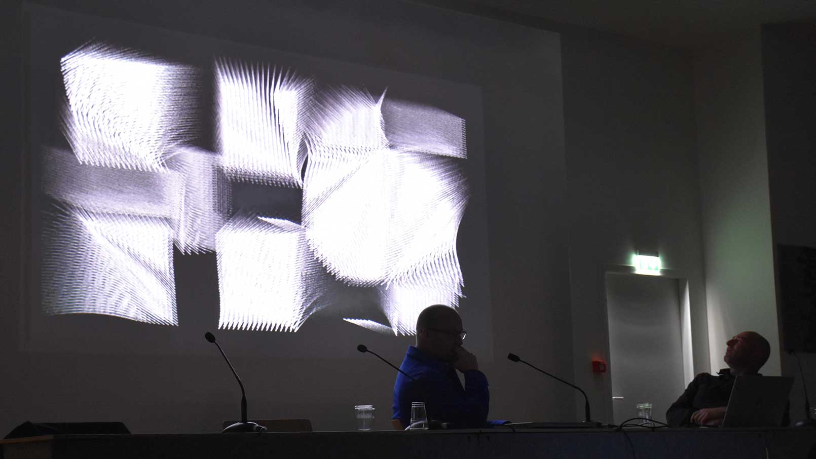
Lecture Homo Scriptus at Printemps de la Typographie 2022, Paris
Grammatographic haute couture
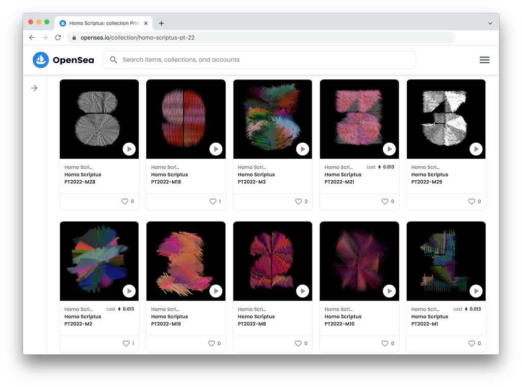
By adding an algorithmic layer on top of OpenType COLRv1 fonts, Homo Scriptus delivers, on the one hand, a typographic system that can be used and applied as any other font. But at the same moment each letter comes with its own dynamics and texture. For this first collection of Homo Scriptus, Printemps de la Typographie 2022, Underware worked closely with the Dutch fashion designer and artist Tessa Bekker. This collaboration led to 33 unique models, which are based on the general subject write, copy, play. All models are build upon the recently published typeface Plakato and are sold as unique NFTs on OpenSea.
Homo Scriptus as NFT
Based upon our experience with other new technological developments in the past, like variable fonts and color fonts, we believe in the benefit of staying curious. And while NFTs have led to many controversial opinions, it is interesting that most of them reflect on the usage of NFTs by some people (the financial aspect) and the shortcoming of the current technological implementation (the energy aspect). But considering that we have been using digital communication like PDFs and email already for many years – also because of ecological reasons – it seems somehow logical that a digital setup will take at the end fewer resources than one based on true products and deliveries. Therefore we decided to keep Homo Scriptus in the digital realm.
At the same time, it is interesting to look at the core principles of NFT, like decentralised distribution and smart contracts, and how they can be used to create a different relation between the maker and the owner. By distributing Homo Scriptus as NFT on OpenSea, we can guarantee on the one hand that the whole collection will always stay visible for everybody in the future, but at the same time create a possibility to engage for everybody who is interested in getting involved with us in this adventure. In the end, the future of NFT will be created just like the internet: it will become what we make out of it.
Homo Scriptus Haute Couture, Printemps de la Typographie 2022 Collection, Model PT2022-M1, courtesy Kenny Schachter, USA
OpenSea & digital haute couture
Each model of Homo Scriptus is for sale for €33 on OpenSea. Purchasing a model makes you the official owner of this model. If you have never used OpenSea before and do not have a digital wallet, we recommend using MetaMask. Once you have created an account, you can add Ethers (the cryptocurrency) with your credit card and you are ready to go.
In the recent months, more and more fashion brands added a virtual companion to their physical collection, allowing their customer to wear Haute Couture in the virtual space. And while it is also (theoretical) possible to wear Homo Scriptus in the purely virtual space, it is created with he idea to connect the virtual with the physical. Therefore each model is a pre-generated counting loop, which you can for example install on a watch. (If you are the owner of an NFT and are interested in wearing your model on an AppleWatch, please get in contact with us. We are happy to help you out.)
▶ Explore the NFT collection on OpenSea.
05 january 2022 — out now
New font: Plakato Color
Digital fonts offer more and more possibilities compared to 30 years ago. A font can support multiple scripts, can provide typographic finesse through smart OpenType features, can be dynamic, and can also contain color.
While most fonts are colourless, or rather have only one colour that can be changed by the user, there are plenty of examples of fonts that do contain multiple colours. Emojis are the best known and most widespread examples.
Recently, a new standard has been published (COLRv1) that makes advanced colour fonts possible, with gradients and transparency. Today we release a set of fonts that take advantage of the new possibilities this font format offers.
03 december 2021 — out now
New font: Plakato
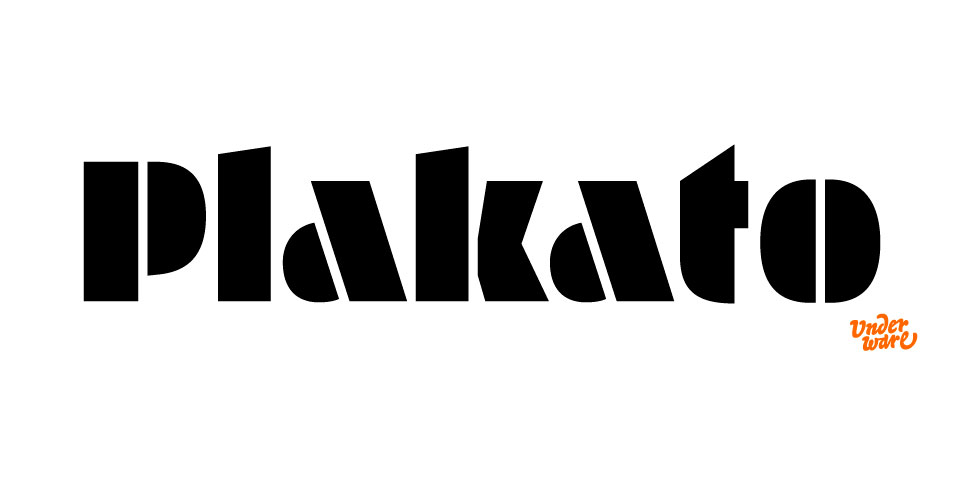
Plakato is a small family of display fonts, where each style has its own characteristics. Plakato is the happy chap, a no-nonsense stencil font with a lot of additional powers, that amiable person you call for help when your message needs to be heard/seen.
Varying from a very fat stencil font family (sure, with flashy italics), up to a neon version, or a font which is constructed out of a few different building blocks in Plakato style. And did we already mention the digital nostalgia in Plakato Game (designed on a C64), and all those extra emoji’s and dingbats? Now we did.
Plakato is an identity toolkit, a heavyweight building block in case you need a strong personality, a small stencil font family to cut out your best ideas and grab all the attention.
Enjoy Plakato!
Introduction offer: Let’s Plaka-To-gether
Order the complete Plakato package, and get a free license for a friend.
This introduction offer runs until 31 Dec 2021.
(We don’t join the discount race to the bottom. We think it’s much nicer to make yourself happy and at the same time share your happiness with a friend. Together is always more fun than alone.)
03 december 2021 — out now
Plakato Play Compendium
The release of Plakato, a collection of eye-catching display fonts, was a two-stage rocket. A set of static fonts & set of dynamic fonts. The static and dynamic fonts share their design, but each dynamic font has its own specific motion and capabilities. Plakato Play is a versatile set of 8 ingenious variable fonts to play with. These variable fonts go beyond the now common width and weight axes and have their own dynamics designed for each style. This newly designed movement brings new possibilities for expression and interaction in text. (For more background, see also the case study The dynamification of typography).
In 1972, Karl Gerstner published his infamous book about the systematics of typography: Kompendium für Alphabeten. In the same spirit we now show, 50 years later, what the results of a systematic approach for OpenType Variable Fonts can be, on the basis of Plakato Play. The Plakato Play Compendium shows 26 possibilities for dynamic type.
29 may 2020 — out now
Hand-drawn logotypes
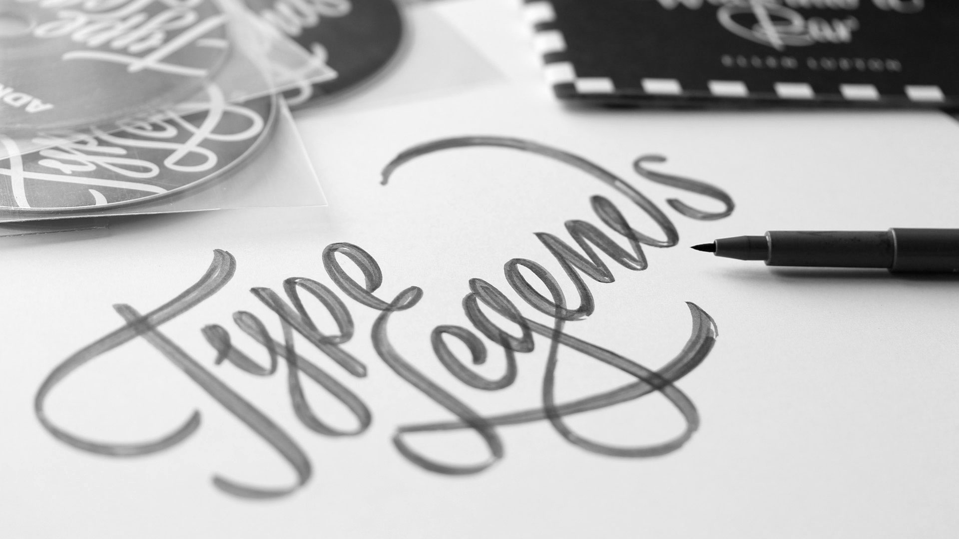
Every thing has a name. What’s better to visually represent this thing than writing that name in appropriate letters? Our projects usually start with hand sketching, and end up and black and white shapes made out of bezier contours. We make lots of hand sketches, from doodles to detailed sketches, but almost none of them are directly visible in a digital end result. That’s not necessary at all, and even the digital lettering can be considered drawn by hand.
During the “stay at home & but also homeschool your kids & stay healthy at the same time” challenge of the past months, we found some time to add a whole bunch of new logotypes, letterings and mastheads to our website. The range of these applications is rather wide: from boat lettering to magazine mastheads to business logotypes. Some logotypes are in motion, others are static. Some required a months-long process, others were done in an afternoon. They can be for a large multinational, but also for an individual. Some of them are meant to build a brand, others are there for pleasure. The lettering itself might contain a secret visual bonus, and sometimes they are as easy as ABC. Sometimes they are made in cooperation with designers or art-directors, in other cases they are made directly for a client. But they all have at least two things in common: they all consist out of letters only, and we’ve drawn them all by hand.
We just love drawing letters by hand. This was also a good moment to update the logotype section of our website. Find 15 new projects which we made in the past years at underware.nl/logotypes
11 november 2019 — out now
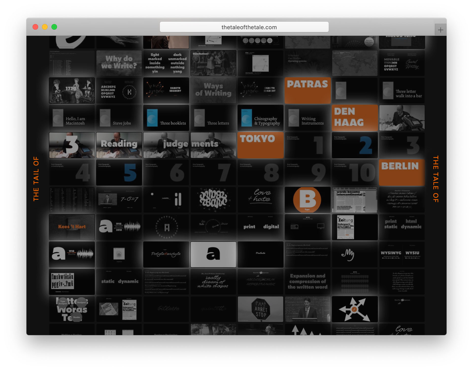
New website: The Tail of the Tale
The Tale of the Tail is a narrative on letters, writing and language by Underware & friends. The 5000+ slides we’ve created for various recent lectures, together with the accompanying publications, as well as new content by others (like Kees ’t Hart) have been transformed into a single publication, making various thoughts and ideas on letters accessible in an entropic way. Talking about language, or writing on letters, is the tale of the tail of the tale of the tail… Watch and listen non-stop: thetaleofthetail.com