03 march 2015 — walhalla
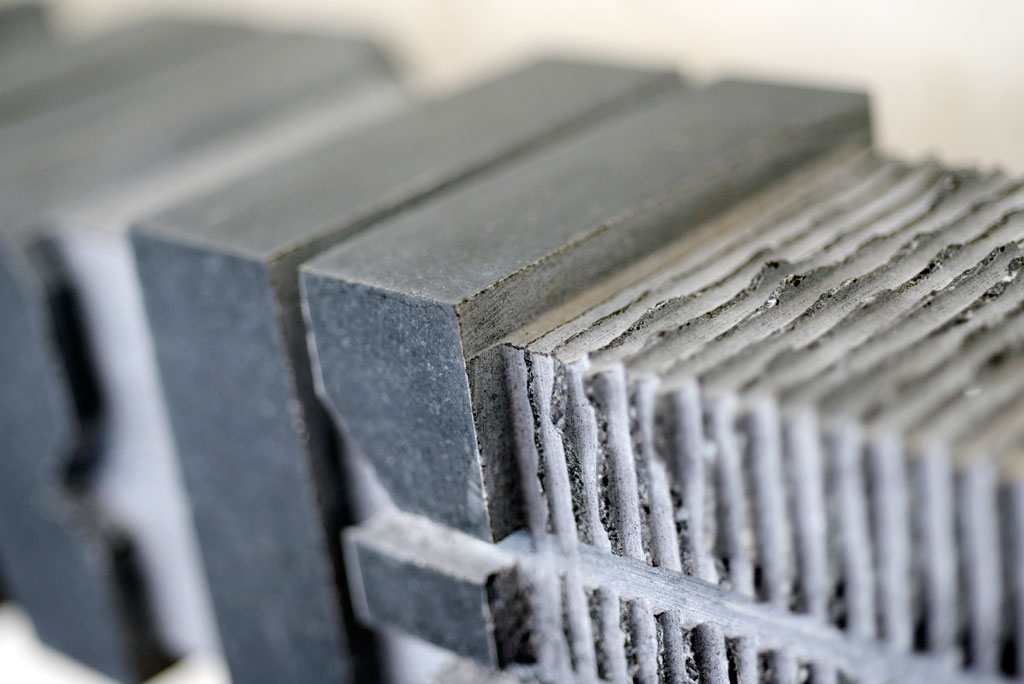
50 kg of Underware
We don’t like superlatives that much, but it’s hard to avoid them while receiving this present. Underware cut into stone.
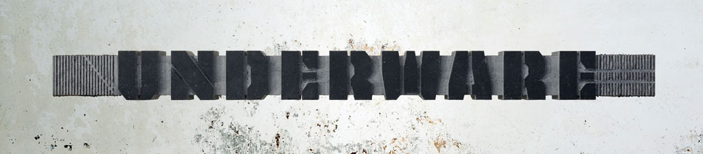
This stone was cut by hand by Dennis Biemans of Studio Baak in the Netherlands. Besides of making furniture and interiors, stonecutting is one of Studio Baak’s favourite activities. Because Tripper became more or less their corporate font, they already applied the typeface throughout their studio. But what’s better than turning it into not so temporary? Something 3D not so temporary, of course.
What goes beyond “Thank You!“? Well, we’re… euhm, speechless. 2015 is already now perfect like it is.
If you are in the mood as much as Baak is, you cut your own name into stone too of course. Boy, they were lucky with only straight lines in the typeface.
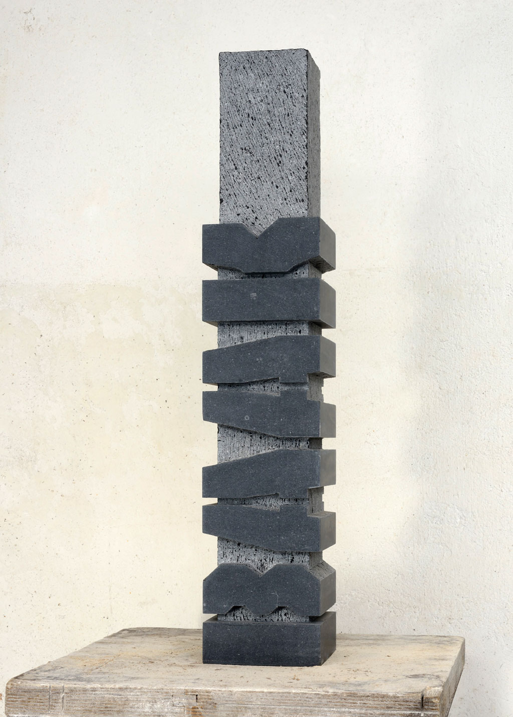
In case you’re interested in receiving your own text cut into stone like this, just contact Studio Baak. They will be happy to help you further:
08 december 2014 — walhalla
Spring 2015 internship
After a decade of not offering apprenticeships in our studio, we have room for one intern in Spring 2015 (Feb–April).
If you know how to design type, dream Adobe CS, talk PHP & Python, then you might be the match we’re looking for.
For this paid internship you’ll be working 4 days/week on 3 different projects. (Three days a week in our Amsterdam studio & one day somewhere else on earth)
Interested? Mail bio, portfolio, motivation & questions before 15 December to: bas@underware.nl
08 october 2014 — walhalla
Typesetting the Dutch IJ
Now. You are a typographer and do your best to achieve ultimate precision in details. You want to set a text in Dutch, as good as possible. You need to master the curious case of IJ.
The Dutch IJ
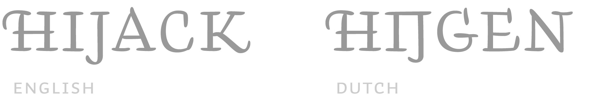
There is a difference between typesetting Dutch and other languages regarding the ij. In Dutch the ij is a digraph, or – if you prefer – a ligature. We don’t care how you call it, as long as you consider the IJ as one letter. So in case you set a text vertically, you’ll have to put the I and the J on the same line.
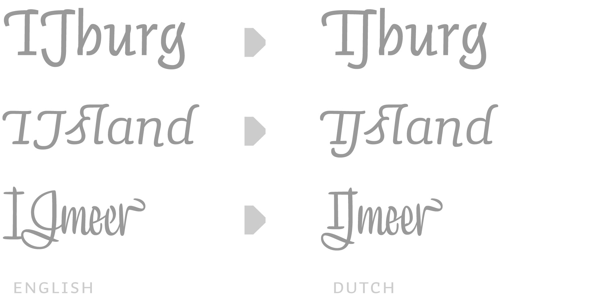
This Dutch IJ might require a special design, depending on the design of the font. Most roman sans serif fonts can live with a regular ‘I’ and ‘J’ combination. Although not always perfect, that’s quite often acceptable. But in swashy fonts the need for a specially designed ‘IJ’ is obvious. A swashy I followed by a swashy J is a nightmare for the Dutch IJ. It needs a special glyph included in the font. And please remember to select the right language for your text, as these IJ’s only (should) show up in Dutch texts.
The missing dot
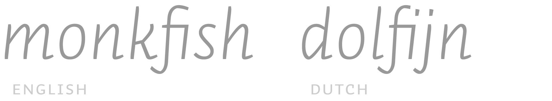
Okay, the ij is cleared. From now on you only work with fonts which have a special glyph for IJ and ij. But then the trouble starts in lowercase. Because fi-ligatures often remove the dot on i, the ij does not look like ij anymore in Dutch. In case the lowercase ij shouldn’t look like a handicapped, amputated lunatic, it needs two dots. To be able to have a nice f+i connection as well as two dots on the ij, you’ll need an additional ligature in your fonts: f+ij
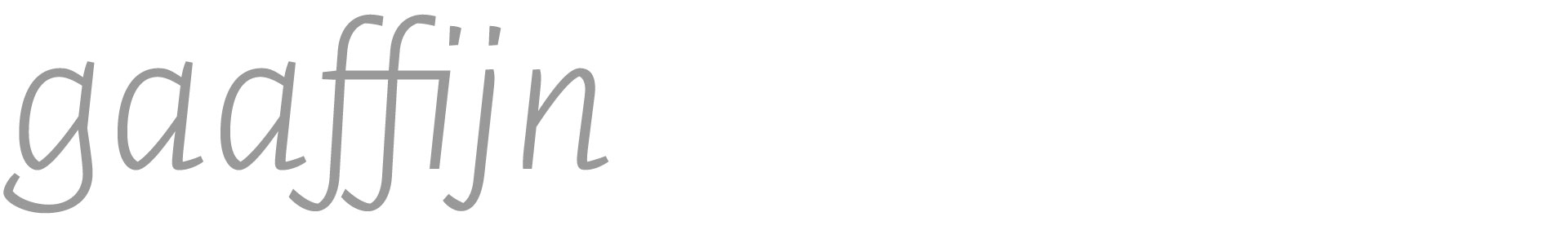
Because some people love to cook their own words, an additional bonus ligature could be included to make sure any imaginable Dutch word looks perfect: f+f+ij
Oh, oh. Exceptions
However, not every i+j in Dutch should become ij. There are some Dutch words which would have their hyphenation in the middle of i and j. There is currently not a beautiful solution for this, so all official exceptions have to be hard coded in the OpenType code of the font.
IJ-acute
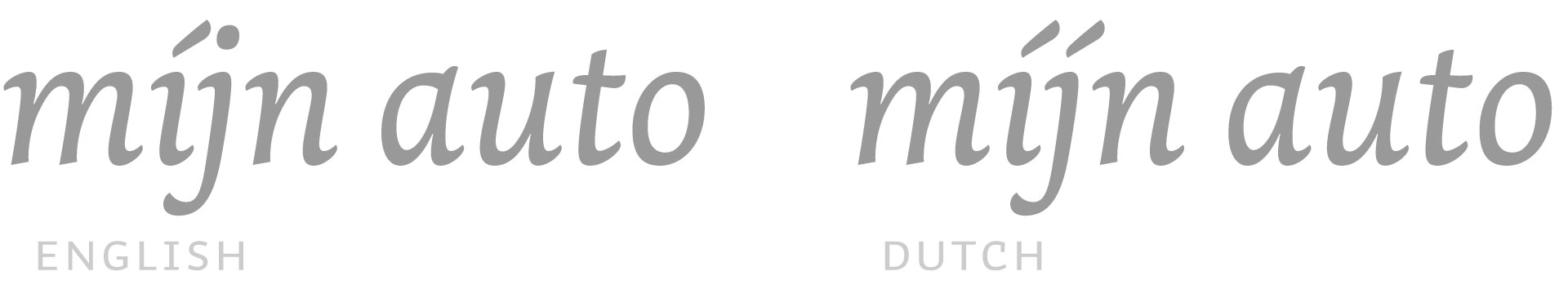
In case you want to stress a word, both letters of ij need an acute. Although one cannot enter a j-acute on a keyboard, the typeface should automatically create both acutes once an i-acute is followed by a j. This should of course only happen in Dutch. So make sure you’ve got your text set to the correct language, and you will have the ij-acute in your Dutch texts.
Our recent library update takes all these Dutch sensitivities into account, making all our fonts suitable for precise Dutch typesetting. All goes automatically, you don’t have to think about all this. Which means you can forget everything you just read.
21 july 2014 — walhalla
World Cup Quiz winner

Two weeks ago we opened a small world cup quiz, when we released Tripper Tricolor. It may be no surprise that most participants were wrong to completely wrong. However. However. One person predicted the final outcome correctly. Just one person? Yes, just one person. We’re trying to get in touch with him. Hopefully he provided his correct email address. Until that time we call him Jeremy the Oracle. Jeremy, you are amazing. Come, and pick up your prize.
08 july 2014 — walhalla
World Cup Quiz prediction
Last week we opened a world cup quiz for some days. Here is the combined prediction of all participants. Up to now the majority is correct. Winners of the quiz will be informed next week after the final. Fingers crossed.

05 june 2014 — walhalla
Stockmann Sans on show


Our custom font family Stockmann Sans is currently on show at the Päivälehti Newspaper Museum in Helsinki, Finland. The exhibition is called “Tunnetko tyypin? Kirjaintyyppien merkillinen maailma”. In case you don’t speak Finnish: it means something like Do you know type? If not, don’t worry because letters are an even stranger world than Finland itself. Only Fins can come up with a title like this. Of course. This educational exhibition makes type design accessible for a broad audience, and features some creations of contemporary Finnish type designers like Hanna Hakala, Saku Heinänen, Jarno Lukkarila and our good own Sami Kortemäki.
The exhibition runs until the 31st of August 2014 at Päivälehti Newspaper Museum, Ludviginkatu 2-4, Helsinki, Finland.
26 may 2014 — walhalla
Polish peace offering

During the last couple of weeks we gave the Poles a hard time. We’ve been teasing them a little during our Wo-Wo Polski? Tour. That tour ended yesterday, so now we have to make it up again with our Polish friends. Therefore we have an über-unique offer: Mistrzowie caps! Poles know that it means “Champions”, and also know that Poland never has been a champion with anything. Therefore these caps are already collectors items, never seen before. Wear them, impress your friends and be prepared in case Poland ever wins something in the future. Polish colours, polish style. Alles geben, cause one day it might happen: Poland wins.
Every font order from Poland receives 2 free caps, so you can celebrate together with your friend (as long as stock lasts)

01 october 2013 — walhalla
That little thing

Can’t remember anymore how often we had to explain the user interface of InDesign to our customers. It’s our top 1-support question. Yes, all the magic of OpenType fonts is very well hidden in a sub-submenu of a palette. Every time we explained the menu, their reaction is the same: ‘WTF, that little thing?’. No wonder that the majority of the font users is not aware of the possibilities of OpenType fonts. Even worse, they often think the small caps are missing because they can’t find them. After more than a decade of OpenType magic, it’s about time that Adobe (but also other developers) improves the OpenType user interface within their applications. Maybe it helps if every Adobe employee is obliged to wear the “triangle plus stripes”-t-shirt until that is fixed?

OpenType features need to be as easy to understand and apply as the Bold & Italic buttons in good old MS Word. Here is one simple suggestion for a possible UI-improvement. But we need more suggestions, so start sketching. Please make and share your OpenType interfaces, and let’s strive for a better UI.

[slides from our “It’s so technical, so let’s tell it with a comic story”-presentation at Kerning Conference earlier this year in Italy. ]
25 september 2013 — walhalla
Typotentie A


Today in “Stuff you can’t find on the internet”: printed collectors items. How cool is that, receiving an email 16 years later? Recently we received an email from Minotaurus – specialized and antiquarian bookseller in Amsterdam – that they discovered a handprinted magazine from Bas in their store: Typotentie A. Honestly, we forgot about this magazine already. So we should thank our local bookshop for preserving some labour intensive specimens. Chapeau for their unscrupulous administration.
Typotentie is hand printed typographic magazine, combining various printing techniques, hand bound, published in a tiny edition. It was our early mini-adventure in self-publishing while studying. Originally intended as a non-regular typographic publication, Typotentie got already stuck at the second issue. The cover of issue B has already been printed, the interior paper is cut and prepared, but a lack of space for setting up the printing press after moving caused a sad ending of this magazine. A sorrowful destiny in true DIY-spirit.
If anybody is interested in a Korrex proofing press, let us know. The press is stored, unused, waiting for new adventures. And if you are ever in Amsterdam, visit Minotaurus bookshop at the Sint Antoniesbreestraat 3d in the city centre of Amsterdam. They still have a copy of Typotentie A in stock, as well as many other books on typography, bookbinding, book history and poetry, as well as many hand printed, bibliophile books. It can’t be stressed often enough how luxurious it is that such a bookshop exists. Take that, internet.