23 may 2023 — out now
Introducing Scribomat
")

Today Underware is happy to introduce Scribomat, making artificial writing accessible without any technological barrier.
What is Scribomat?
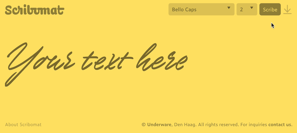
Scribomat, a platform for artificial writing, lets you scribe any text. Create your own animated text and simply download it. Type your own text, select style, press Enter (or click the Scribe button) and a written text is automatically generated for you. Voilà, as simple as that.
How does it work?
1: Type your own text
2: Select your style
3: Scribe
4: Download
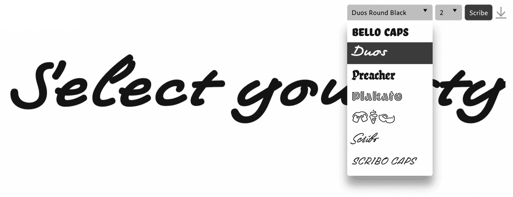
You can animate short texts, which can be downloaded in various formats. The animated SVG is available without registration, and supported by every browser. Just drag and drop, or embed the SVG like any other image. You can use these animations for evaluation purposes only, and request registration for additional download formats or commercial use. Of course the animated SVG is vector based, so it can be scaled and used in bigger sizes as well, and because it supports transparency the animated lettering can be put on top of a picture, movie or any other background.
You want more?
If you would like to animate longer pieces of texts, or use different colours, fonts, sizes, or writing speeds, just contact us: info@scribomat.com. There are much more possibilities with Scribomat, but the layout options in the public application were explicitly kept very simple to avoid any fuzz.
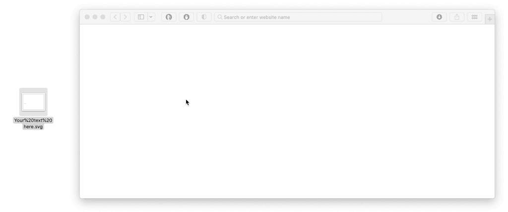
Simply drag and drop the downloaded SVG into a browser window.
Beyond the horizon
Scribomat, just like Grammato, raises awareness of contemporary typographic possibilities. Since the introduction of the variable font format, there are many more ways to work with dynamic text. These written animations, created with Underware’s patented technology and typefaces, are just one example. There will be more beyond the horizon.
Try yourself
Instead of reading about written texts, write your own text. Besides, better than watching the trembling animated GIFs (!) above, get the real, fluent experience by scribing your own texts at Scribomat.com
03 may 2023 — out now
New font: Scribo
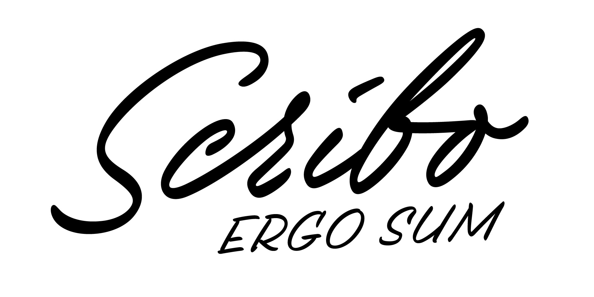
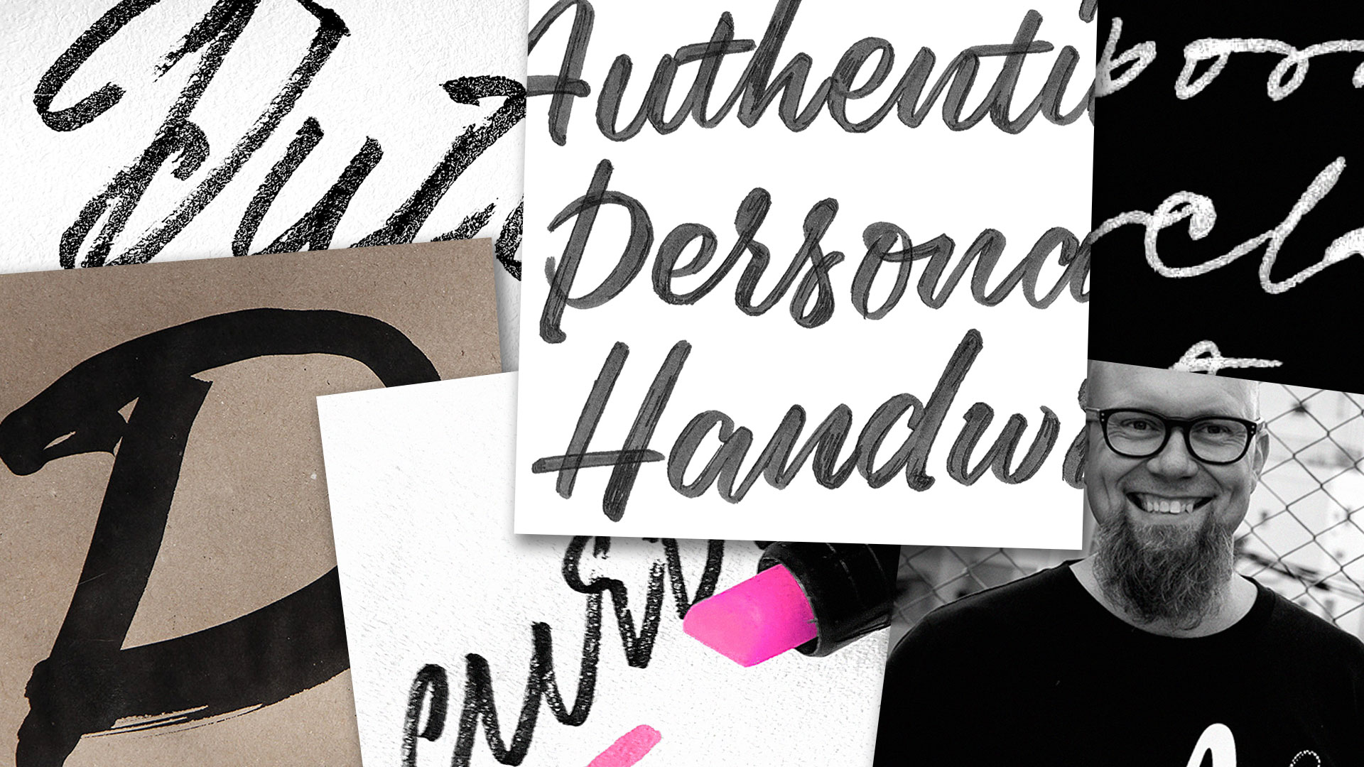
We’re delighted to introduce Scribo. What started as a desire to really capture writing, ended up as a set of dynamic & static fonts that forced us to push our own boundaries. The dynamic fonts (Scribo Write) allow texts to be really written, as all the writing dynamics (stroke order, speed variations, etc.) are included in the digital font file! The static fonts (Scribo Pro) offer a wide range of handwriting styles, created with 5 different tools, making it the most intelligent handwriting fonts we can imagine.
Scribo Write: capturing writing in time (dynamic)
We’re in a technological age that offers far more possibilities than 20 years ago. Yet most of our software, as well as our habits of working with computers, are based on existing conventions and don’t take advantage of these new possibilities. So it’s time to rethink our existing practices, also as type designers. It is already possible to include time as a dimension in a digital font file. But what does that mean? In this case, it means that we can finally capture the action of writing in a font file.
This means that not only every facet that is part of writing, such as ductus and airtime, is built in, but much more than that. For example, ink bleed can be neatly controlled, and the visual impact of writing extended as a result. The dynamic font Scribo Write brings together the two worlds of analogue handwriting and technolgical digital typography, opening up new, previously unknown possibilities.
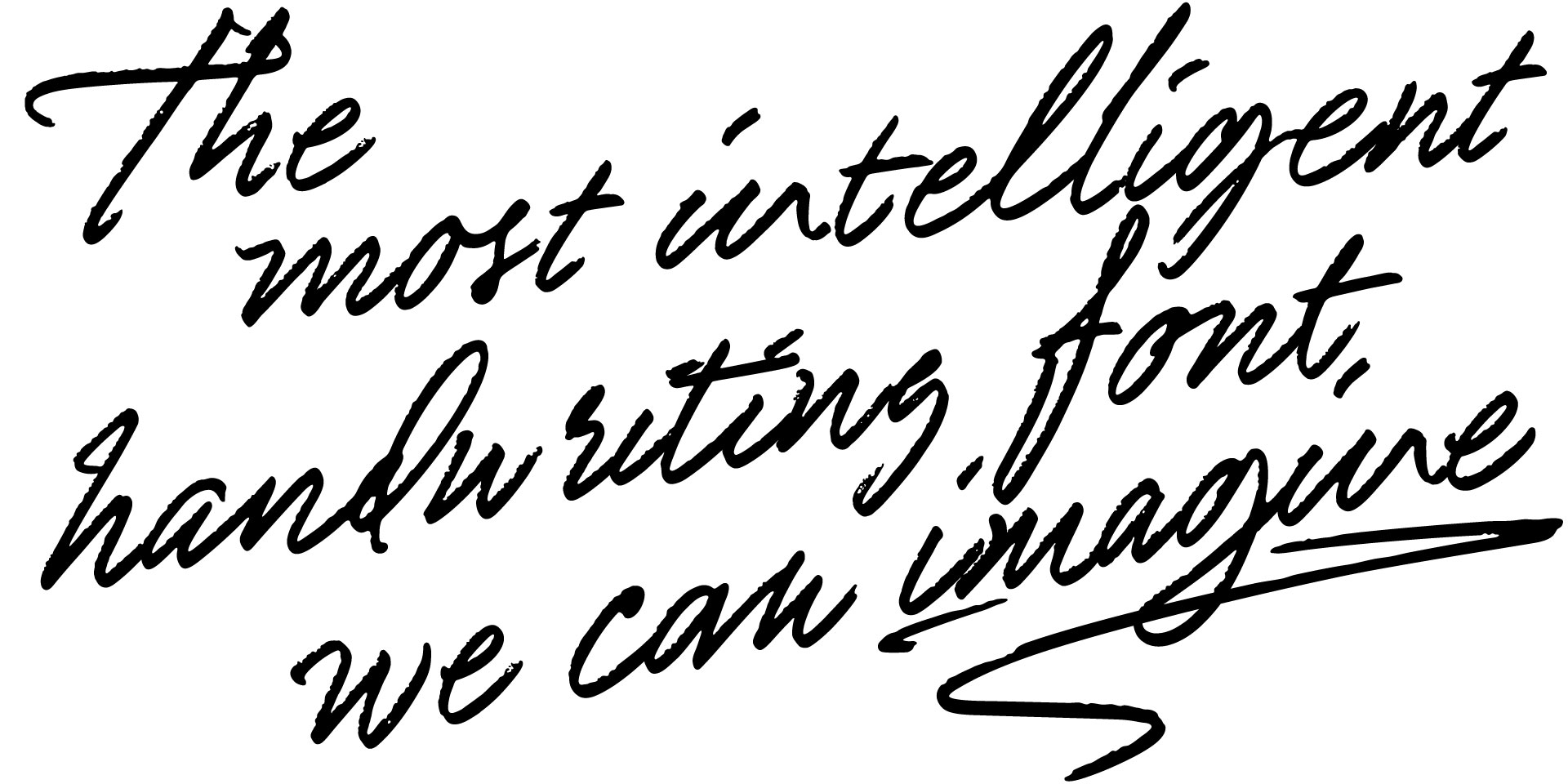
Scribo Pro: intelligent, imperfect, individual (static)
And for designers who think, “Nice, but I don’t need all this dynamic stuff, give me normal fonts”, we would like to say that Scribo is just the most intelligent handwriting font we can imagine, even the traditional, static versions. We’re happy to introduce 15 static fonts, made with 5 different writing tools (marker, pencil and 3 different brushes). As usual, the introduction of this new font is accompanied by an extensive PDF that will be a pleasure for your eye, and lots of additional images and information on our website. Of course, you don’t have to read all these texts – you can start writing your own texts right away.
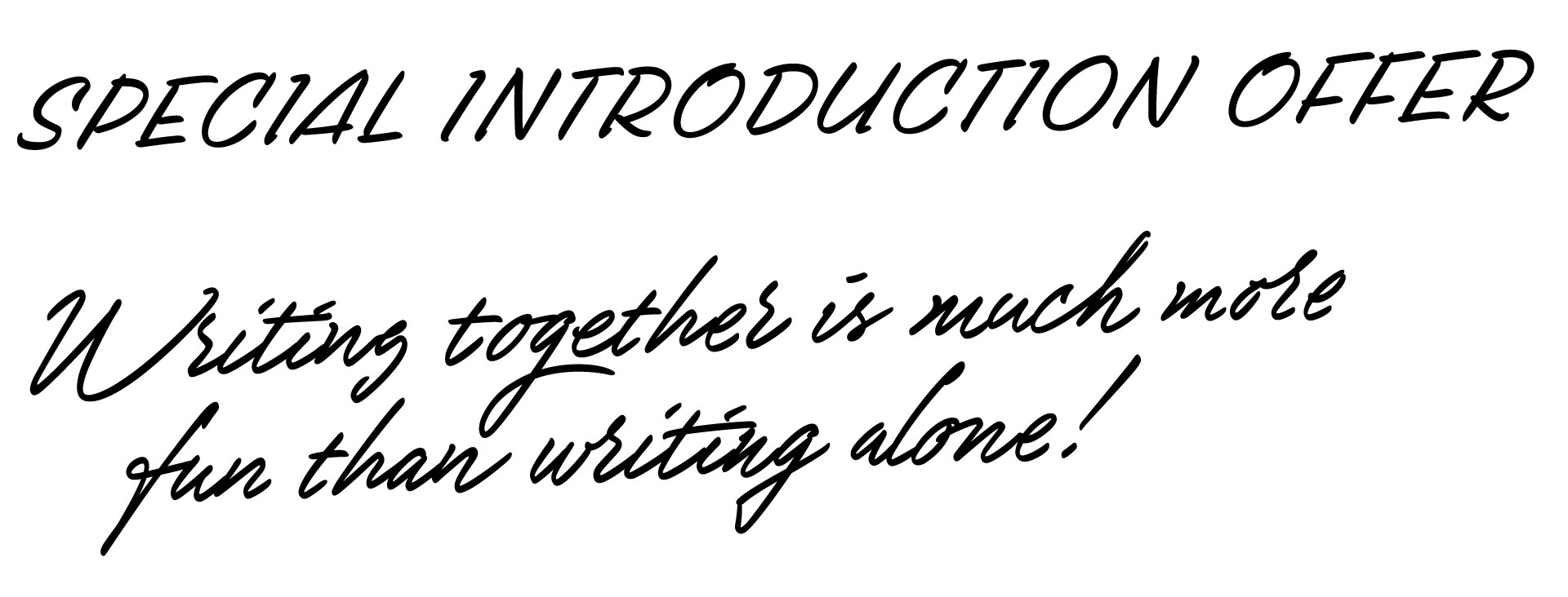
Introduction offer: Buy Scribo, get a license for a pen friend for free
Because writing together is so much more fun than writing alone, we have a special introductory offer for Scribo. Order Scribo before 01 July 2023, and receive a free license for a pen friend. Double the fun, and maybe you’ll have a new pen pal right away?
25 april 2023 — presentations
Lectures: Scribo, ergo sum
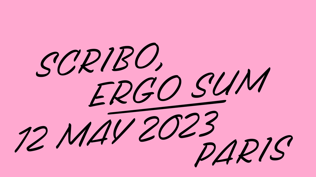
Although through writing someone can assert their existence, we are not publishing a book but instead will soon give two lectures around the theme “Scribo, ergo sum”. These lectures will take place on Friday 12 May 2023 in Paris at the ATypI conference, and on Saturday 13 May 2023 in Antwerp at the TypoCafé.
12 May 2023 — Paris
The first lecture in Paris is titled “Scribo, ergo sum” and trades on writing anno 2023, what new possibilities the combination of writing by hand and by computer offers, and also what new unexplored territory lies there, and we touch on a lack of terminology to describe that new territory.
atypi.org
13 May 2023 — Antwerp
The second lecture in Antwerp is one day later, and is logically titled “In retrospect: Scribo, ergo sum”. This will probably be our most topical lecture ever, as in it we look back at what we presented just one day earlier in Paris. We will try to already reflect cautiously at this event organised by Initiaal, alumni of the Plantin Institute of Typography.
initiaal.be
11 april 2023 — walhalla
Typeworkshop: Signature moves
New typeworkshop coming up this summer! Do you want to learn type design or improve your skills? Do you also happen to appreciate nice weather? Then this 5-day workshop in Barcelona might be the right opportunity. Instructed by our own Sami Kortemäki, participants will explore the relation between personal characteristics and their own visual representation in text. Every letter you draw is personal, but does it also reflect your own personality?
Workshop: Signature moves
Handwriting is a primal act; while writing we can’t hide our personality. In this workshop we use our intimate, personal letters as a starting point for type design: your own handwriting as well as your signature. The signature is everybody’s most personal writing, everybody’s most individual expression through letters, and the result is almost asemic as they often drift away from legible letterforms.
The intention is not to digitalize your handwriting or signature 1:1, but to analyse its qualities & details and transform those into distinctive design concepts, studying the balance between asemic and semic, primal and subsequent.
Motto: “Cherish your quirky details & design flaws — avoiding making mistakes in order to preserve your image makes you extremely boring”.
Date
26-30 June 2023 (at Elisava, La Rambla 30-32, Barcelona, Spain)
Who can apply
Graphic & Type Designers who want to expand their sandbox.
Objectives
The objective is to discuss, learn & try methods to achieve personal & distinctive touches to type design. Once you gain guts to touch the letters in your own style, your work will never be the same. As a side product you make your graphic design interesting for yourself.
Professor
Sami Kortemäki is one of the founders of Underware. Left handed lettering artist, script face specialist and uncompromising craftsman. Strength: curves. Weakness: straight lines. Beard: long, red brown.
Register now
Register before 01 June at Elisava.
(20% discount until 30 April 2023)
11 april 2023 — publications
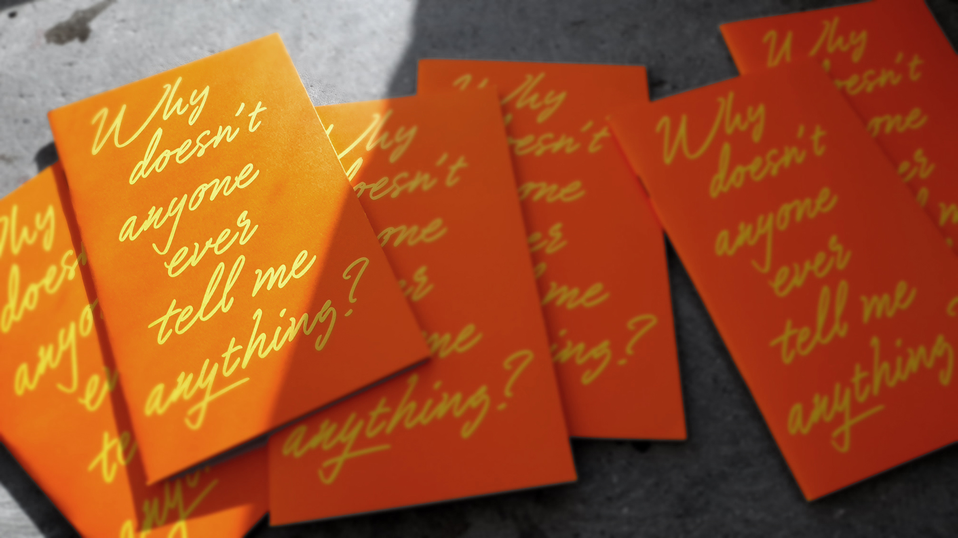
New publication: Why doesn’t anyone ever tell me anything?
In the past 5 years we have written and published some small booklets of the same size (11,5 x 19 cm). Mostly such a booklet accompanies a certain lecture. The booklet is an extension of that lecture, or telling the story of the lecture in a different way, and is distributed after the lecture to the audience. The booklets are easier to understand by those who have attended the lecture, but are certainly not limited to just this audience.
The pandemic threw a spanner in the works for the publication of these booklets. For some years, there were hardly any in-person lectures, so no corresponding printed materials either. But last year we produced another publication in the same series again (From Typography to Grammatography, PMS 309) for our lecture Homo Scriptus at the Printemps de la Typographie conference in Paris. (We did make other printed material outside this series during that period, like the Manicule specimen or the Plakato stencil set)
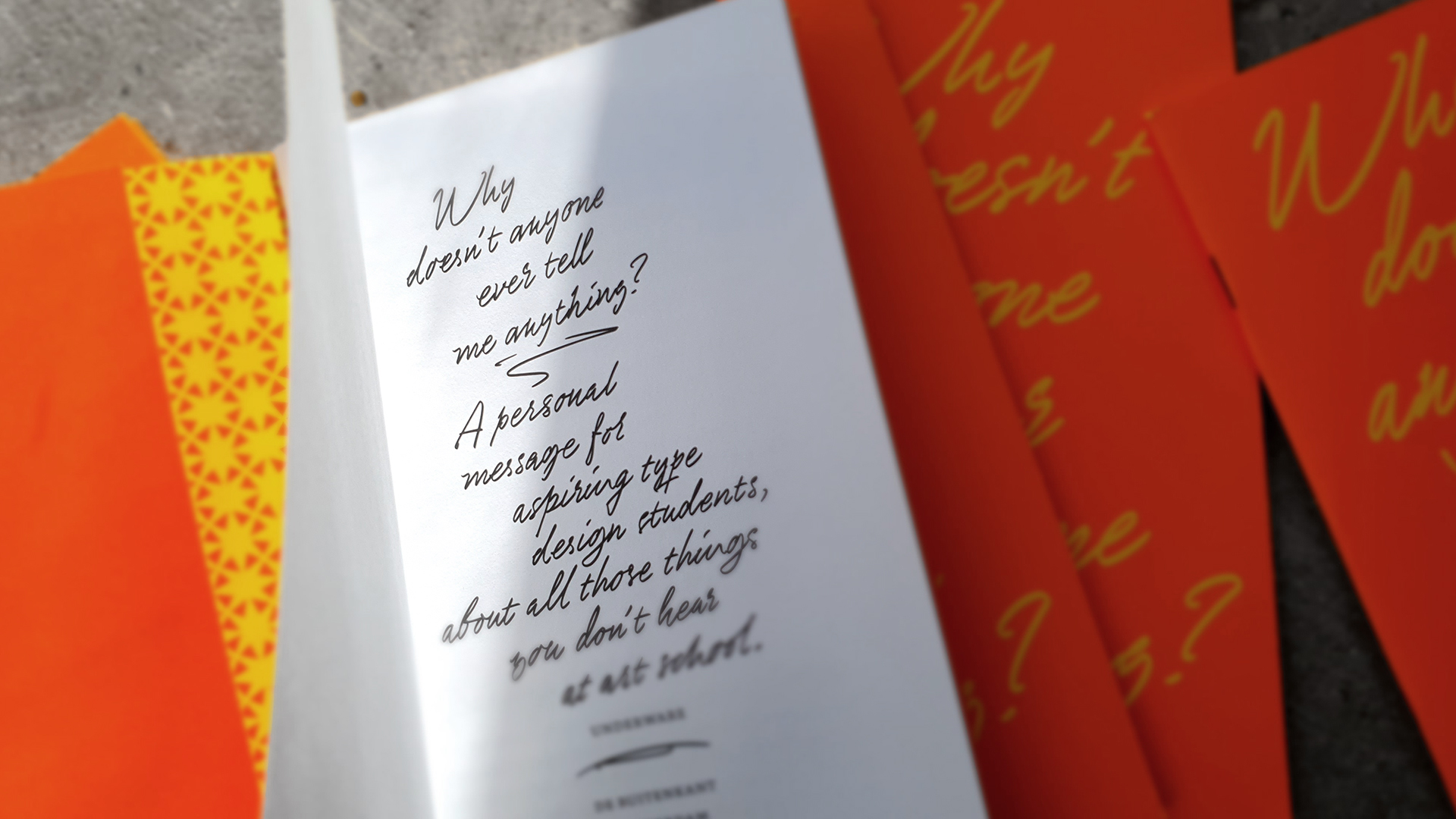
Why doesn’t anyone ever tell me anything?
This year saw the publication of the 10th volume in this series. The publication ‘Why doesn’t anybody ever tell me anything’ is aimed at type design students, and was published on the occasion of some of the educational activities we are undertaking this year. These include Sami teaching a type design workshop in Barcelona this summer (Signature moves, registration has just opened!), and Bas being an external jury at L’École supérieure d’art et de design in Amiens, or giving a type crit at Type Paris. We thought this would be a great opportunity to touch on some aspects of the practice of type design that are not always the first to be addressed, by writing a letter to aspiring type design students that contains lots of questions. This publication was published in collaboration with Uitgeverij de Buitenkant, and is therefore not limited to type design students of our workshops, but also available in regular bookshops.
▶ Why doesn’t anyone ever tell me anything?
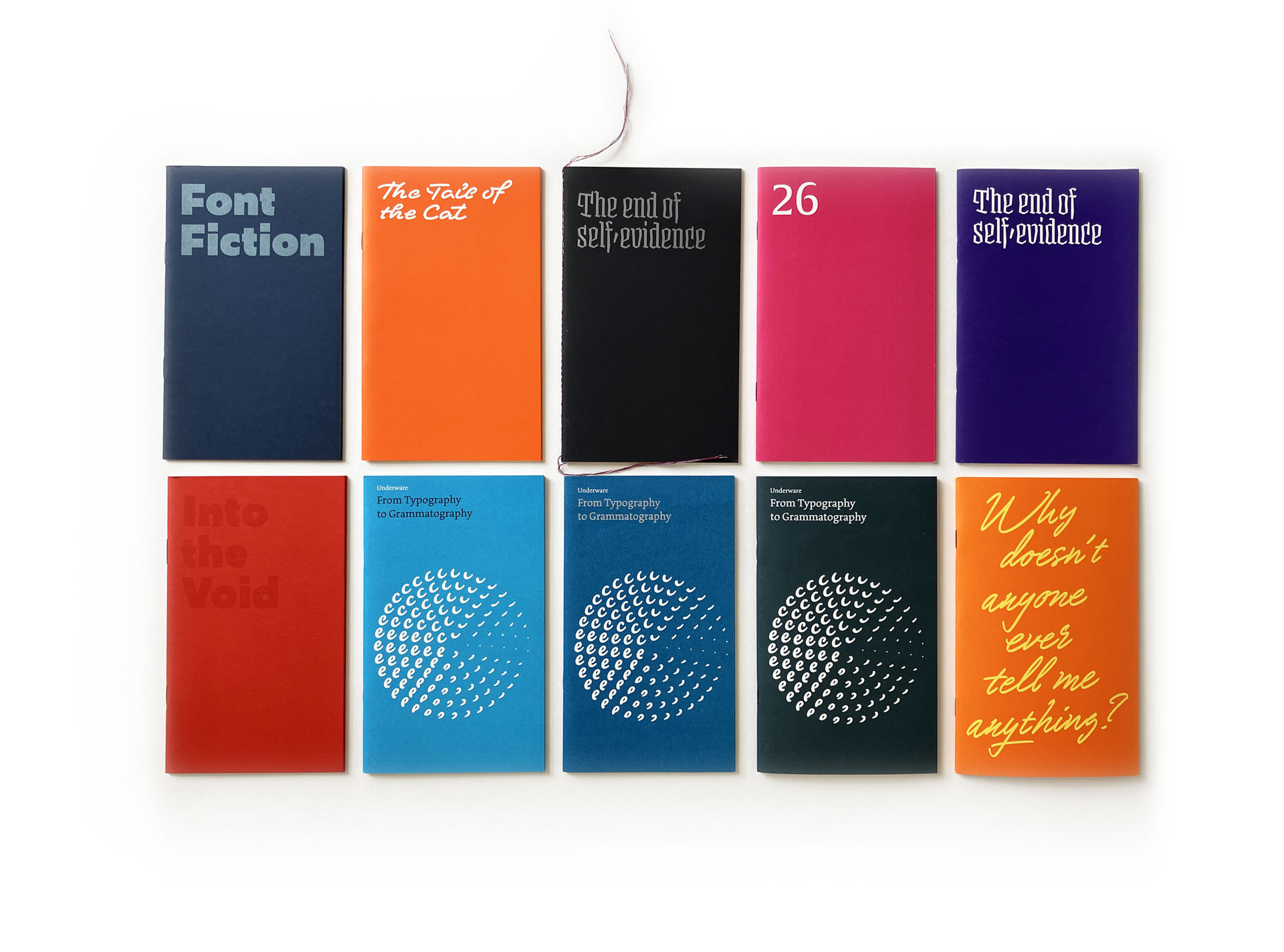
Overview of 10 booklets, from left top to right bottom:
Font Fiction (Berlin, 2018)
The Tail of the Cat (Berlin, 2018)
The end of self-evidence, black (Paris, 2019)
26 (Amsterdam, 2019)
The end of self-evidence, purple (Münich, 2018)
Into the Void (Berlin, 2019)
From Typography to Grammatography, PMS 306 (Patras, 2019)
From Typography to Grammatography, PMS 307 (Tokyo, 2019)
From Typography to Grammatography, PMS 309 (Paris, 2022)
Why doesn’t anybody ever tell me anything (Den Haag, 2023)
25 november 2022 — publications
Plakato stencil set deluxe
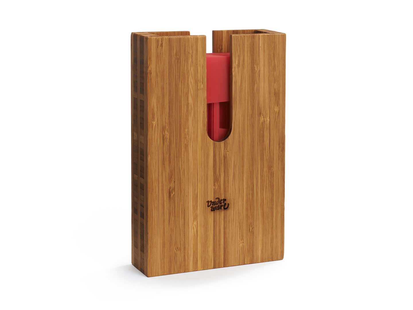
Three months after publishing the Plakato stencil set, we’re happy to publish a limited edition version of the same stencil set. The Plakato stencil set deluxe comes in a wooden box, handmade by Studio Baak in the Netherlands. These limited edition boxes have the same content as the regular stencil set: 40 separate stencils (A-Z 0-9 & ? ! ↑) and a RISO printed booklet in Plakato style.
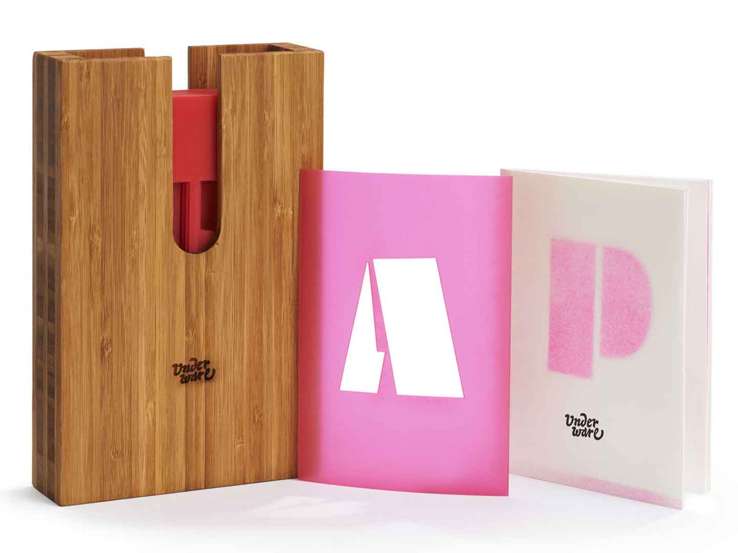
If you want to spread your words in Plakato style with a box in 😎-style, check out the Plakato stencil set deluxe.
11 october 2022 — presentations
Rule of Three lecture
Saturday 15 Oct 2022 we’ll give a talk titled Rule of Three at the InScript festival, a 5-day festival on the overlap of typography and technology. As the organisation puts it: “The five-day festival will showcase portfolios and behind-the-scenes among top design practitioners working with artificial intelligence, augmented and virtual realities, dimensional typography, creative coding, physical computing, and innovative use of traditional craft.” All lectures will be streamed online, so you can follow this inaugural event from anywhere in the world. In case you want to be inspired by 30+ speakers in the world of contemporary experimental type, sign up at inscript.tf
▶ Rule of Three
Lecture by Underware at InScript
Saturday 15 October 2022
NY 11:30–12:10
Amsterdam 17:30–18:10
Shanghai 23:30–00:10
Register & watch online at inscript.tf
30 august 2022 — publications
Plakato stencil set
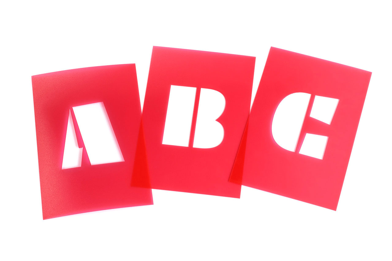
In the year 2022, printed type specimens are no longer a matter of course. But print has other specific qualities that a digital type specimen cannot have, and besides, it brings us great pleasure to make it. Earlier this year we made the Manicule Specimen, a printed publication which contains an overview of various fonts from our catalogue. A printed type specimen of the Plakato typeface family, however, requires a specific approach, one that is quite obvious. There is only one way to present a stencil typeface properly: with a stencil set.
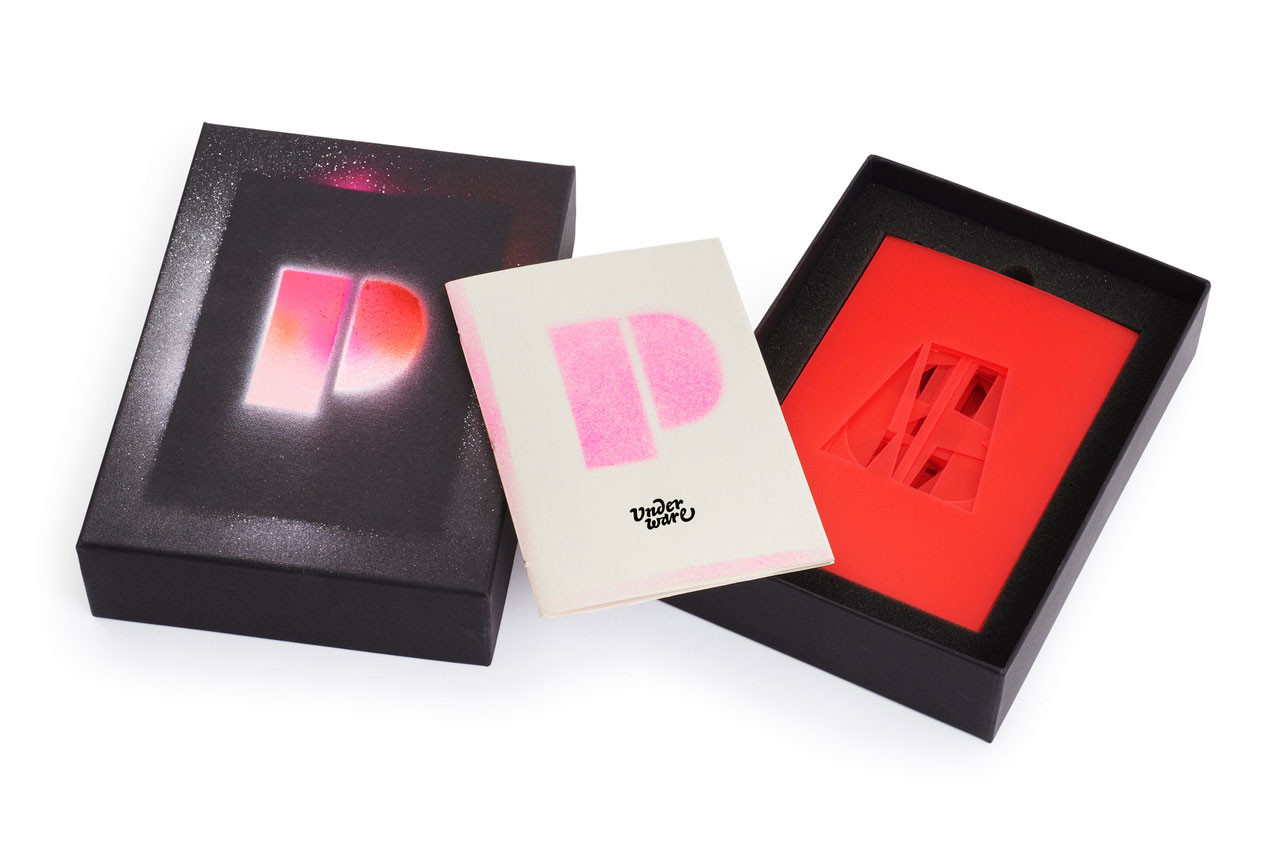
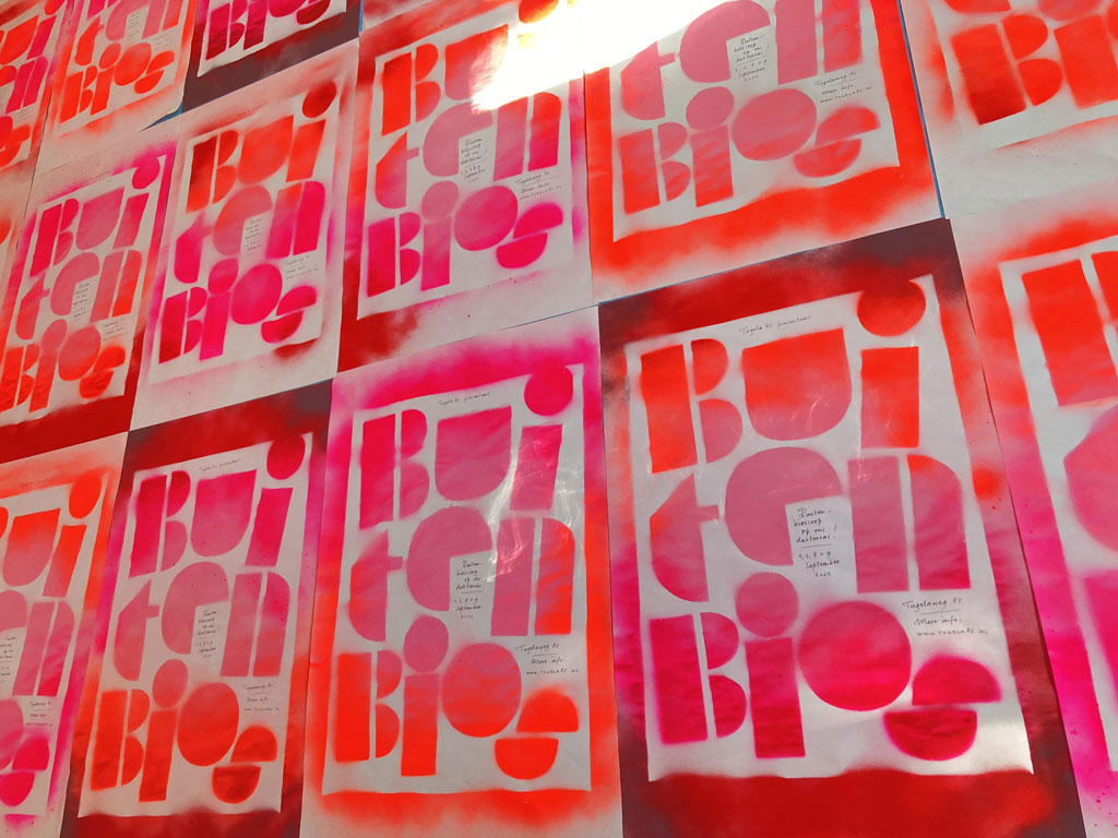
Stencils are a fantastic way of producing visuals. With Plakato you can print out your text, and just cut it out of paper, cardboard, or any other material you prefer. Get your spray can, paint, brushes or any other tool you prefer. We always prefer spray cans because they are the fastest way to write a text with a stencil. Last week, for example, we hand-sprayed all the posters for the BuitenBios, the open-air cinema on the roof terrace of our Amsterdam studio, in Plakato style. Those posters used a custom-made stencil, but sometimes you just want to put your own message on something quickly. Prefabricated stencil letters are perfect for that.
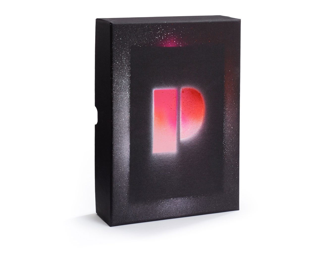
That is why we are pleased to present the Plakato Stencil Set today. It is a physical type specimen and utensil in one. This stencil set, consisting of 40 separate stencils (A-Z 0-9 & ? ! ↑), comes in a customized box and is accompanied by a dedicated booklet in Plakato style. The booklet has a simple message: get your hands dirty and don’t let this stencil set become your typographic Japanese Senseo machine. The pamphlet stitched booklet, which is RISO printed, and the Plakato stencils are packed together in a sturdy box, and now available for a bargain. Spread your message in style with the Plakato stencil set!
25 august 2022 — font update
PostScript Type 1 fonts end of support
There is still a small chance that you’re working with PostScript Type 1 versions if you have been working with our fonts for over a decade. We started distributing our desktop fonts in the more recent OpenType format long ago, and our library upgrade in 2013 turned all our fonts in the same technical condition. Since then all our desktop fonts come as OpenType fonts. More details were back then described in Upgrade available & Notes about the library upgrade.
Those good old PostScript Type 1 fonts you might have bought from us 20 years ago, still work today. However, as of January 2023 Adobe is no longer supporting PostScript Type 1 fonts in their applications. So today is a good moment to check if the Underware fonts you are working with are already in the .otf (OpenType) format. If not, you can upgrade them to the most recent version for free in your account.
In case you have any questions about this, or trouble with upgrading, just contact us.
24 august 2022 — walhalla
BuitenBios 2022
Stencils are still one of our favourite techniques, as they provide a quick-and-dirty way to produce visuals. Next to that, they also guarantee a nice balance between full control and manual irregularity. For this year’s BuitenBios edition, the one and only open-air cinema on the rooftop of our Amsterdam studio building, we created all posters by hand (😅) with a stencil.