15 july 2022 — out now
Plakato Moiré
New possibilities with COLRv1
Just as with Plakato One Two, which we published earlier this week, this version of a coloured Plakato font shows again new typographic possibilities. Plakato Moiré takes advantage of the option to include transparency within a font. Combined with variable paint tables, this allows for eye shocking letters.
Moiré effect
Moiré effects have caused printers and photographers many headaches. The effect of this interference pattern is caused by identical patterns which are slightly displaced. For example if one patterns is a tiny bit rotated. But instead of letting this cause us headaches, designers can also take this moiré effect as a starting point for their design. For example the Japanese artist Takahiro Kurashima published a couple of splendid books in recent years which take advantage of the moiré effect.
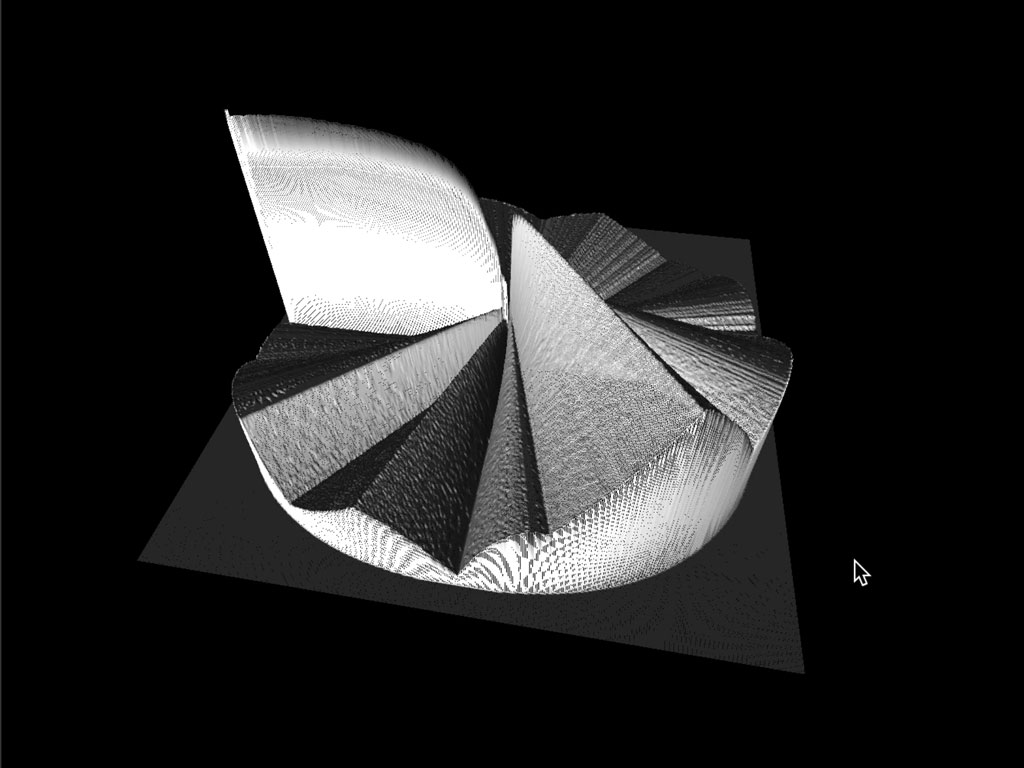
Plakato Moiré
We were curious to see what would happen if the moiré patterns would appear inside a letter. Plakato Moire introduces this method in the digital realm of variable OpenType fonts. By carefully limiting the variability of the font to the essential parameters of moiré — color, grid size, and layer rotation — Plakato Moire wants to provide maximum possibilities with a minimal set of parameters. All dynamic, all live within your browser. You can experience it yourself by influencing the parameters as you want.
▶ Please meet Plakato Moiré.
06 july 2022 — out now
Plakato One Two
New possibilities with COLRv1
There are more and more possibilities with letters, also because technical possibilities have heavily improved in the past decade. You might have seen Plakato Color which was released half a year ago. That font family takes advantage of the wonderful new possibilities that the COLRv1 font format offers. However, that font family didn’t take advantage of the variable Paint table. This table allows you to change the colors, and the position of the colors, within (!) a letter.
Variable Paint table
We have now applied variable Paint tables in Plakato One Two. A close comparison with the old Plakato Color will reveal a big difference. Now you can not only change the colors, but also change the position of the color stops (the place where a certain color is located).
Plakato One Two
See it live! Instead of all this bla-bla, why not experience these new options yourself with the Plakato One Two demo? Make your own color! The demo allows you to apply your own colors to the color font and the background. But you can also play with the variable Paint table and experience it yourself. The future is bright colorful!
▶ Please meet Plakato One Two.
(visit the demo with a browser that supports COLRv1, like Chrome or Edge)
Thank you: We would like to thank you Peter Constable, Behdad Esfahbod, Laurence Penney, Dominik Röttsches, Adam Twardoch and Ben Wagner for their great support to make Plakato One Two possible.
03 july 2022 — presentations
Inside the letter lecture
Instead of presenting our recent findings and points of views in a lecture, we’ve used the opportunity of giving a lecture to develop new findings and points of views in recent years. A satisfactory turnaround in approach. Contemporary technological developments not only affect the design process (not only of letters, but of any design process), but also have an impact on how letters are used, and what a letter is. A lecture is a good moment to reflect on this, by developing new thoughts, making new demos, sketching new ideas, or making new designs.
Coming Thursday 7 July 2022 we’ll give a lecture at the International Conference on Typography and Visual Communication in Thessaloniki, Greece. This time we’re gonna explore what’s inside the letter.
.
12 may 2022 — walhalla
Read Naked raffle


This week it has been 20 years since the typeface Sauna was released with the Secret Sauna Party in Berlin. It was the first opportunity to test the book Read Naked inside a hot sauna, because some parts of the book only become visible at 80° Celsius or higher. We made this publication together with Dutch designer Piet Schreuders, and the production – printing on Neobond paper (the Rolls Royce of papers), binding without using glue – guaranteed the publication would survive a serious sauna visit. Drying instructions to get the book back into the bookshelf are included on page 1.
16 march 2022 — out now
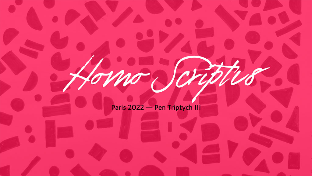
Homo Scriptus
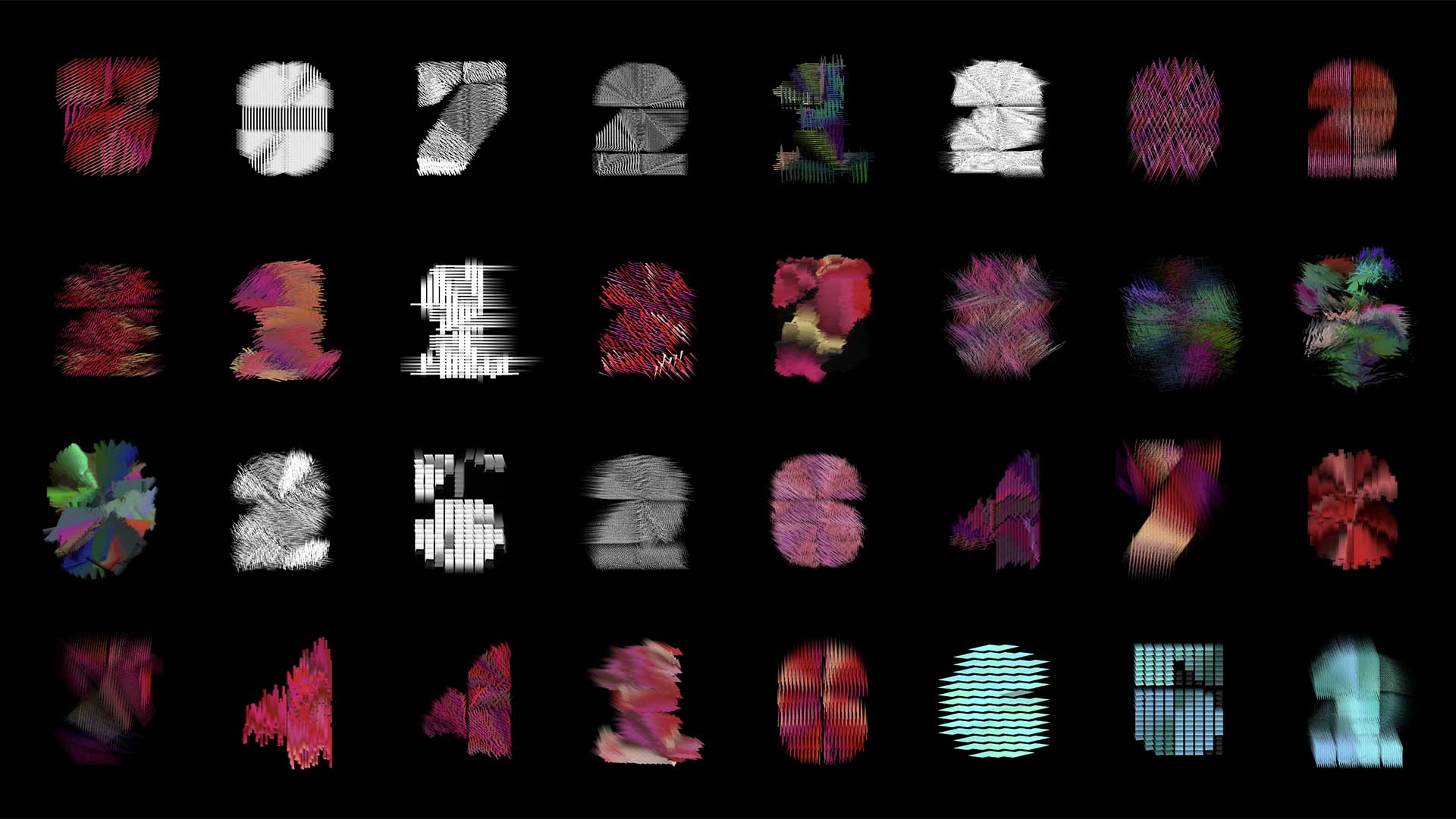
Homo Scriptus, collection Printemps de la Typographie 2022
Homo Scriptus
Grammatographic haute couture available as NFT
On Thursday the 10th of March, our lecture ‘Homo Scriptus’ at the Printemps de la Typographie conference in Paris took place at the end of the Paris fashion week. This lecture was the final part of our Parisian Pen Triptych and ended with a fashion show of Homo Scriptus: Underware’s new label for grammatographic haute couture.
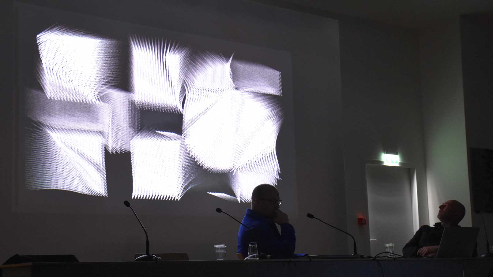
Lecture Homo Scriptus at Printemps de la Typographie 2022, Paris
Grammatographic haute couture
By adding an algorithmic layer on top of OpenType COLRv1 fonts, Homo Scriptus delivers, on the one hand, a typographic system that can be used and applied as any other font. But at the same moment each letter comes with its own dynamics and texture. For this first collection of Homo Scriptus, Printemps de la Typographie 2022, Underware worked closely with the Dutch fashion designer and artist Tessa Bekker. This collaboration led to 33 unique models, which are based on the general subject write, copy, play. All models are build upon the recently published typeface Plakato and are sold as unique NFTs on OpenSea.
Homo Scriptus as NFT
Based upon our experience with other new technological developments in the past, like variable fonts and color fonts, we believe in the benefit of staying curious. And while NFTs have led to many controversial opinions, it is interesting that most of them reflect on the usage of NFTs by some people (the financial aspect) and the shortcoming of the current technological implementation (the energy aspect). But considering that we have been using digital communication like PDFs and email already for many years – also because of ecological reasons – it seems somehow logical that a digital setup will take at the end fewer resources than one based on true products and deliveries. Therefore we decided to keep Homo Scriptus in the digital realm.
At the same time, it is interesting to look at the core principles of NFT, like decentralised distribution and smart contracts, and how they can be used to create a different relation between the maker and the owner. By distributing Homo Scriptus as NFT on OpenSea, we can guarantee on the one hand that the whole collection will always stay visible for everybody in the future, but at the same time create a possibility to engage for everybody who is interested in getting involved with us in this adventure. In the end, the future of NFT will be created just like the internet: it will become what we make out of it.
Homo Scriptus Haute Couture, Printemps de la Typographie 2022 Collection, Model PT2022-M1, courtesy Kenny Schachter, USA
OpenSea & digital haute couture
Each model of Homo Scriptus is for sale for €33 on OpenSea. Purchasing a model makes you the official owner of this model. If you have never used OpenSea before and do not have a digital wallet, we recommend using MetaMask. Once you have created an account, you can add Ethers (the cryptocurrency) with your credit card and you are ready to go.
In the recent months, more and more fashion brands added a virtual companion to their physical collection, allowing their customer to wear Haute Couture in the virtual space. And while it is also (theoretical) possible to wear Homo Scriptus in the purely virtual space, it is created with he idea to connect the virtual with the physical. Therefore each model is a pre-generated counting loop, which you can for example install on a watch. (If you are the owner of an NFT and are interested in wearing your model on an AppleWatch, please get in contact with us. We are happy to help you out.)
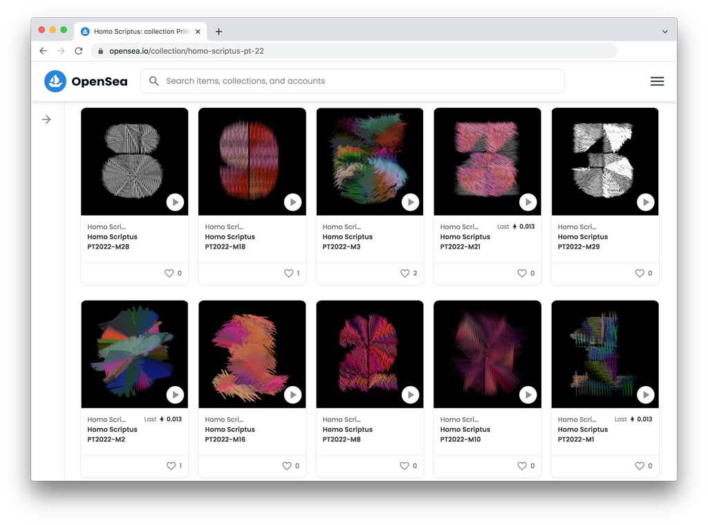
▶ Explore the NFT collection on OpenSea.
04 march 2022 — presentations
Homo Scriptus lecture (Pen Triptych III)
Thursday 10 March 2022 we’ll give a lecture at the Printemps de la Typographie, organised by l’école Estienne in Paris. Those who can remember previous editions, that’s before the pandemic, will remember we gave a lecture a the last 2 editions of this one day seminar. As usual we only understand what we’re doing while we’re doing it, and we came to the conclusion that we’ve actually been telling one long story at the Printemps de la Typographie, started in 2019, continued in 2020, and we’re gonna finish that story in 2022 with the lecture ‘Homo Scriptus’. Therefore it would be a pleasure to see you coming Thursday in Paris at the final episode of our Pen Triptych. Other lectures by Emmanuël Souchier, Charles Gautier, Gabriele Cepulyte, Jean Alessandrini and Olivier Nineuil, Sophie Cure, Esther Szac & André Baldinger.
Tickets and more info here.
19 january 2022 — publications
New publication: Manicule specimen
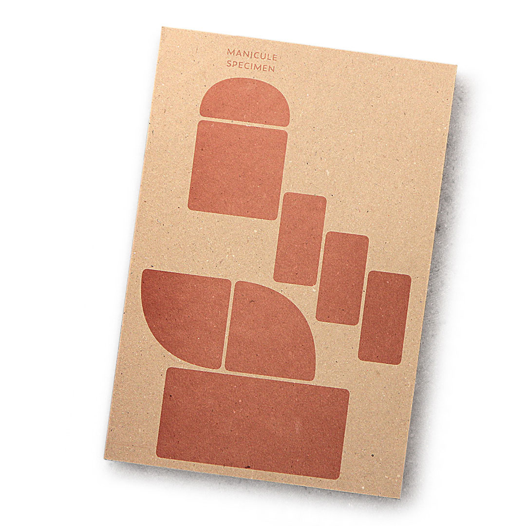
It’s been a well-kept secret, but we often design specific 👉 manicules to fit the style of a typeface and include those in our fonts. Those pointing hands are the subject of a small publication.
This month we hooked up with publishing house De Buitenkant, drukkerij Jan de Jong & zetterij Chang Chi Lan-Ying, for a Copper Monday print (a Dutch printing tradition) and made a Manicule specimen (Dutch title is ‘Handjesproef’ 😘).
This illustrated essay on the manicule, which briefly tells its transition from the margins of 12th century books up to the vaults of contemporary typefaces, brings our love for carefully designed manicules in the open. This publication is therefore not a type specimen, but rather a manicule specimen, in which each manicule is presented in combination with the typeface to which it belongs.
This publication is not for sale, but if you want to obtain a copy, join our raffle.
19 january 2022 — walhalla
Manicule specimen raffle
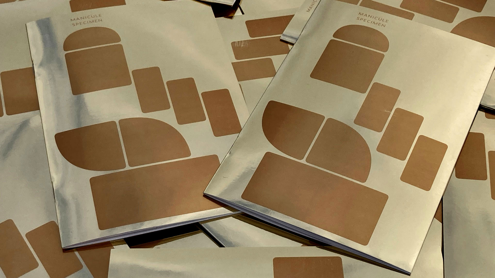
A special edition for a special occasion! Our manicule specimen is printed on leftovers of the printing shop. Therefore 6 different editions exists: different paper, different color. So in a way every edition is a special edition. However, there is also a special special edition. There is a 7th version of this publication, not distributed at all, with an incredible mirroring golden cover. Our manicule specimen is not for sale, but we’re giving a way 10 copies of this triple-X special special edition in the one and only Manicule Specimen Raffle. You can win, win, win!
Win a free copy!
Participation is easy. In case you’re interested to win a copy of this manicule specimen (100% for free), just send an email before 31 January 2022 to raffle@underware.nl with your postal address, saying “I Want It That Way!” (Incomplete or missing postal addresses are invalid submissions). We’ll randomly pick 10 addresses and send the winners a golden edition by post. This publication is not for sale, this is your only chance. Join now!
05 january 2022 — out now
New font: Plakato Color
Digital fonts offer more and more possibilities compared to 30 years ago. A font can support multiple scripts, can provide typographic finesse through smart OpenType features, can be dynamic, and can also contain color.
While most fonts are colourless, or rather have only one colour that can be changed by the user, there are plenty of examples of fonts that do contain multiple colours. Emojis are the best known and most widespread examples.
Recently, a new standard has been published (COLRv1) that makes advanced colour fonts possible, with gradients and transparency. Today we release a set of fonts that take advantage of the new possibilities this font format offers.
03 december 2021 — out now
New font: Plakato
Plakato is a small family of display fonts, where each style has its own characteristics. Plakato is the happy chap, a no-nonsense stencil font with a lot of additional powers, that amiable person you call for help when your message needs to be heard/seen.
Varying from a very fat stencil font family (sure, with flashy italics), up to a neon version, or a font which is constructed out of a few different building blocks in Plakato style. And did we already mention the digital nostalgia in Plakato Game (designed on a C64), and all those extra emoji’s and dingbats? Now we did.
Plakato is an identity toolkit, a heavyweight building block in case you need a strong personality, a small stencil font family to cut out your best ideas and grab all the attention.
Enjoy Plakato!
Introduction offer: Let’s Plaka-To-gether
Order the complete Plakato package, and get a free license for a friend.
This introduction offer runs until 31 Dec 2021.
(We don’t join the discount race to the bottom. We think it’s much nicer to make yourself happy and at the same time share your happiness with a friend. Together is always more fun than alone.)