03 december 2021 — out now
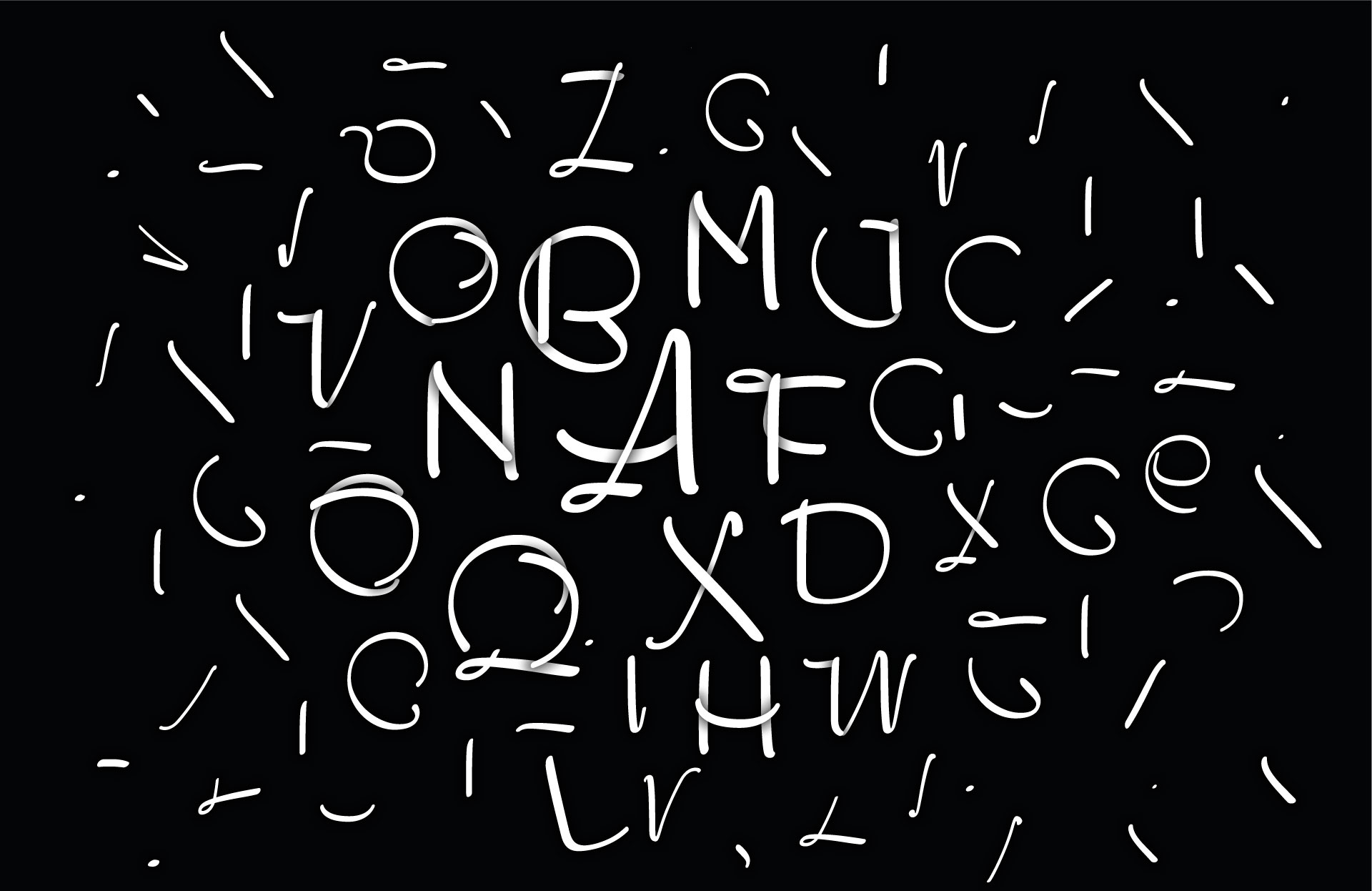
Plakato Play Compendium
The release of Plakato, a collection of eye-catching display fonts, was a two-stage rocket. A set of static fonts & set of dynamic fonts. The static and dynamic fonts share their design, but each dynamic font has its own specific motion and capabilities. Plakato Play is a versatile set of 8 ingenious variable fonts to play with. These variable fonts go beyond the now common width and weight axes and have their own dynamics designed for each style. This newly designed movement brings new possibilities for expression and interaction in text. (For more background, see also the case study The dynamification of typography).
In 1972, Karl Gerstner published his infamous book about the systematics of typography: Kompendium für Alphabeten. In the same spirit we now show, 50 years later, what the results of a systematic approach for OpenType Variable Fonts can be, on the basis of Plakato Play. The Plakato Play Compendium shows 26 possibilities for dynamic type.
03 december 2021 — publications
The dynamification of typography
Because Plakato, our latest font release, consists of a set of static as well as a collection of dynamic fonts, this is a suitable moment to reflect on changes in the practice of a type designer. Accompanied with videos of dynamic versions of Plakato, this case study touches the question if the dynamics of a design should be defined by the user or by its creator, and what it means that type became dynamic.
Read the case study: The dynamification of typography.
28 june 2021 — walhalla
Grammato awarded
German Design Award for Grammato:
expressive writing with dynamic letters
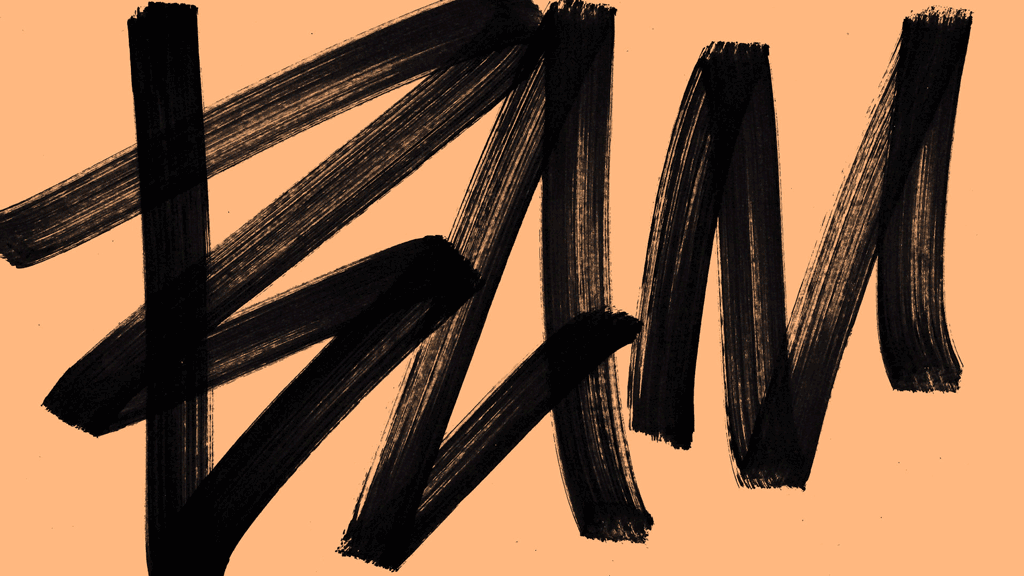
After having already won awards in New York and Tokyo, we have once again been awarded a prestigious international prize, the German Design Award Gold. Underware received this award for their invention of a new way of writing, writing with dynamic letters. This makes it possible for authors as well as designers to manifest themselves more expressively through text.
Grammatography
Until now, texts have always been either handwritten or typed using a static font. With grammatography, Underware introduces a third way of writing that combines both worlds: the expressive possibilities of handwritten text combined with the accessibility of digital texts. This allows search engines to still recognize, index and translate these personal texts, but also creates the ability to influence the expression of the letters: the “tone” of the text.
Using the Higher Order Interpolation technique developed by Underware, it is possible to deform letters in such a way as to create a new form of expression that is not possible with static letters. This was recently shown at the exhibition From Typography to Grammatography at the Print Gallery in Tokyo. As Akiem wonders: “Why can’t letters be deformed and played the same way music is played with a piano?” Because this new technology is based on the existing technological standard of digital letters, it can be applied in any software environment. From social media to operating systems, from apps to interfaces, from smartphones to washing machines.
The dream of the writing machine
The desire for a writing machine and a more expressive use of letters is not new. For example, the French watchmaker Jaquet Droz built a writing doll as early as 1770, and Steve Jobs presented the first Macintosch with the now legendary computer-written demo “insanely great” to the public in 1984. The major difference with grammatography is that in those two cases it was only a simulation. With grammatography, the dream of a writing machine – a machine that can write as beautifully as a human – is now finally realized, available on any computer.
Enthusiastic reception
“Why is writing with letters as static today as it was with Gutenberg 500 years ago? It’s 2021, right?”, Bas asks himself. The judges of the Type Directors Club in Tokyo and also New York, and of the German Design Award in Frankfurt also saw this as true, which is why they independently awarded grammatography. In their view, grammatography will have a great impact not only on the future of written language, but above all on the idea of writing as such.
In case you have questions, or want to know more, just contact us.
German Design Award: https://www.german-design-award.com
28 may 2021 — walhalla
Summer workshop BAM BAM BAM
BAM BAM BAM
Workshop introduction to type design
This 3-day workshop offers designers the opportunity to delve further into type design, while at the same time investigating the relationship between spoken and written language. How does sound relate to writing?
Workshop
This workshop is aimed at young graphic designers who want to develop their typographic skills further by immersing themselves in the design and creation of their own typeface. In this 3-day workshop, in which sketches will be made alternately on paper and digitally, the basic principles of type design will be explained, and a digital font will eventually be made. But since letters can also be a visual representation of spoken language, during this process other possibilities to represent spoken language & sound on paper, beyond the existing conventions, will simultaneously be investigated.
Despite the fact that designing a font family usually takes several years, this entire process will be covered in a bird’s eye view during the workshop in just 3 days. Just BAM BAM BAM.
Skill level
Experience with drawing bezier outlines is desirable, for example in Illustrator or another comparable drawing program.
What do you need to bring?
• Laptop (preferably with OSX)
• Pencils, pens and markers
• Sketch paper
• Tape & scissors
Costs
€95,– for pros
€75,– for students
Apply
• Apply until 18 July 2021
• Workshop will be held in English
• Lunch is included
• Max 15 participants
• Participants will be selected based on motivation
• Location: Ingehousz Breda, the Netherlands
Applications can be made until the 27th of June at graphicmatters.nl
07 may 2021 — walhalla
Stad zoekt kunst
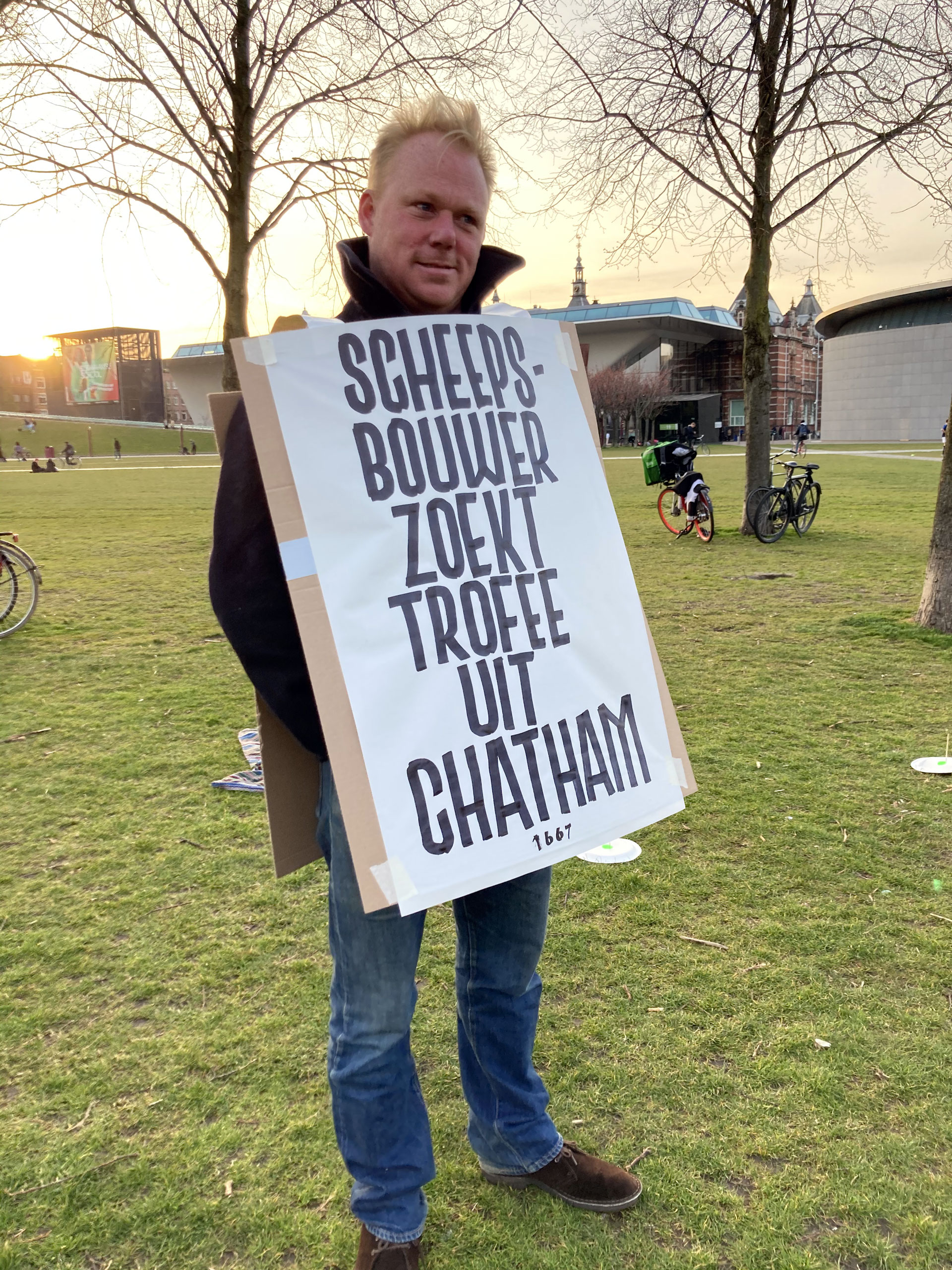
It started with a spontaneous action 3 weeks ago, a manifestation at the Museumplein in Amsterdam to break the absence of art in lockdown times. We helped out the organisation by casually writing personal ads on location, allowing participants to walk around with their own message in XXL size. One writing tool, one colour, no planning, no time to waste, 100% action, pure speed.
05 may 2021 — custom type
Kone custom fonts
During the past decade we’ve teamed up with KONE Corporation, one of the world’s largest companies in the elevator and escalator industry, for whom we have developed a whole range of typographic tools. The initial set of custom fonts was meant to unify their products, but meanwhile the custom fonts kept expanding and turned into a universal and valuable branding tool. Read the case study
04 november 2020 — presentations
Coming up: The Pen Triptych
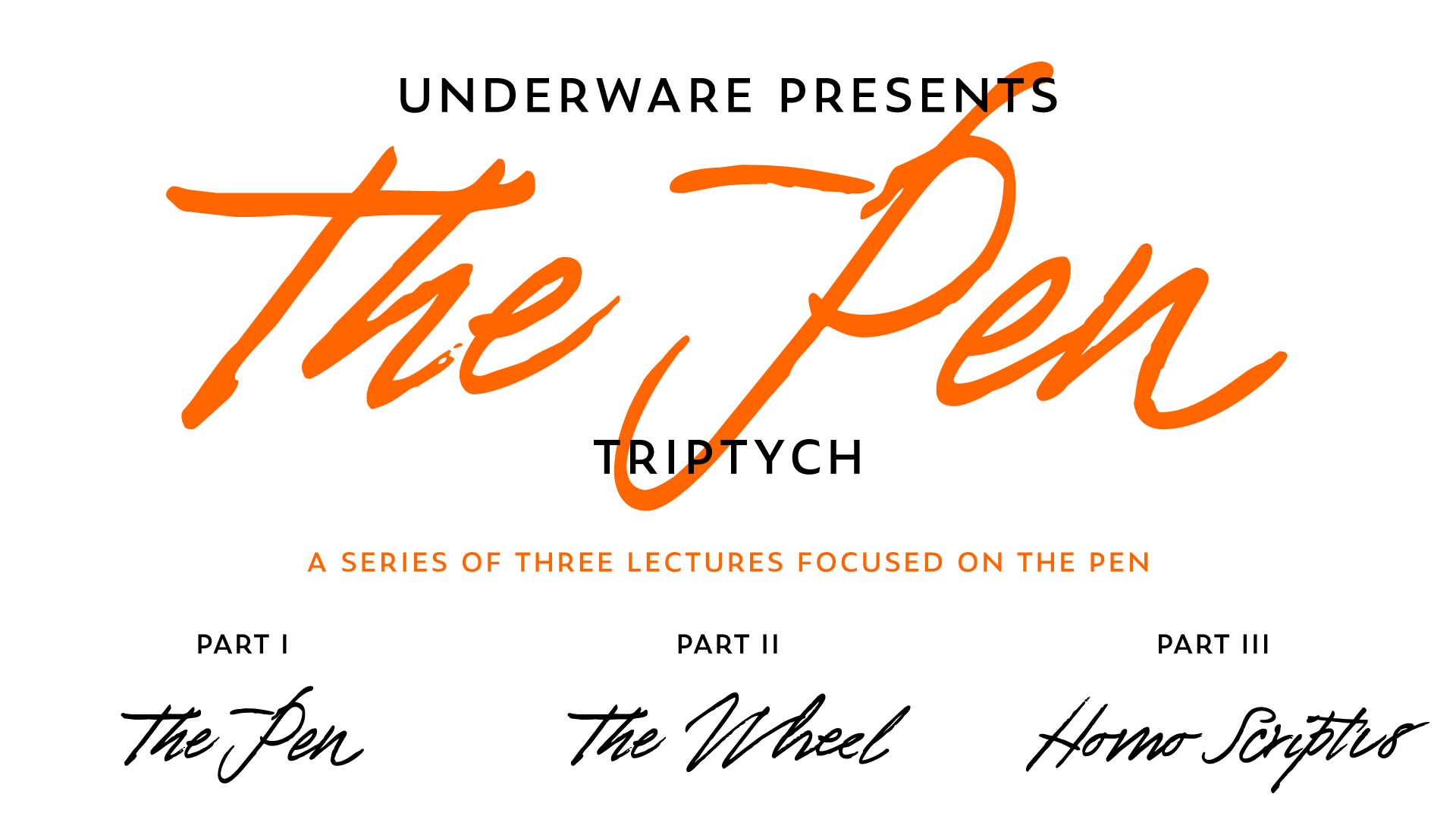
Coming Friday, 6 Nov, we’ll start something new. Inspired by our Berlin Triptych (2017-2019), a series of three lectures in which every lecture continued where the previous lecture had ended, we’re gonna start a new series of 3 joined lectures which tell one longer story. But where the Berlin Triptych (I, II, III) was focused on the subject of letters, this new triptych explores the pen.
The first part of this new triptych, named “The Pen”, will be presented this week in Mexico at the Tipografía México conference, and can be watched online for free. The second part (“The Wheel”) and third part (“Homo Scriptus”) of the triptych are still to be announced.
Fri 6 Nov. 2020
Underware lecture: The Pen
(The Pen Triptych part I)
🇲🇽 12:00 (CST) Mexico 😎
🗽 13:00 (EST) New York ☀️
🇪🇺 19:00 (CET) Berlin 🌧
🇮🇳 23:30 (IST) Mumbai 🌛
🇯🇵 03:00 (JST) Tokyo 🌚
Broadcasted for free
👉 tipografiamexico.com
24 september 2020 — presentations
Grammatography FTW
15-minute introduction to grammatography
If you’ve never heard about grammatography, but if you are interested in writing, fonts, scripts, or typography, then this presentation about a new way of writing is for you.
This 15-minute introduction to grammatography was broadcast 25 Sept 2020 during the Typewknd-conference, and is now available for anybody to watch. The video is accompanied by a quick write-up for even better understanding of this new subject. For 🤯 check the complete case study Grammatography!
(ps. Original trailer here)
29 may 2020 — out now
Hand-drawn logotypes
Every thing has a name. What’s better to visually represent this thing than writing that name in appropriate letters? Our projects usually start with hand sketching, and end up and black and white shapes made out of bezier contours. We make lots of hand sketches, from doodles to detailed sketches, but almost none of them are directly visible in a digital end result. That’s not necessary at all, and even the digital lettering can be considered drawn by hand.
During the “stay at home & but also homeschool your kids & stay healthy at the same time” challenge of the past months, we found some time to add a whole bunch of new logotypes, letterings and mastheads to our website. The range of these applications is rather wide: from boat lettering to magazine mastheads to business logotypes. Some logotypes are in motion, others are static. Some required a months-long process, others were done in an afternoon. They can be for a large multinational, but also for an individual. Some of them are meant to build a brand, others are there for pleasure. The lettering itself might contain a secret visual bonus, and sometimes they are as easy as ABC. Sometimes they are made in cooperation with designers or art-directors, in other cases they are made directly for a client. But they all have at least two things in common: they all consist out of letters only, and we’ve drawn them all by hand.
We just love drawing letters by hand. This was also a good moment to update the logotype section of our website. Find 15 new projects which we made in the past years at underware.nl/logotypes
28 may 2020 — walhalla
Underware in motion
At Underware we often talk about stuff. And that stuff could be anything, it’s whatever we discuss at that moment. This is probably born out of our lack of mastery of the English language 20 years ago when we called almost everything stuff, but the word stuck in our conversations and became useful in some sense too. So let’s talk about stuff here.
In this case the stuff could be an identity, or a brand, a company, a group, an organisation or institution, or just a text. Lots of different stuff, basically anything which is graphically (re)presented. While representing this stuff, motion has become a default part of the characteristics of this stuff in digital media. Half a century ago designers had to consider the visual representation mainly only in static media. When a designer had created a poster/corporate identity/book/other media with a strong own identity, that stuff could have a successful life of its own. But in today’s world, this isn’t always the case anymore. There can be more to the stuff today. As anything can move in unstable media, it’s important to define how stuff moves. Your move is different than my move, in the same way as your dance is different than my dance, and your handwriting is different than mine.
(more…)