27 may 2020 — fonts in use
Fakir loves beer
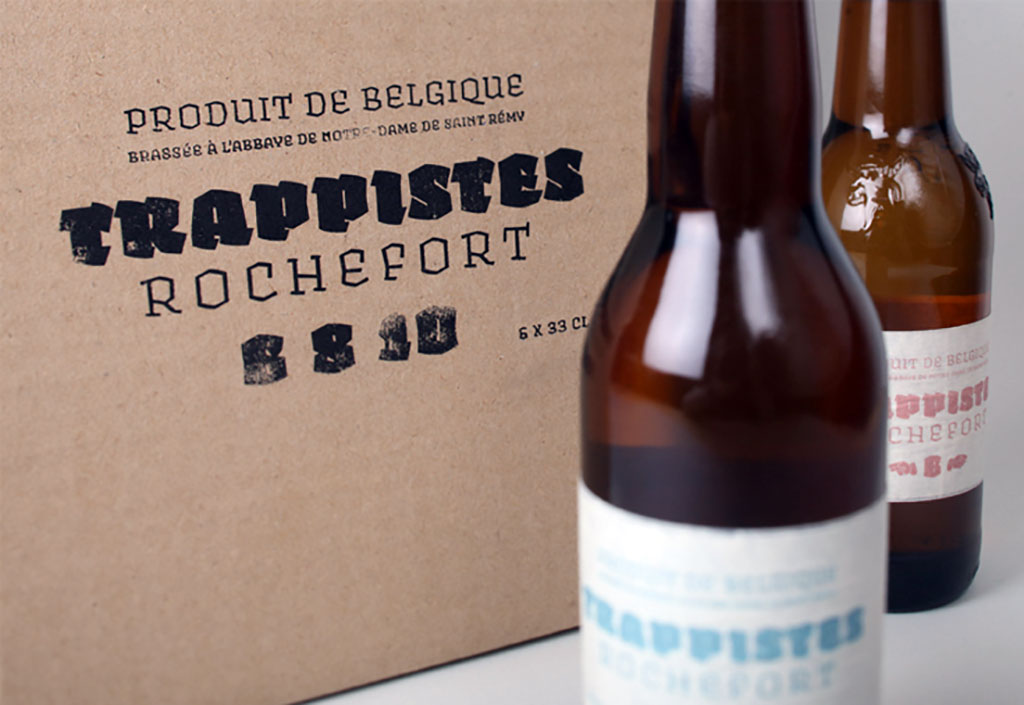
Some people love books, others love shoes, music, surfing, football, chilling, bird watching, scrabble, witchcraft or metal detecting. We love letters. Everybody is different, but in the end we all love beer. To celebrate that it’s beer which unites such a large part of the world, we collected some beer labels set in our typeface Fakir. Apparently black letters are a thing in the beer cosmos, maybe even more than in gangster rap. Beer must have black letter, or it ain’t real. In case you still have any doubts that it’s really black letter & beer which unite the world, here are a few examples of Fakir in use on beer labels from across the globe.
20 may 2020 — walhalla
Buiten Bios

We’re over 2 months into the Corona crisis, and it’s still a different world than we used to know. But instead of noticing what’s currently not possible, why not focusing on what actually is possible at the moment? Yesterday it was announced that the Dutch regulations are going to being eased from the 1st of June on. So if you’re around Amsterdam: every Friday in June there is the Buiten Bios, an open-air cinema on the rooftop of our Amsterdam studio building. Starts at sunset, max 30 visitors. Be welcome at Tugela85. Tickets are on sale now: https://tugela85.nl/activiteiten/1084/t85-buitenbios
15 november 2019 — publications
26
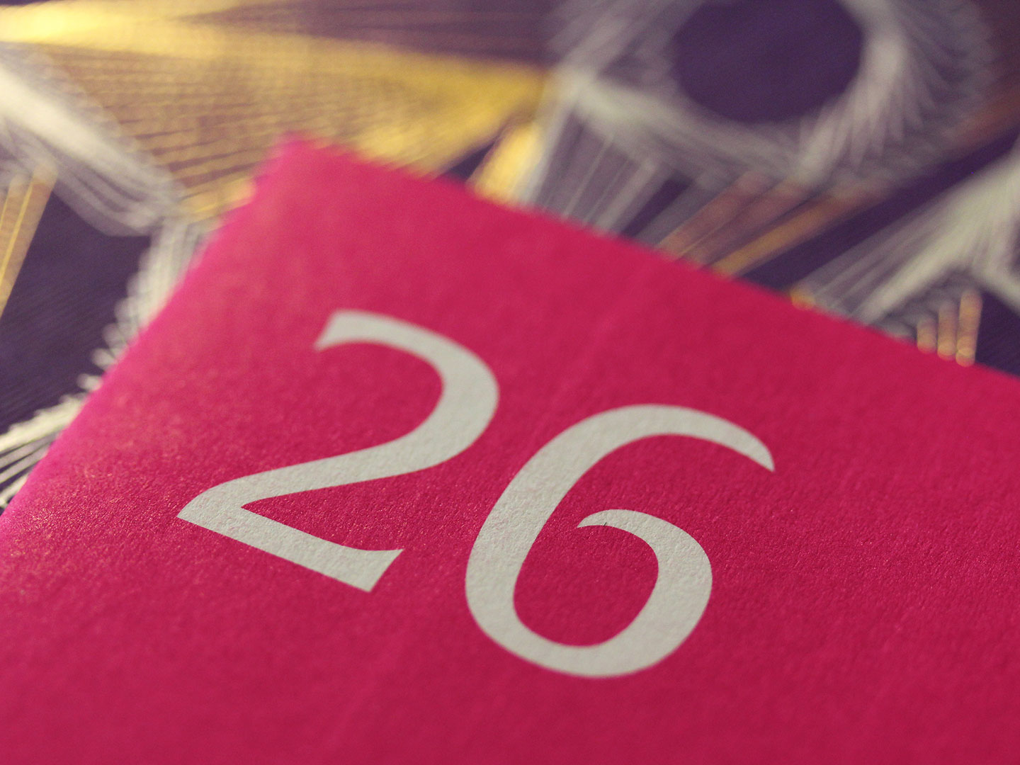
The publication 26 is a speculative 26th chapter of the book Theory of Type Design by Gerard Unger (22 Jan 1942-23 Nov 2018). Despite that the number 26 will always remain a benchmark in the Latin type world, Unger’s book about those Latin letters only consists out of 25 chapters. As Gerry Leonidas describes it in his foreword, Unger’s book “offers a reference point for the design community to respond to, and, not least, for other authors to contribute further.” So did Gerard Unger deliberately not include a 26th chapter? Is this book actually a request for other type designers to respond to? Can Unger’s choice for writing 25 chapters be regarded as an open invitation for anybody to write their own version of the missing 26th chapter themselves? We hope to read many 26th chapters by other type designers in the future, which will keep Unger’s spirit of writing on type design alive. Bring on the responses. Our 26th chapter is this publication.
The text in this publication is an elaboration of the talk Underware held during the book presentation on 6 September 2018 at the Nieuwe Instituut in Rotterdam. 26 was written and published by Underware on the occasion of TypeAmsterdam 2019.
Win a free copy!
We’re giving away 26 copies of the publication 26. For free! And we really mean “free” as in free. No hidden meanings, which is almost an exception these days. We’ll randomly pick 26 addresses from those who apply, and then we’ll ship the publication for free. This publication is not for sale. With other words: this is your only chance.
If you want to participate in this raffle and win a free copy of this publication, make sure you send your name & full postal address before 22 November 2019 to info@underware.nl and mention “I wanna win 26!”. Winners will be notified before 1 December.
11 november 2019 — out now
New website: The Tail of the Tale
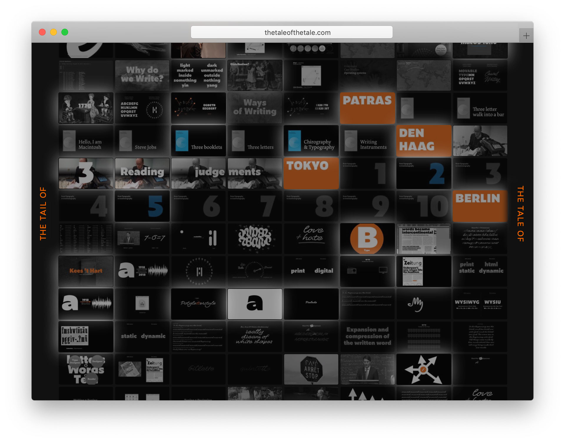
The Tale of the Tail is a narrative on letters, writing and language by Underware & friends. The 5000+ slides we’ve created for various recent lectures, together with the accompanying publications, as well as new content by others (like Kees ’t Hart) have been transformed into a single publication, making various thoughts and ideas on letters accessible in an entropic way. Talking about language, or writing on letters, is the tale of the tail of the tale of the tail… Watch and listen non-stop: thetaleofthetail.com
29 october 2019 — presentations
Into the Void – Berlin Triptych III
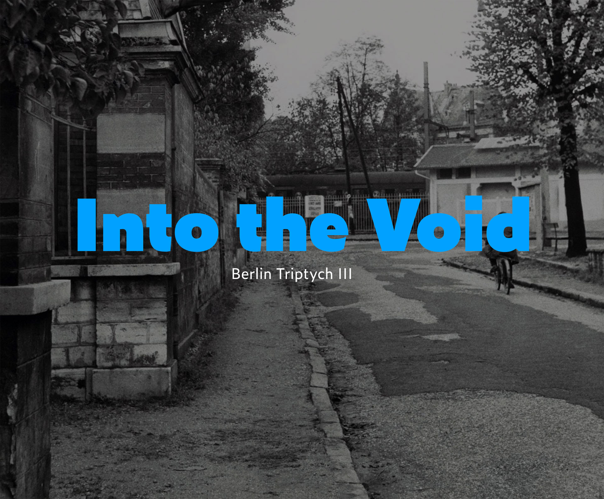
On Friday 8 November 2019 we’re gonna complete our Berlin Triptych, with a lecture at Creative Mornings in Berlin. In the past 2 years we gave a lecture once a year in Berlin which was part of a triptych. What started in 2017 with the first lecture “If you want something new, you have to stop doing something old”, was followed by the second lecture in 2018 titled “Export Future”. The triptych will now be completed with the third and last lecture in this series titled “Into the Void”.
Three lectures filled with developments, ideas, concepts, approaches, sketches, thoughts, perspectives, and mostly questions, in this case focused on letters, but they apply to other subjects too. During the first 2 lectures of this Berlin Triptych various typographic ideas – for example Font Fiction, Higher Order Interpolation or the SuperFont™ – were introduced. Next week Friday we gonna see where this journey will end up.
If you missed out on the first 2 lectures, don’t worry. You can either still do your homework and watch them online before you attend (see links above), or completely surprise yourself and attend the third lecture without any previous knowledge. We’ll leave that up to you.
Into the Void
Underware’s Berlin Triptych III
Venue: Creative Mornings Berlin
Date: 8 November; 08:30 o’clock
Location: Native Instruments, Schlesische Str. 29-30, Berlin
Tickets will be on sale from Monday 4 November 10:00 o’clock at the Creative Mornings website: Register.
If you’re in the mood to join us on our typographic trip, we would enjoy seeing you in Berlin next week. (And we would like to thank Jürgen Siebert for enabling Underware’s Berlin Triptych)
25 september 2019 — walhalla
Grammatography exhibition Tokyo


We write 6 September 2019. Is there a better way to introduce grammatography than with an exhibition at Print gallery in Tokyo? Don’t think so. A small exhibition with big ideas, a small lecture and big guests, a small projection which fits Hiragana and Latin into a single variable letter and a big smoke machine. A big stop at our small Right To Write Tour 2019. Sounds by the Dutch artist Rob Bothoff, Liza Y, a single letter opening speech and good beer and good talks. What else should we say?
(More photos at this Flickr album)
12 september 2019 — presentations
Grammatography lecture
We’ve just returned from our Right To Write Tour in Japan. Besides of an exhibition at Print Gallery in Tokyo, and a workshop at the Temple University in Tokyo, we gave 4 lectures in Tokyo and Osaka in which we presented grammatography, and introduced Grammato.com. Instant updates during the tour don’t happen on this blog, but on our Twitter or Instagram account. So follow those in case you want to see more snippets. However, for those who are curious to know more about grammatography, the video of our talk titled Grammatography at the ATypI conference in Tokyo is now online. Featuring live writing, as future is written. Enjoy! (ps. At the interpreter’s request we tried to speak slowly…)
05 september 2019 — out now
Introducing Grammato
Until now, every text has either been written by hand, or typeset with a font. With Grammato, we’re introducing a third approach, combining the best of both worlds: beautiful, infinitely smooth written text, where text keeps its semantics. Grammato is built on standard technologies, so it just works everywhere. Wherever you’ve only been using fonts, you can now use Grammato: in apps, social media, videos, interfaces, devices, operating systems, everywhere!
We’re extremely happy and excited to announce the introduction of grammatography with Grammato ▶▶▶ www.grammato.com
27 august 2019 — presentations
Right To Write Tour Japan 2019

Get ready for grammatography in our Right To Write Tour. Next week we’ll have 4 lectures, a workshop and an exhibition in Japan. We don’t give workshops that often anymore these days, and an exhibition of our work is definitely rare. So feel free to drop by if you’re around Tokyo or Osaka.
| 2019.09.05 | Lecture Grammatography • ATypI • Tokyo • 18:30 |
| 2019.09.06 | Workshop Causal Writing • Temple University • Tokyo • 14:00 |
| 2019.09.07 | Lecture From Typography to Grammatography (English-Japanese translation) • Print Gallery • Tokyo • 15:00 |
| 2019.09.07 | Exhibition From Typography to Grammatography • Print Gallery • Tokyo • 6-8 september 2019 • Opening 7 september • 17:30 |
| 2019.09.08 | Lecture Page Not Found • Book & Design • Tokyo • 13:00 |
| 2019.09.10 | Lecture Right To Write • Enokojima • Osaka • 18:00 |
We would like to thank Gerry Leonidas & Ian Lynam, who enabled the events in Tokyo, and Duncan Brotherton & Tetsuya Goto, who enabled the lecture in Osaka.
19 march 2019 — presentations
The end of peninsularity workshop Barcelona
The end of peninsularity – typeworkshop in Barcelona
The first week of July brings the opportunity to expand your skills and brains with a type design workshop in Barcelona. Type designers are masters of the black and white 2D universe. But what is that 2-dimensional Cartesian world actually? Can 2D be approached in another way? And if you do that, what are the consequences for your (type) design process? This subject is gonna be explored coming July in Barcelona (Spain) during a 5-day in-depth type workshop, where the fundament of designing letters will be questioned and investigated. This workshop is suitable for aspiring type designers who already have a little bit of experience, already made a font themselves in the past, and who are ready to open their mind and expand their skills within an enthusiastic group of people. They will leave the workshop not only with more knowledge, but also with an expanded view on their own type design process.
Only recently it has become clear that from now on type designers aren’t any longer just designing outlines of fonts, but are mostly designing relations between outlines of fonts. Therefore interpolation will become increasingly relevant in the future of type design, and will logically be an essential aspect within this workshop. During this workshop we’re not only going to explore the design of letters (hands-on), but also explore the space in which those letters relate to each other (brains-on). Designing the design, as well as designing the design space these designs live in. And that – well… if everything works out – leads to another, innovative way of looking at your design.
Improve your type design skills in Barcelona this summer
Organisation: Elisava, Barcelona School of Design and Engineering
Date: 1-5 July 2019
Instructors: Joancarles Casasín (TypeTogether) & Bas Jacobs (Underware)
Limited amount of seats available. Registration is now open: type.elisava.net